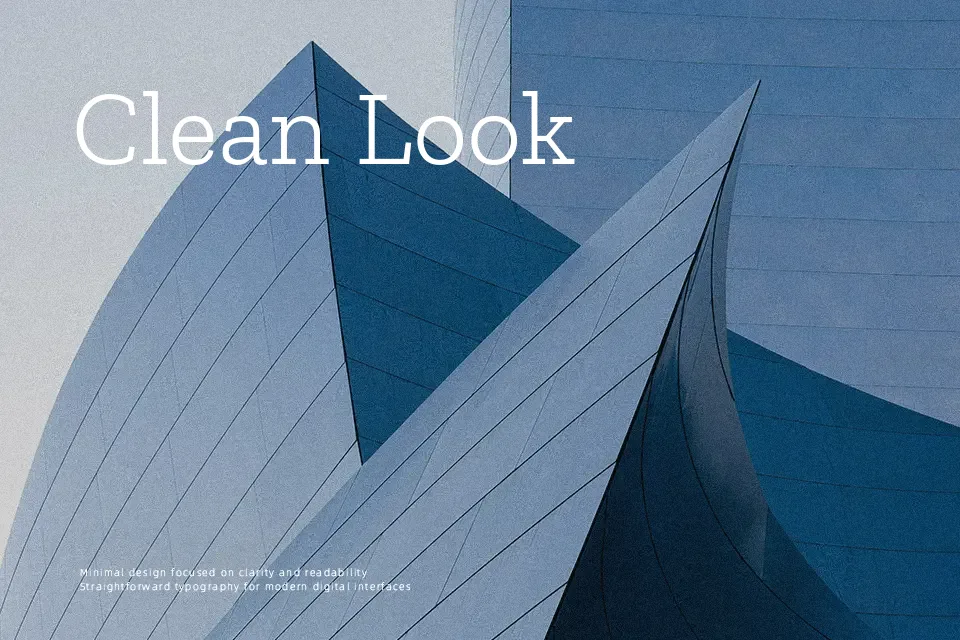
Zilla Slab Font
Free for Commercial UseAbout
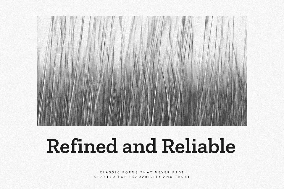
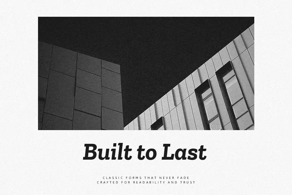
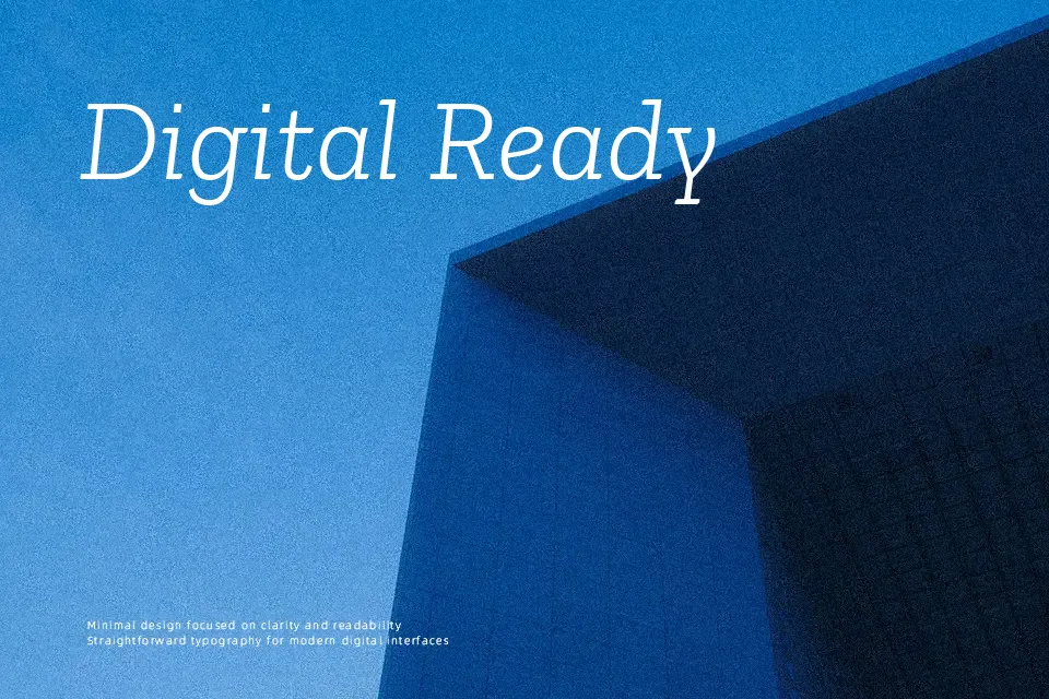
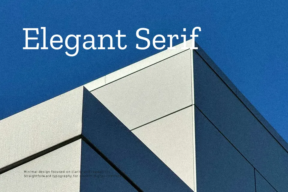
Zilla Slab pairs solid, blocky serifs with open counters and gentle curves, so text feels sturdy without turning stiff. The family spans light to bold with matching italics, giving you enough range for hierarchy in interfaces, presentations, or reports that need clear structure. It leans more contemporary than workhorses like Clarendon, which makes it fit well with modern color palettes and roomy layouts. I like it for headlines, pull quotes, and short paragraphs, especially when you need a strong brand accent that still reads comfortably. Very dense body copy set at small sizes or in highly formal documents can feel a bit informal, so I would reach for something more neutral there.
Best For:
Brand-led headlines and subheads in digital products
Editorial layouts, zines, and reports with a modern tech-friendly tone
Marketing pages and slide decks that need a sturdy, approachable serif voice
Not Ideal For:
Highly formal corporate documents or legal long-form text
Very small body copy in dense, information-heavy layouts
Projects that require an extremely neutral, invisible text face
Perfect for body text, branding, and editorial, with a bold and slab serif style.
License
Gallery