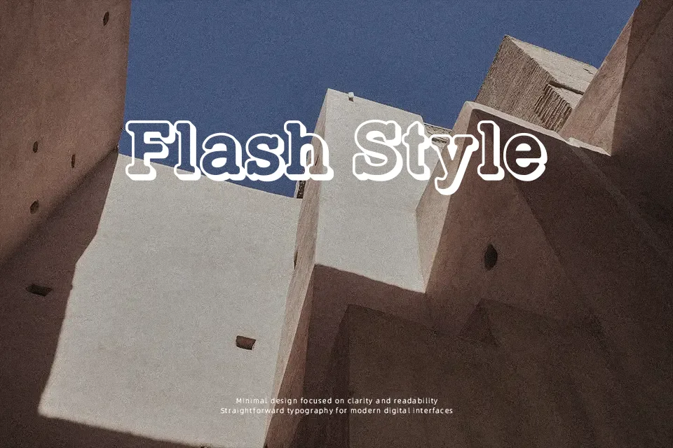
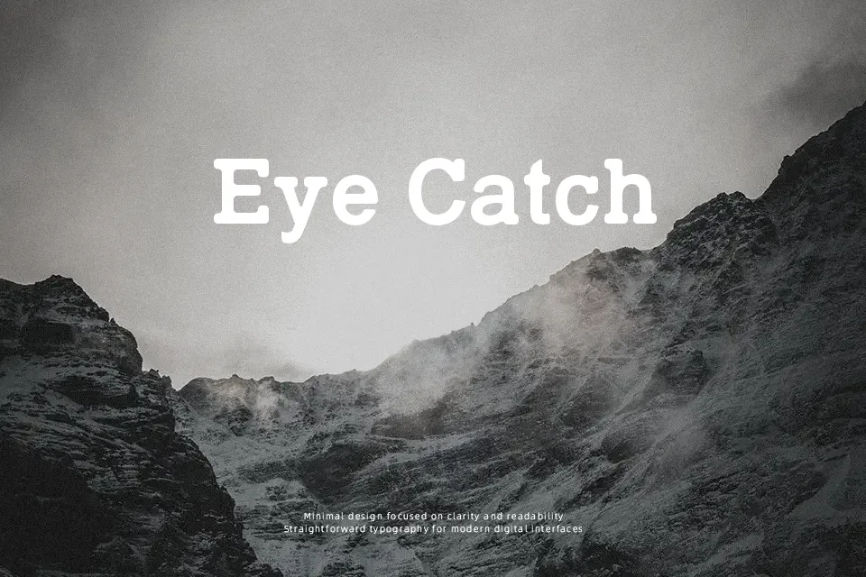
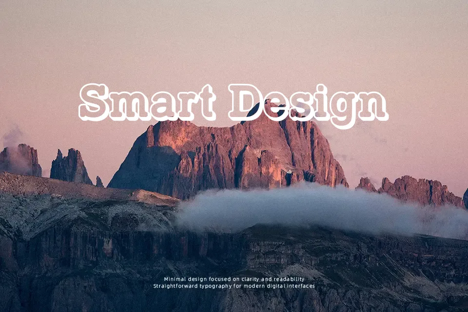
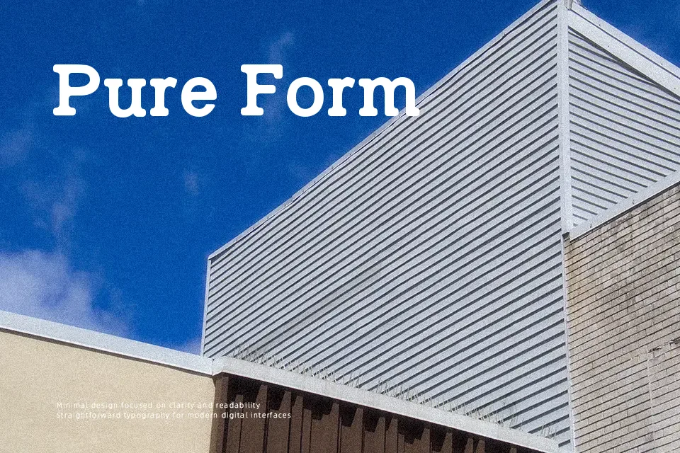
Typo Slab Irregular Font
Free for personal useAbout
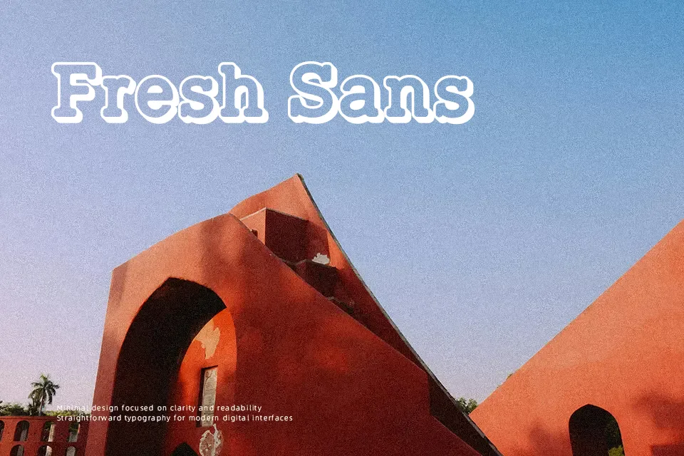
Typo Slab Irregular Font works best as prominent display text, using broad slab serifs, firm strokes, and deliberately uneven details to create a rugged, printed character. Its proportions feel substantial rather than delicate, while the generally steady spacing keeps short words and headlines from becoming chaotic. Uppercase forms carry the strongest visual weight, and the visible numerals retain the same blunt, structured approach. The font is effective for titles, labels, and identity pieces that need a vintage-leaning editorial tone. At small sizes, the irregular edges and heavy serif treatment can make fine details less clear, so it is not a comfortable choice for extended reading.
Best For: editorial magazine headlines,vintage product packaging,poster titles,restaurant signage
Not Ideal For: long paragraph text,small interface labels,legal documents,dense editorial layouts
Perfect for editorial, headline, and logo, with a bold and decorative style.
License
Gallery