Cream Font
Free for personal useAbout
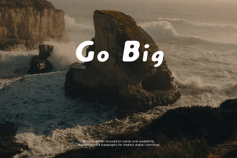
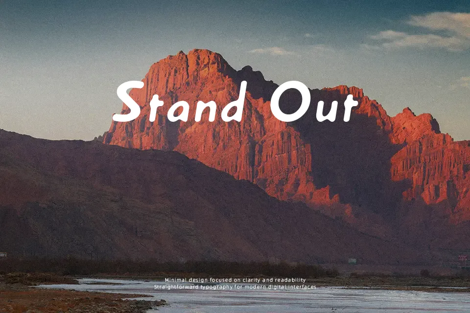
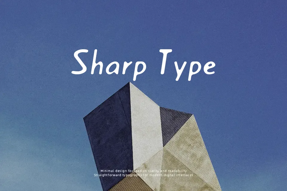
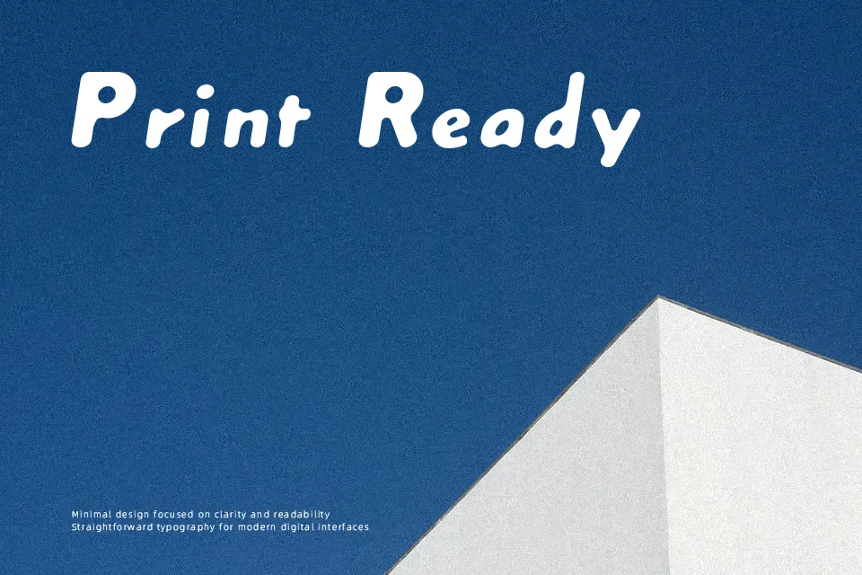
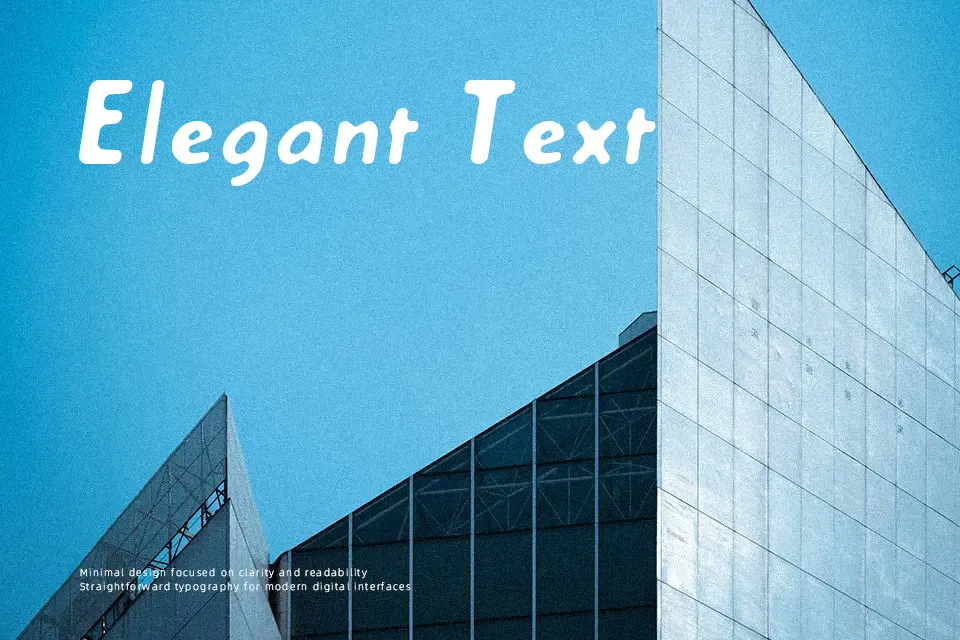
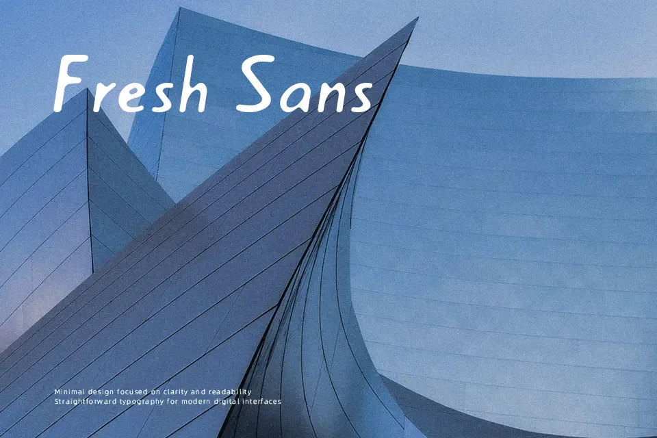
Cream Font features eroded silhouettes paired with uneven, weathered edges that simulate physical ink degradation on coarse paper. Thick stroke weights give each character solid presence, while moderate internal proportions keep basic letter structures identifiable at glance. Spacing between individual glyphs remains relatively tight, preserving compact word blocks that command attention in bold title sequences or gig flyers. However, this dense texturing severely hinders legibility when scaled down to smaller sizes. Decorative degradation creates visual noise across delicate counters, making extended reading uncomfortable in dense editorial layouts. The typeface performs best in punchy, short-form headline compositions.
Best For:
vintage product packaging, music festival posters, streetwear apparel graphics, grunge album covers
Not Ideal For:
long paragraph text, mobile app body copy, formal business documents, small technical captions
Perfect for headline, logo, and music, with a bold and decorative style.
License
Gallery