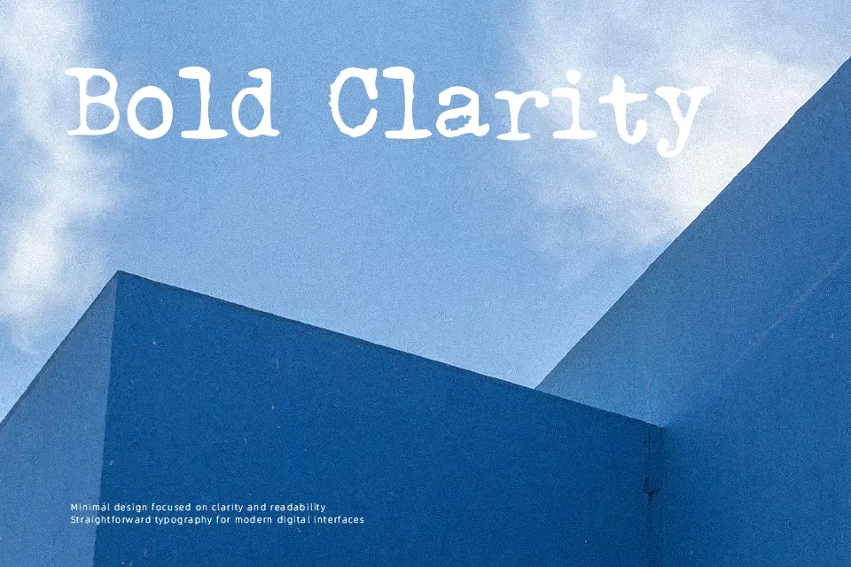
Triumph Tippa Font
Free for personal useAbout
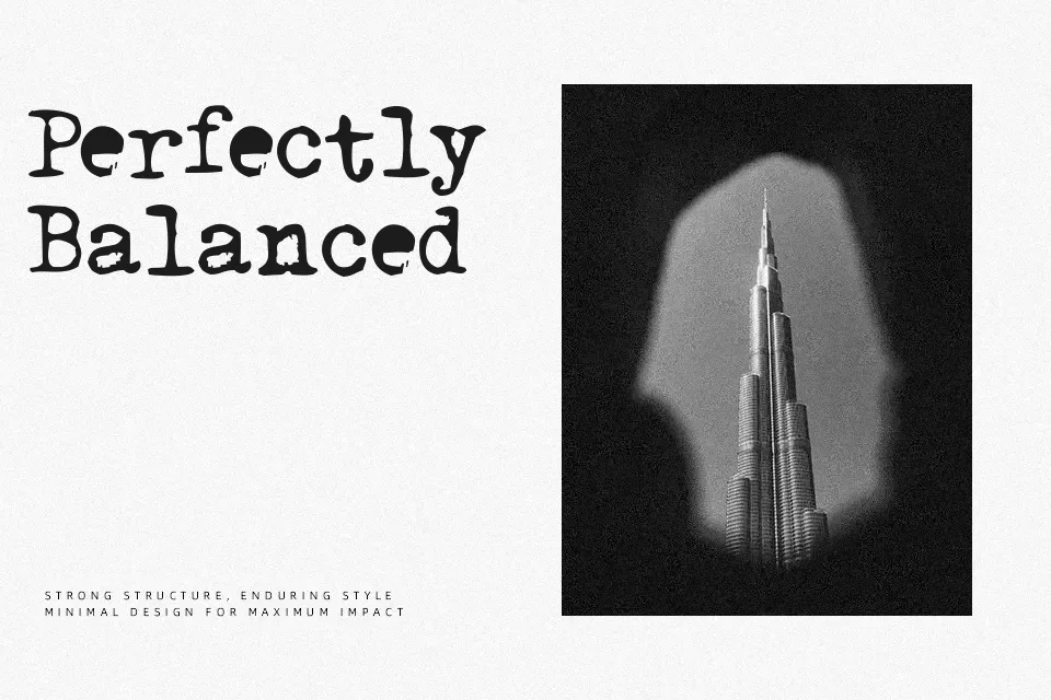
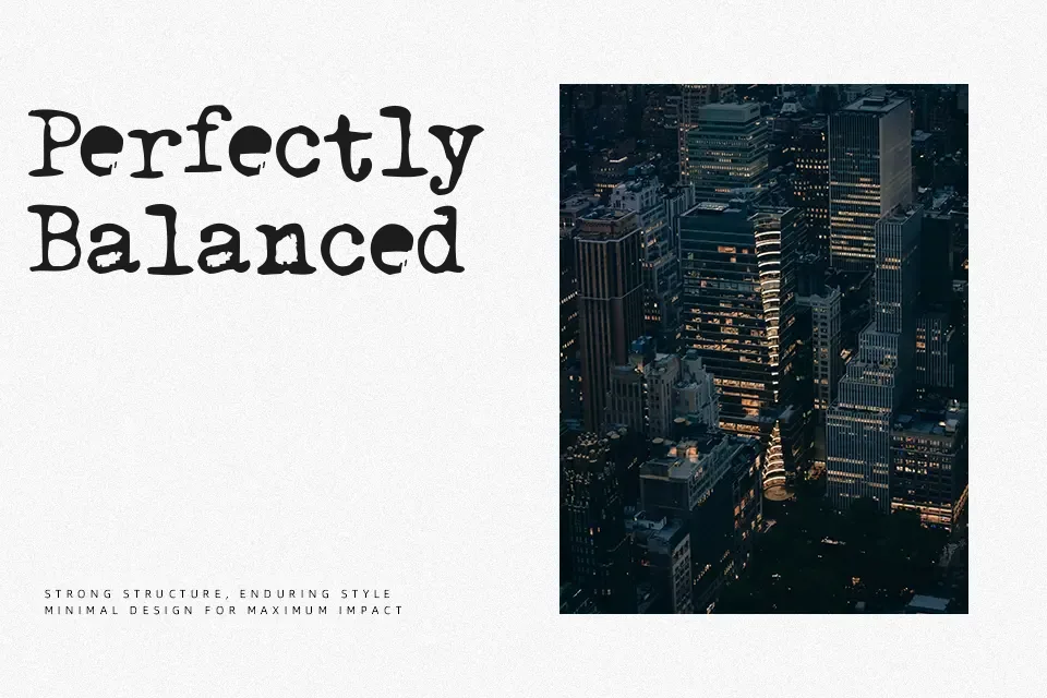
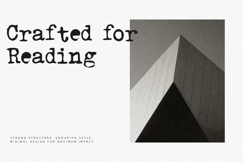
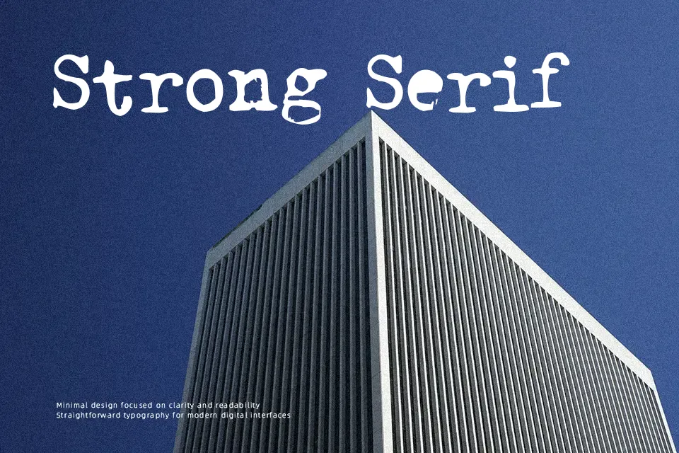
Built upon rigid mechanical geometries, Triumph Tippa Font delivers a raw typewriter aesthetic marked by heavy slab terminals and monospaced proportions. Each glyph features uniform horizontal allocation, producing noticeable gaps around narrower letters while wider characters fill their allotted boundaries completely. The strokes show minimal modulation with blunt joins, giving the letterforms an unrefined stamped character. While this rhythmic structure offers legible presentation in display titles, archival document mockups, and narrative chapter markers, extended paragraphs suffer from visual fatigue due to the repetitive horizontal pitch. The consistent stroke weight ensures reliable clarity when printed at medium sizes.
Best For: vintage book covers, archival prop design, editorial pull quotes, retro packaging labels
Not Ideal For: dense book typography, continuous body text, mobile interface labels, tabular spreadsheet data
Perfect for editorial, film, and headline, with a classic and display style.
License
Gallery