Pridi Font
Free for Commercial UseAbout
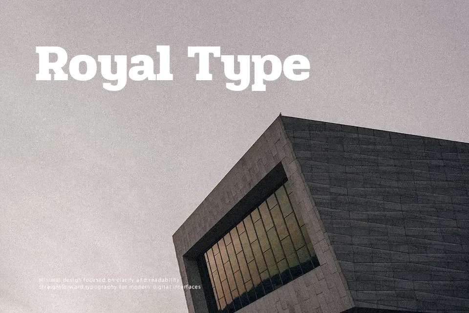
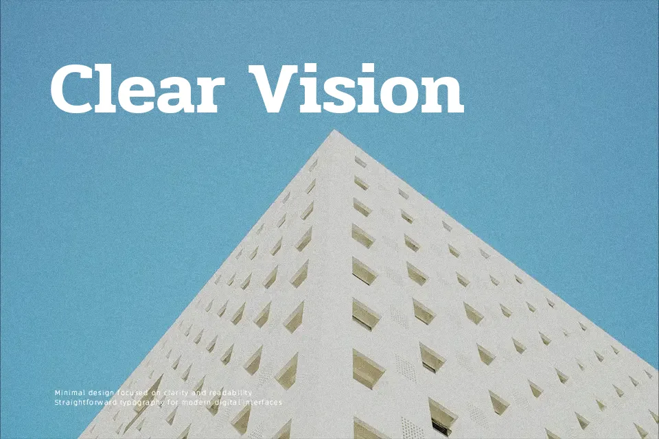
Pridi combines slab serif Latin characters with looped Thai letterforms, using solid verticals, generous counters, and moderate spacing to stay readable even in dense paragraphs. On screen or in print, it feels structured but not stiff, so it suits long-form reading, product explainers, and content-heavy dashboards that need Thai support. I tend to reach for it when a project has both Thai and Latin text and needs a consistent voice across headings and body copy, but I would skip it for ultra-minimal branding that demands razor-thin strokes or highly expressive display work.
Best For:
Bilingual Thai–Latin editorial layouts
Content-heavy websites and blogs in Thai
UI text where Thai readability is critical
Print reports and publications with Thai sections
Not Ideal For:
Highly decorative logos needing strong personality
Ultra-light minimalist branding systems
Playful kids or cartoon themes
Oversized experimental display typography
Perfect for body text, editorial, and headline, with a classic and serif style.
License
Gallery