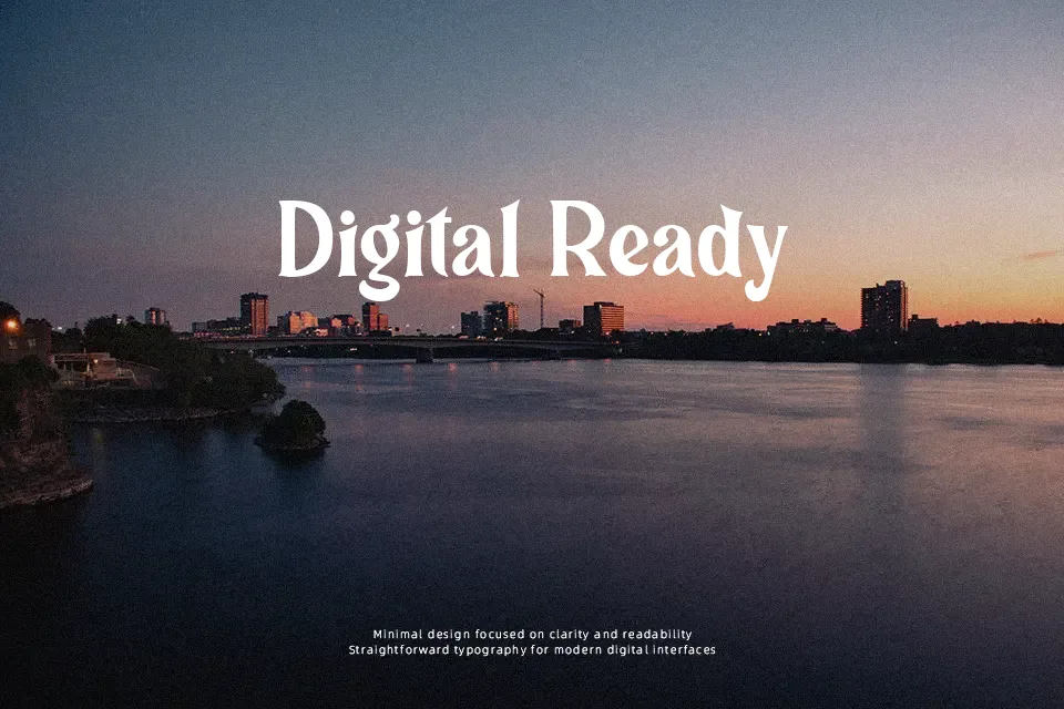
Connecticut Font
Free for personal useAbout
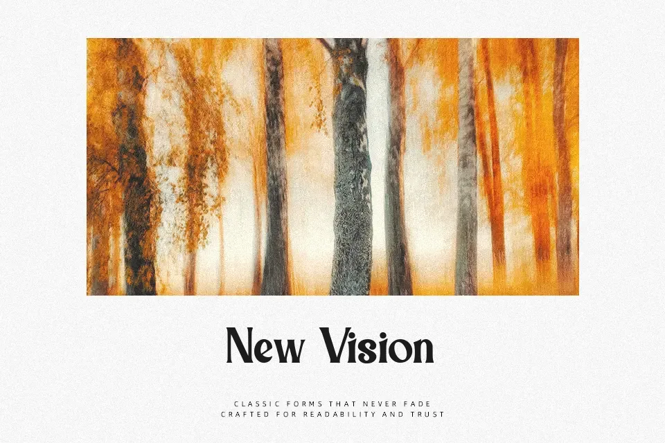
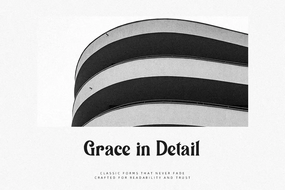
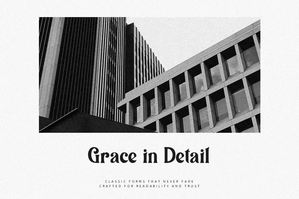
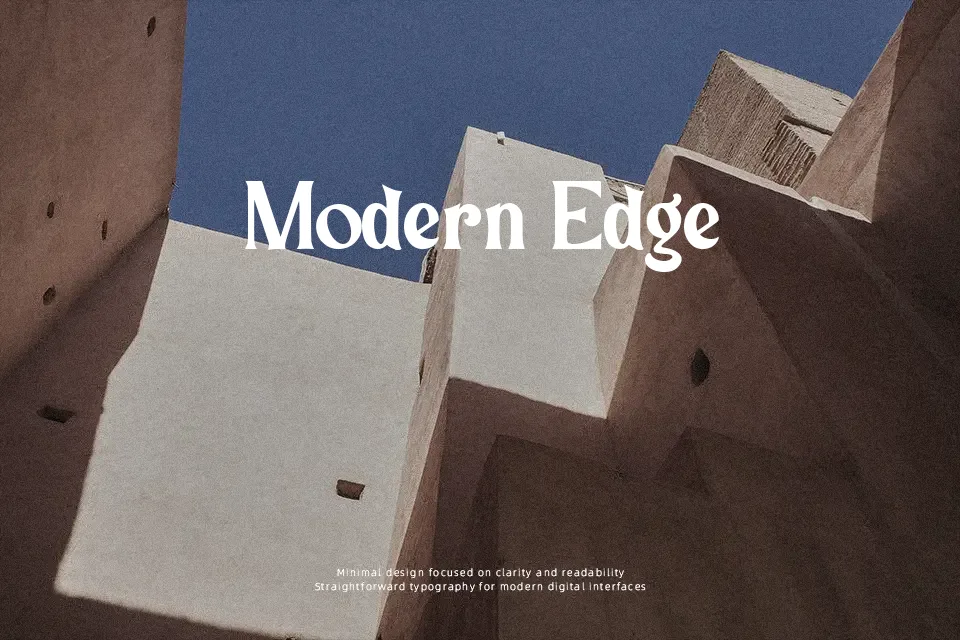
Connecticut Font exhibits substantial stroke weight paired with moderate contrast and expressive, gently curved serifs that evoke classic twentieth-century display typography. The letterforms show sturdy, grounded proportions with relatively uniform character widths, creating a rhythmic and cohesive appearance across uppercase and lowercase sets. Spacing remains moderately tight, which strengthens visual cohesion in compact titling but compromises letter separation at reduced optical sizes. In terms of legibility, the design delivers immediate recognition in billboard headlines, restaurant menu titles, and merchandise branding. However, dense character counters and prominent serifs reduce reading comfort in continuous body paragraphs, making the typeface poorly suited for extensive editorial text.
Best For: vintage product packaging, restaurant menu headers, retro apparel graphics, music festival posters
Not Ideal For: long paragraph text, small interface labels, technical manuals, dense editorial layouts
Perfect for headline, logo, and packaging, with a bold and decorative style.
License
Gallery