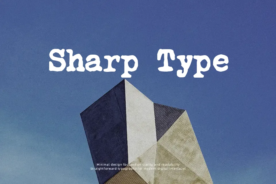
Courier Polski 1941 Font
Free for personal useAbout
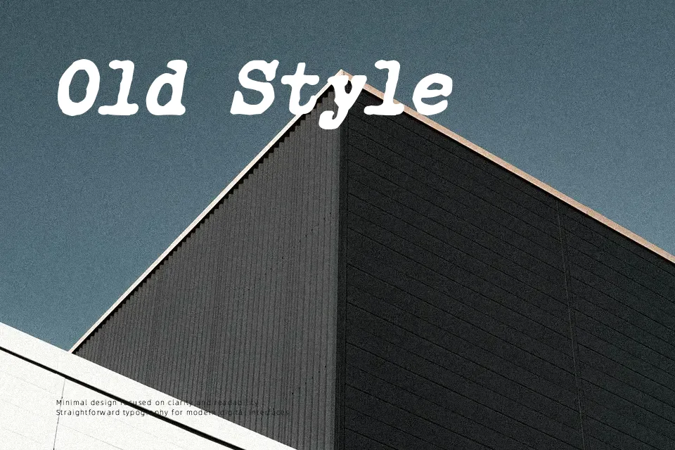
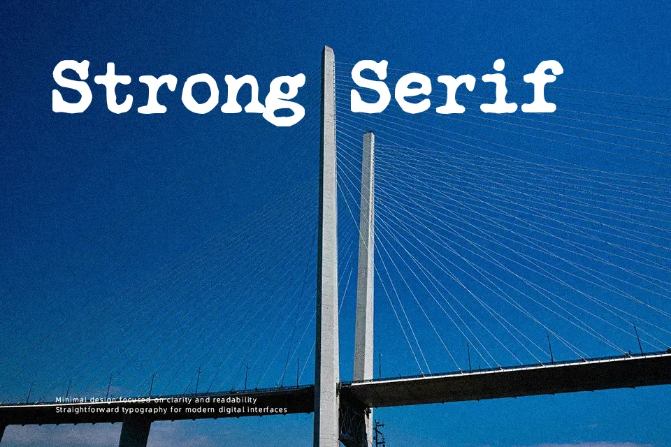
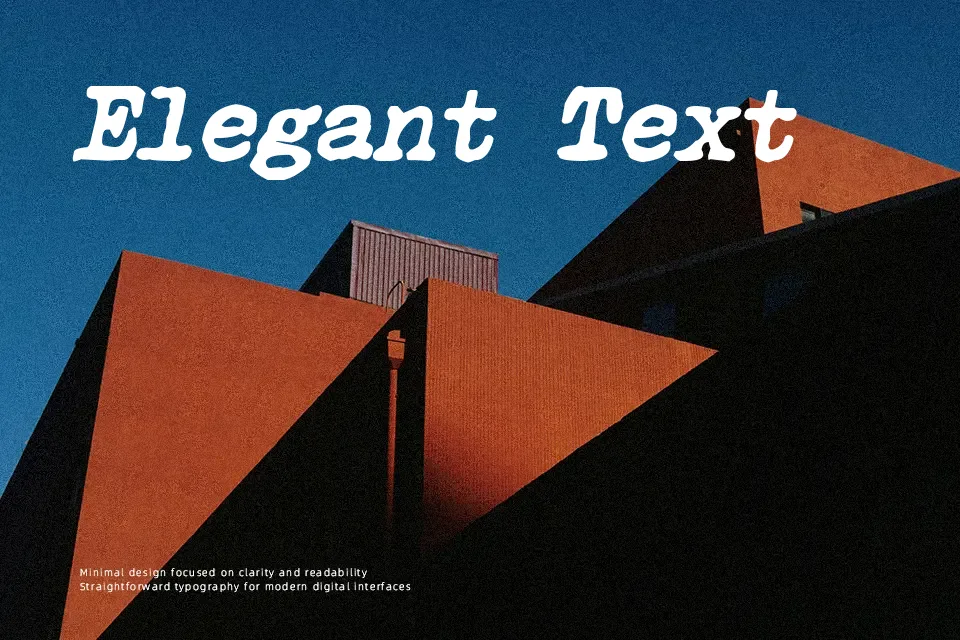
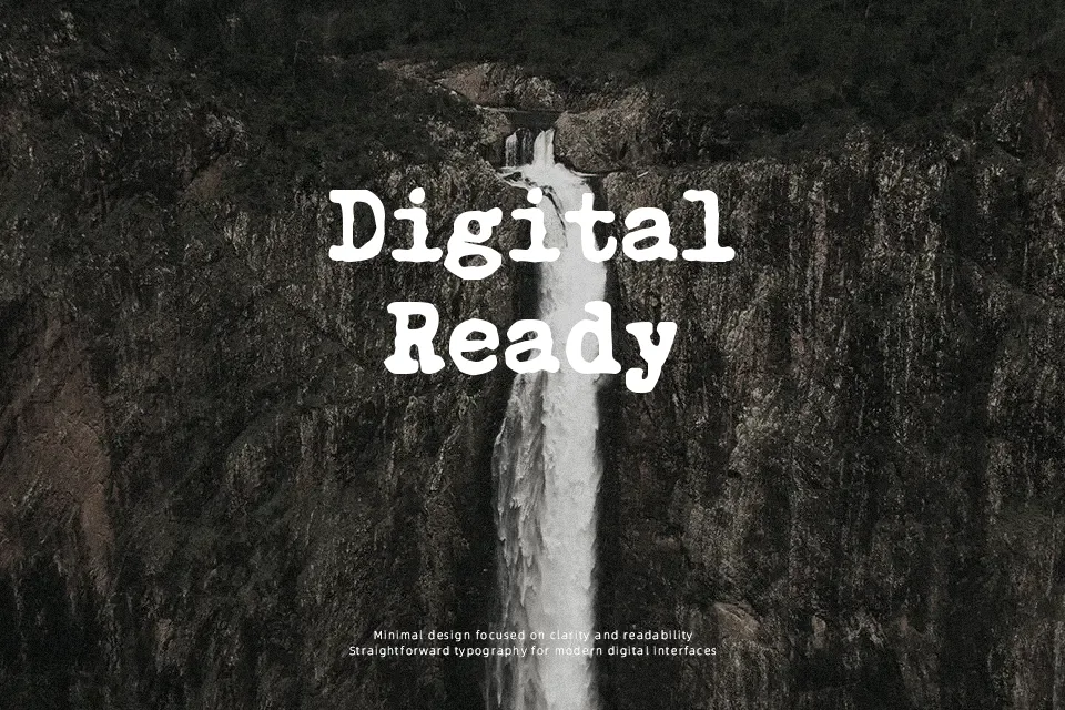
Courier Polski 1941 Font is characterized by its rigid monospaced architecture, prominent slab serifs, and low stroke contrast reminiscent of vintage mechanical typing. Each letterform occupies a consistent horizontal width, generating a rhythmic cadence with generous spacing around narrow glyphs and dense fitting on wider characters. The stroke terminals display subtle softness that mimics ink transfer on paper, lending warmth to its structured proportions. At headline and subheader scales, the letterforms provide excellent legibility for historical book jackets, cinematic title cards, and themed packaging. However, extended text blocks suffer from visual monotony, making the typeface unsuited for dense body paragraphs.
Best For: vintage poster headlines, period packaging labels, theatrical title cards, historical book covers
Not Ideal For: dense editorial paragraphs, small user interface captions, mobile app body text, corporate financial spreadsheets
Perfect for editorial, headline, and packaging, with a classic and display style.
License
Gallery