Pack’In Font
Free for personal useAbout
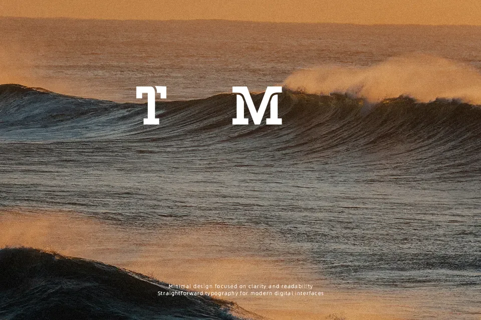
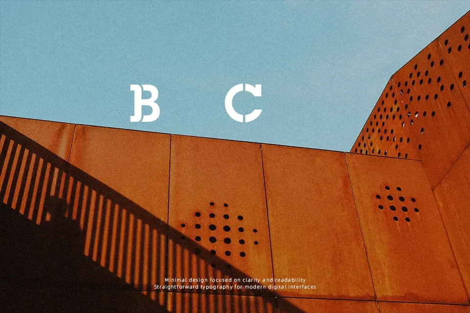
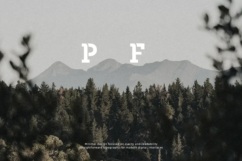
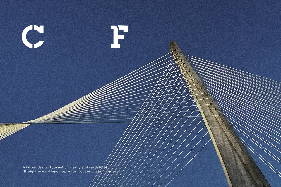
Pack’In Font works best when displayed at larger sizes, where its heavy stencil construction and sharply segmented forms remain clear. The uppercase-focused letterforms use thick, low-contrast strokes, compact proportions, and purposeful internal breaks that create a rugged rhythm across short words. Spacing appears controlled rather than open, helping titles and labels hold together as solid visual units. It is a practical choice for poster headlines, themed packaging, and garment graphics that need an industrial or military-like tone. The strong shapes improve visibility in large display settings, but the stencil cuts and dense forms make it less comfortable for small text or extended reading.
Best For: military-style posters,equipment labels,apparel graphics,industrial packaging
Not Ideal For: long paragraph text,small interface labels,legal documents,dense editorial layouts
Perfect for headline, logo, and packaging, with a bold and decorative style.
License
Gallery