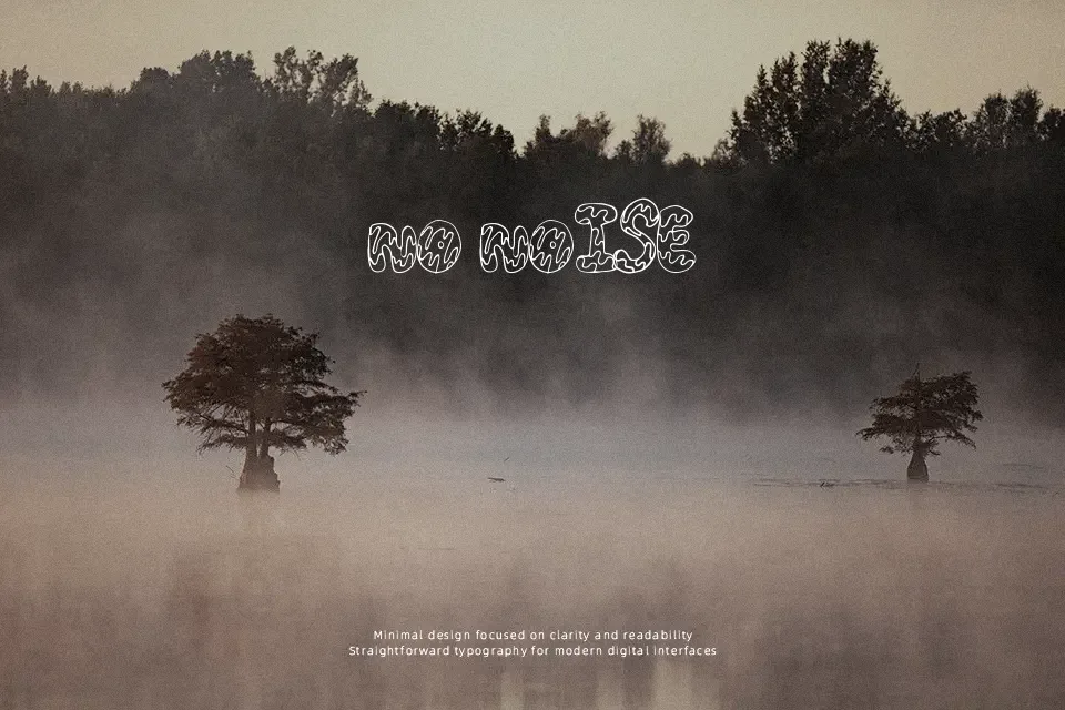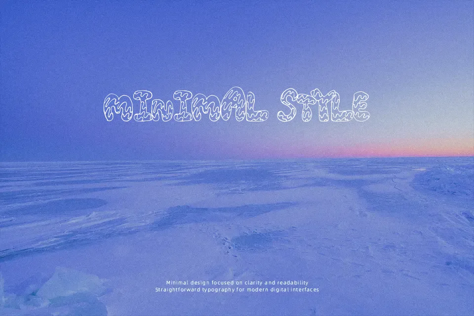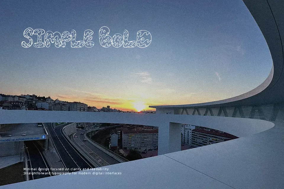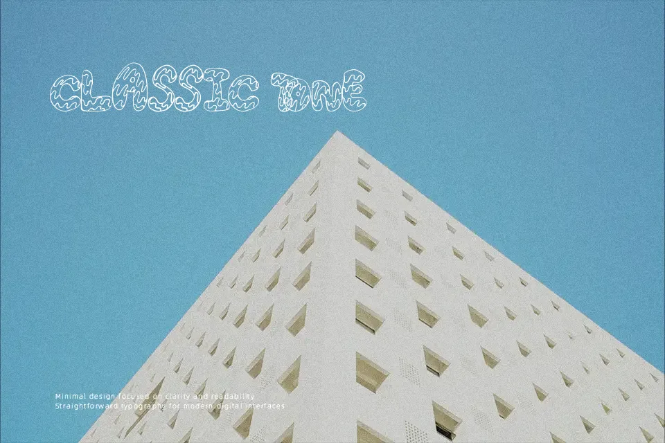
CreamCone Font
Free for personal useAbout
CreamCone Font presents a bulbous display construction built around heavy exterior boundaries and dripping, soft-serve texturing. Each glyph exhibits exaggerated proportions with plump curves, low stroke contrast, and narrow horizontal spacing that locks neighbouring letters tightly together. These thick weights ensure substantial visual weight across ice cream shop signs, candy packaging, and youth apparel graphics. While the generous letterforms deliver instant personality across prominent titles, the internal wavy accents diminish character separation at modest scales. As a consequence, the typeface becomes ineffective for continuous editorial copy or compact user interface labels where clean geometric discipline is necessary for effortless decipherability.
Best For: candy packaging, ice cream shop signs, youth apparel graphics, summer event posters
Not Ideal For: continuous editorial copy, corporate annual reports, compact mobile app labels, dense financial spreadsheets
Perfect for headline, kids, and logo, with a bold and cartoon style.
License
Gallery