Libertinus Mono Font
Free for Commercial UseAbout
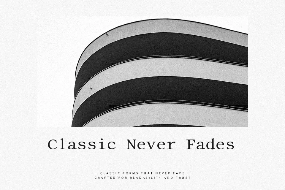
Libertinus Mono takes the structure of a classic book serif and locks it into a strict monospaced grid, so every character sits on the same width without feeling mechanical. Strokes are moderate, terminals are calm rather than flashy, and the spacing leaves enough air for dense code or command-line snippets to stay readable over long sessions. Compared with more clinical coding faces, it carries a slightly literary tone, which can be pleasant in documentation, academic tools, or developer-facing branding where you want a more thoughtful voice. It is less convincing for heavy display work or ultra-small UI text, where a crisper sans serif might hold up better.
Best For:
code editors and IDE themes
technical documentation layouts
developer-focused websites
terminal and command-line screenshots
Not Ideal For:
high-impact marketing headlines
kids products or playful branding
very small mobile UI labels
formal print body text in books
Perfect for body text, headline, and ui design, with a classic and monospace style.
License
Gallery