Kreon Font
Free for Commercial UseAbout
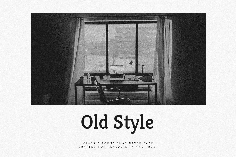
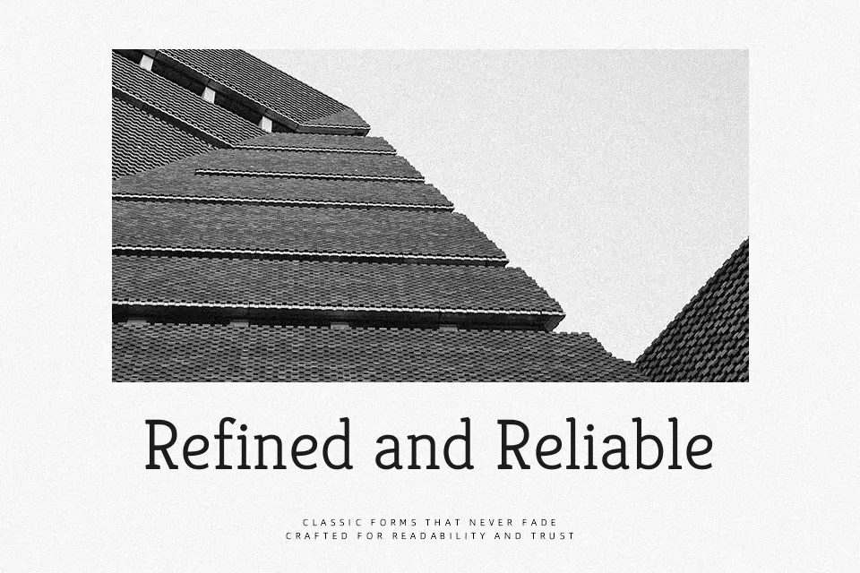
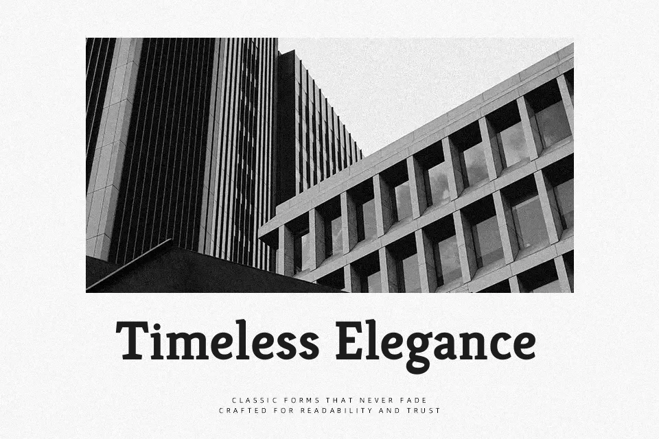
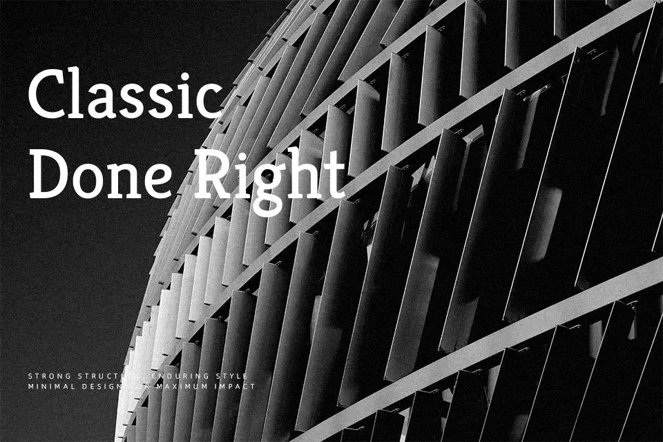
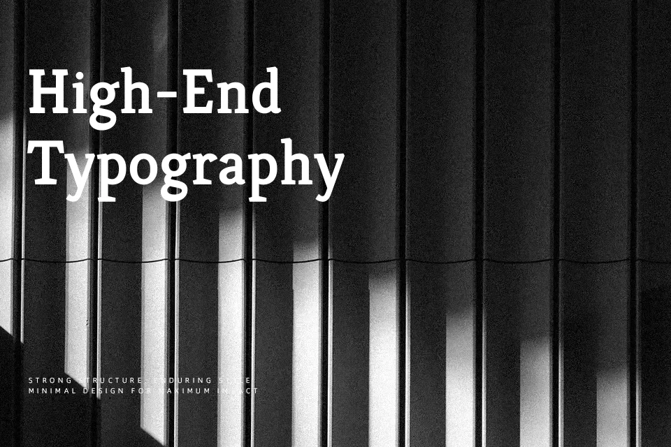
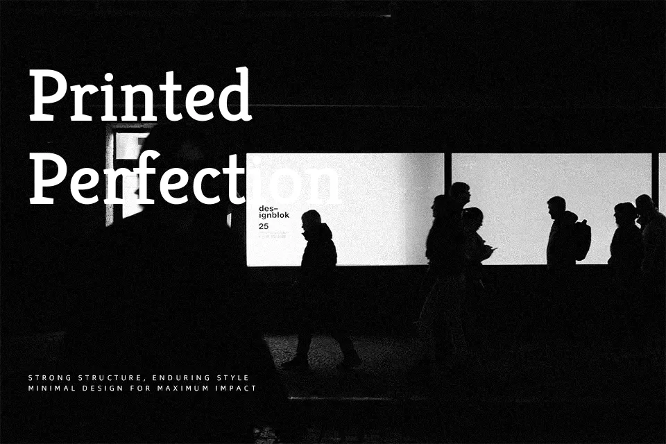
Kreon is a slab serif typeface with chunky, slightly wedged serifs, open counters, and relatively low contrast between thick and thin strokes, which keeps text steady at small sizes. The rhythm feels relaxed rather than stiff, so paragraphs flow without that “wall of text” effect common in harsher slab designs. It suits editorial-style reading on screens—think news portals, content-heavy blogs, or thoughtful brand stories—where you want a serious tone but still approachable. In very tight UI layouts or ultra-formal corporate reports, though, its personality can feel a bit informal and wide compared to sharply cut serifs. If you like the readability of classic newspapers but want something more contemporary and friendly, Kreon sits nicely in that space.
Best For:
editorial web articles
online news sections
content-heavy blogs
magazine-style landing pages
Not Ideal For:
highly formal legal documents
dense UI microcopy
minimalist tech dashboards
ultra-compact captions
Perfect for advertising, body text, and editorial, with a classic and serif style.
License
Gallery