Kaisei Tokumin Font
Free for Commercial UseAbout
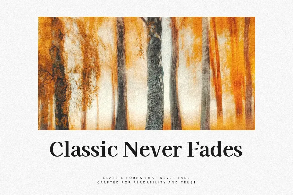
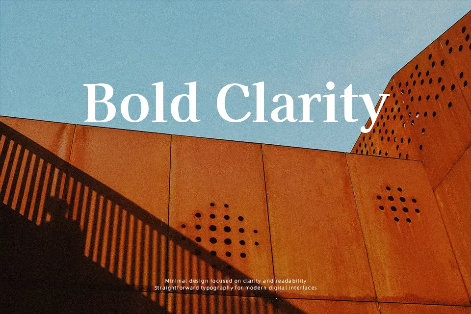
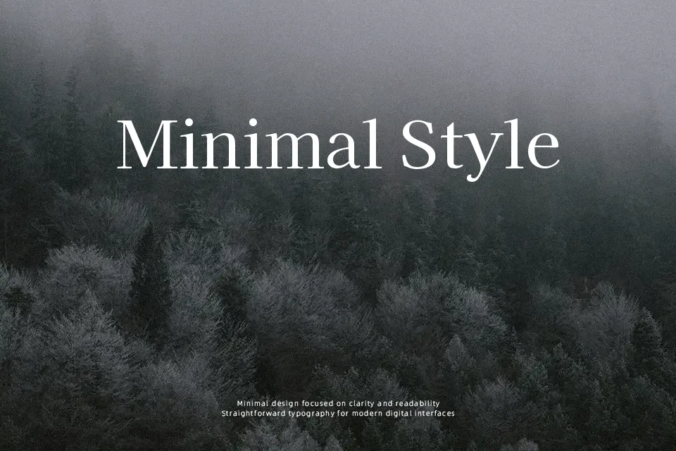
Kaisei Tokumin is a Mincho-style serif with sturdy vertical strokes, clear contrast, and generously drawn kana that sit heavier than the surrounding text, so titles feel anchored and emphatic. The structure is orderly and balanced rather than ornate, giving it a dignified look that still reads cleanly on screens and in print. I find it shines on projects that need a strong Japanese character—magazine mastheads, book jackets, restaurant branding, or bold UI banners—where the extra-bold kana can carry the visual weight. For dense, small-size body copy or highly minimalist Western layouts, though, its strong personality can feel too dominant, and a quieter serif will usually behave better.
Best For:
display titles with Japanese text
editorial covers and feature pages
branding for traditional or premium products
restaurant menus and signage
Not Ideal For:
small body text at low sizes
highly minimal Western-only layouts
dense technical documents
subtle corporate reports
Perfect for branding, editorial, and headline, with a bold and serif style.
License
Gallery