Times for Punks Font
Free for personal useAbout
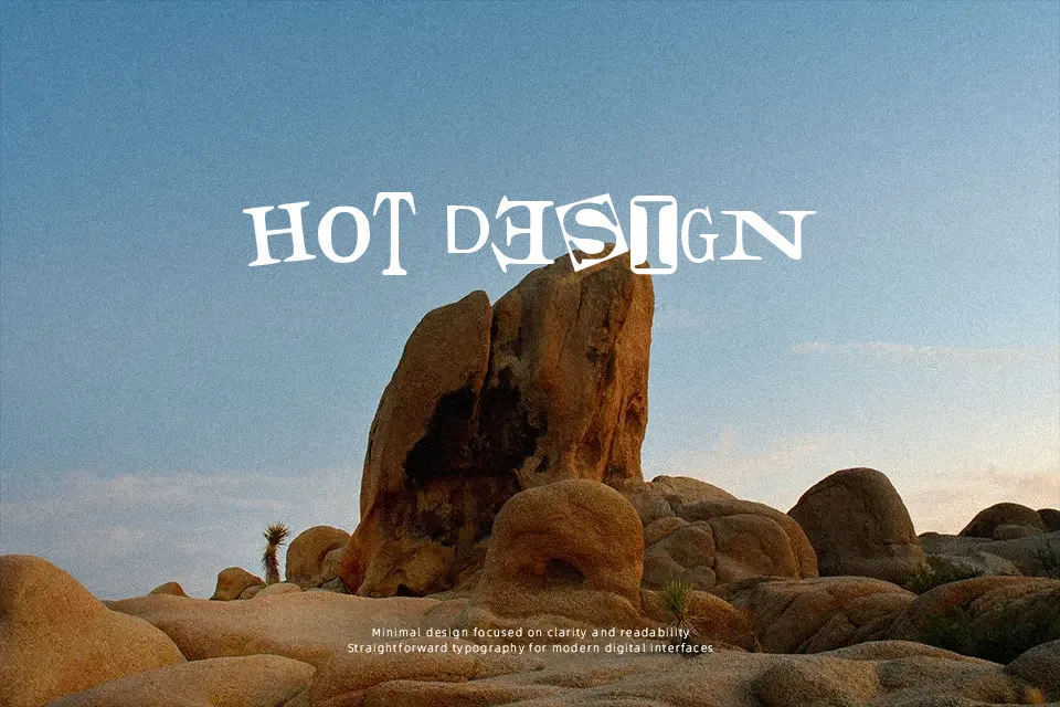
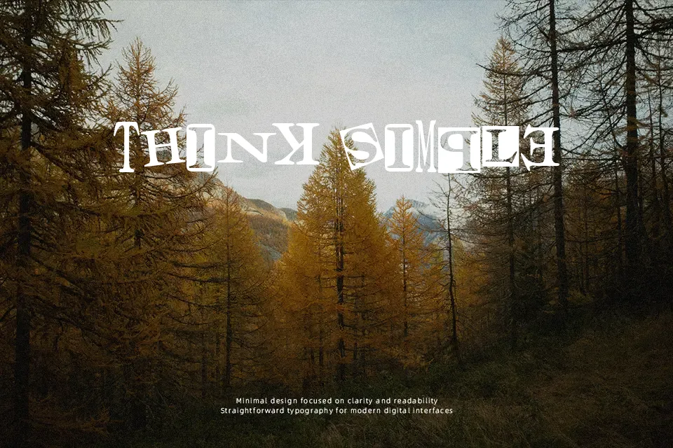
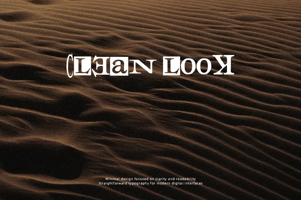
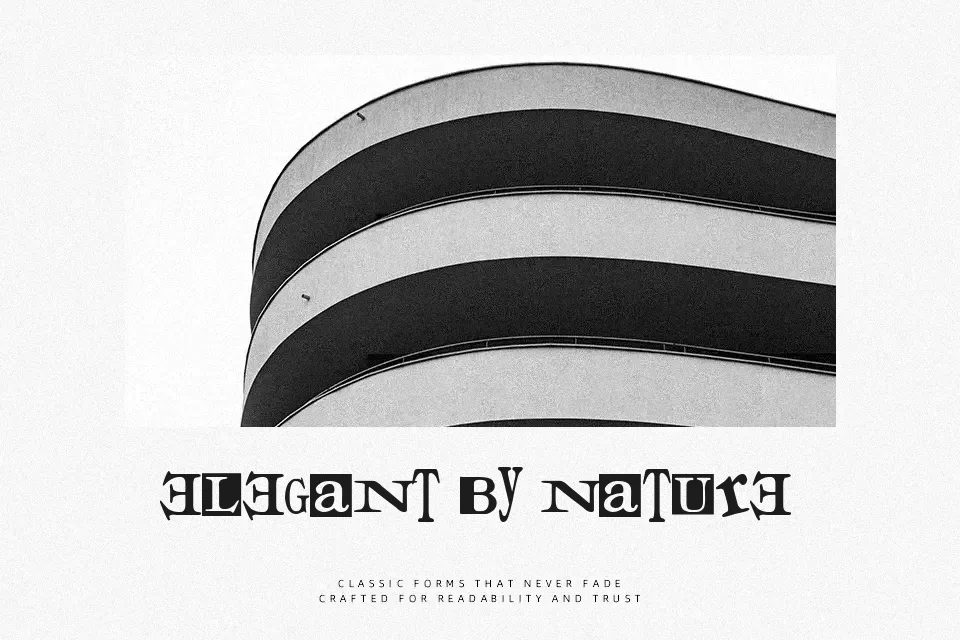
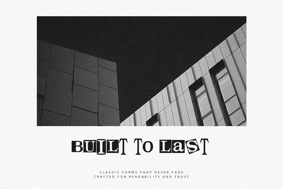
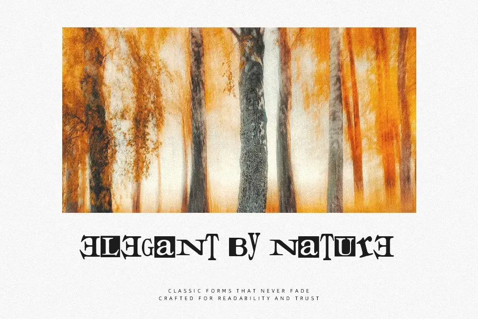
Times for Punks Font combines traditional serif proportions with aggressive, irregular distressing along each character boundary. Heavy vertical strokes display jagged cutouts and eroded terminals, creating substantial visual friction across uppercase and lowercase sets. Spacing remains relatively tight, which helps the letterforms lock together cohesively in large headline configurations. While the underlying Roman architecture preserves basic letter identification, decorative erosion significantly impairs readability when scaled down. The typeface excels in punk band merchandise, protest banners, and edgy magazine titles where raw energy takes precedence over clinical clarity. However, dense text layouts and small captions lose definition entirely, making the design unsuitable for continuous reading.
Best For: punk rock album covers, alternative music festival posters, streetwear apparel graphics, zine cover titles
Not Ideal For: dense paragraph body text, corporate annual reports, small mobile interface labels, legal contracts
Perfect for branding, headline, and music, with a bold and decorative style.
License
Gallery