Domine Font
Free for Commercial UseAbout
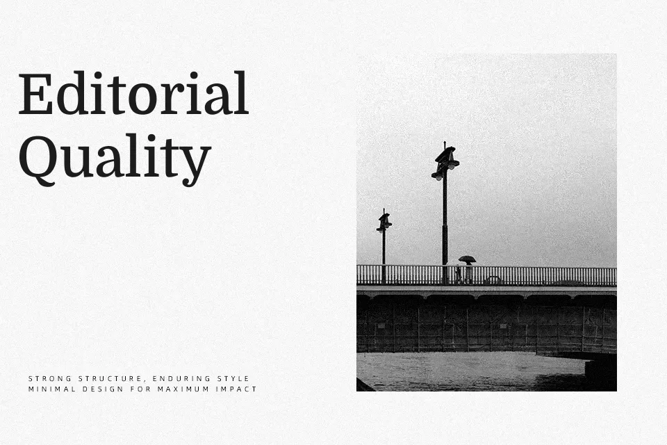
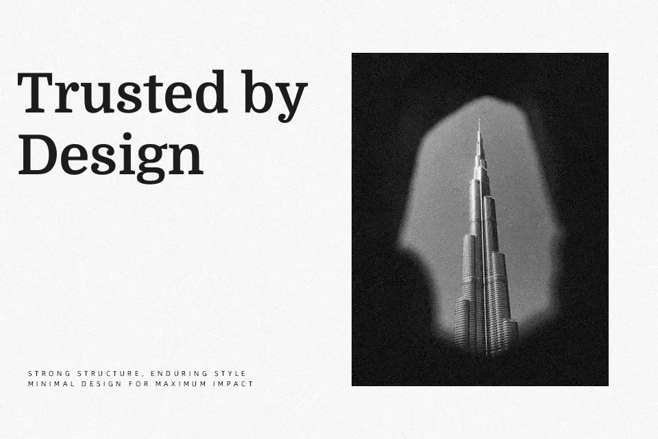
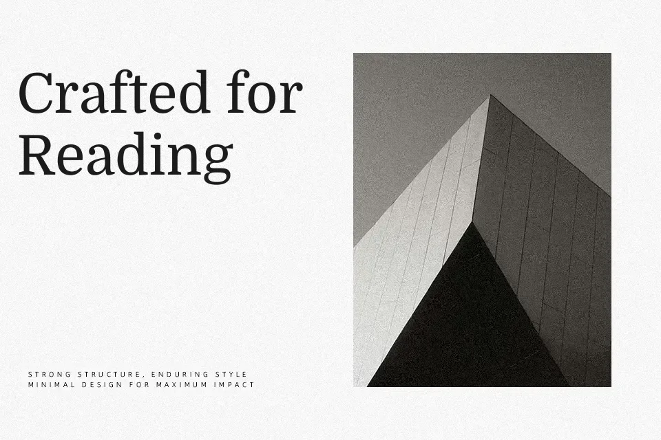
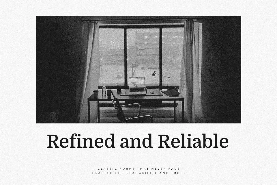
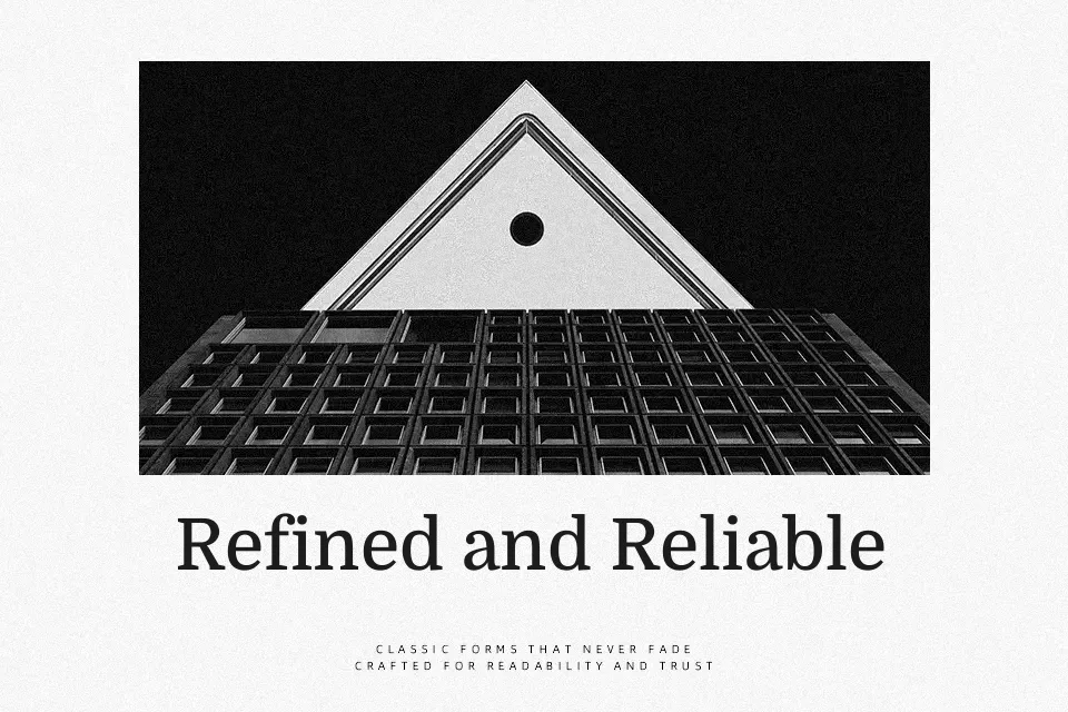
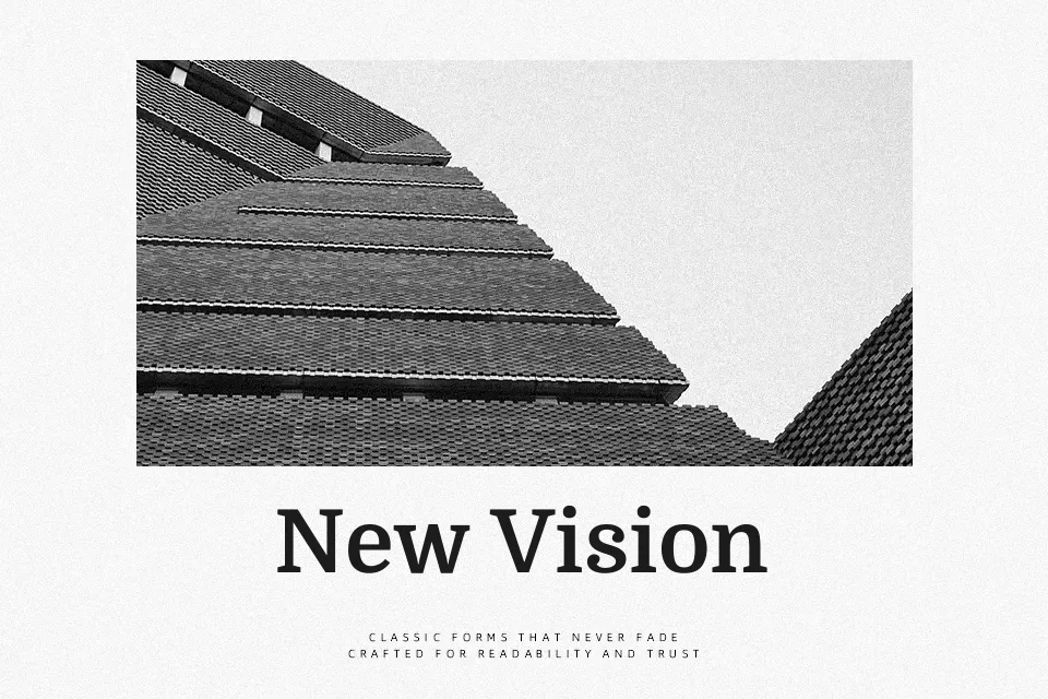
Domine is a serif text family with moderate contrast, broad counters, and compact, slightly slab-like serifs that keep strokes steady at small sizes. Its structure leans traditional, but the x-height and spacing are tuned for screens, so paragraphs sit comfortably without feeling cramped or airy. You get a solid, newsy tone that works well for articles, opinion pieces, and documentation where clarity matters more than decoration. On the other hand, it does not bring much personality for expressive branding or high-drama posters, and the lack of italics can be limiting in complex editorial hierarchies. If you like the feeling of classic newspaper serifs but want a more relaxed, digital-ready rhythm, Domine fits that role neatly.
Best For:
long-form web articles
editorial blogs and magazines
content-heavy news websites
documentation-style pages
Not Ideal For:
expressive logo wordmarks
highly decorative posters
interfaces needing extensive italics
playful kids or fashion branding
Perfect for body text, business card, and editorial, with a classic and serif style.
License
Gallery