Crackers Font
Free for personal useAbout
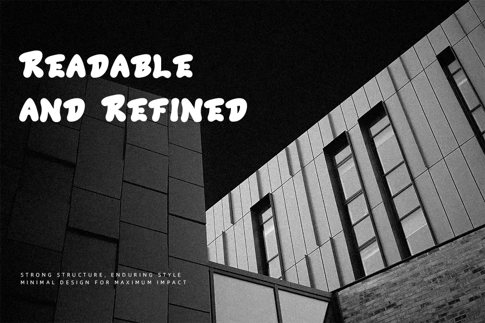
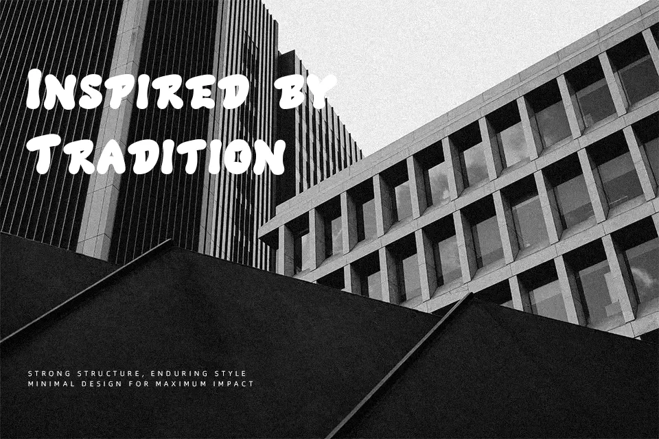
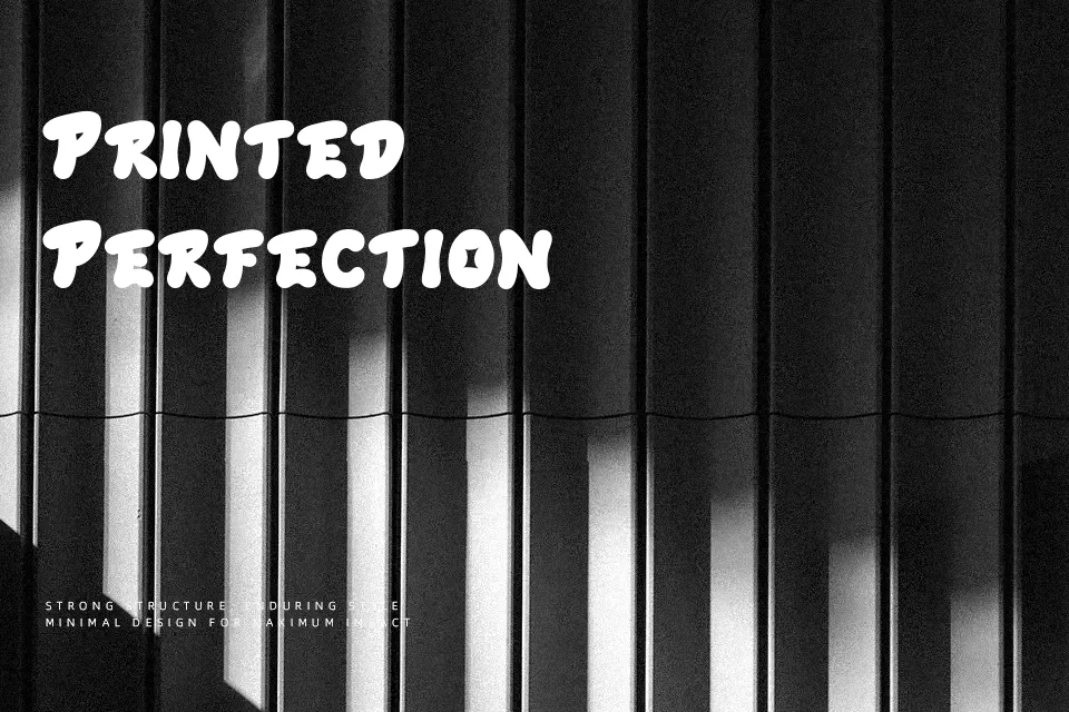
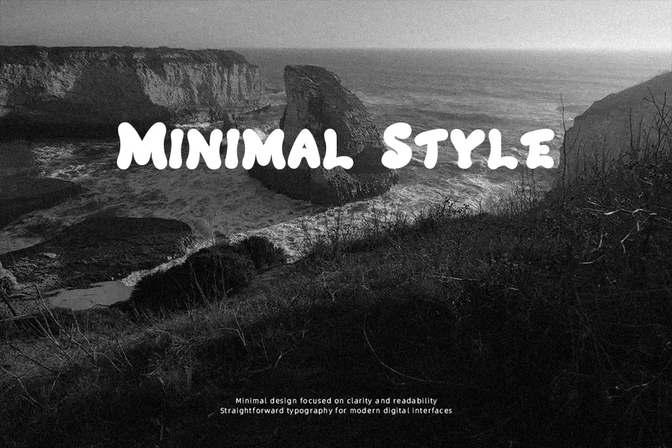
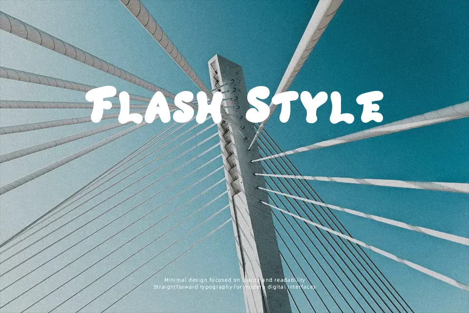
Crackers Font prioritizes visual weight through inflated cartoon shapes that immediately draw focus in headline arrangements. Strokes maintain uniform, ultra-thick widths with softly radiused terminals and tight internal negative space. Letter proportions remain wide and slightly irregular, establishing an informal visual rhythm across short titles. Spacing between individual glyphs is deliberately compact to keep words unified when rendered at prominent sizes. This design functions exceptionally well for mobile game banners, amusement park flyers, and children’s party invitations. However, the exaggerated density substantially hinders clarity in continuous paragraphs, making the letterforms unsuited for small body text.
Best For: snack packaging labels, children’s book covers, mobile game titles, cartoon stickers
Not Ideal For: dense editorial paragraphs, legal contracts, mobile user interface body text, corporate annual reports
Perfect for headline, kids, and logo, with a bold and cartoon style.
License
Gallery