Crepes French Font
Free for personal useAbout
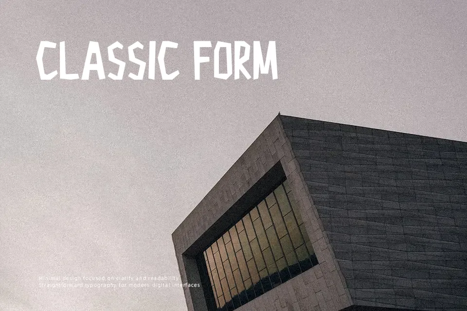
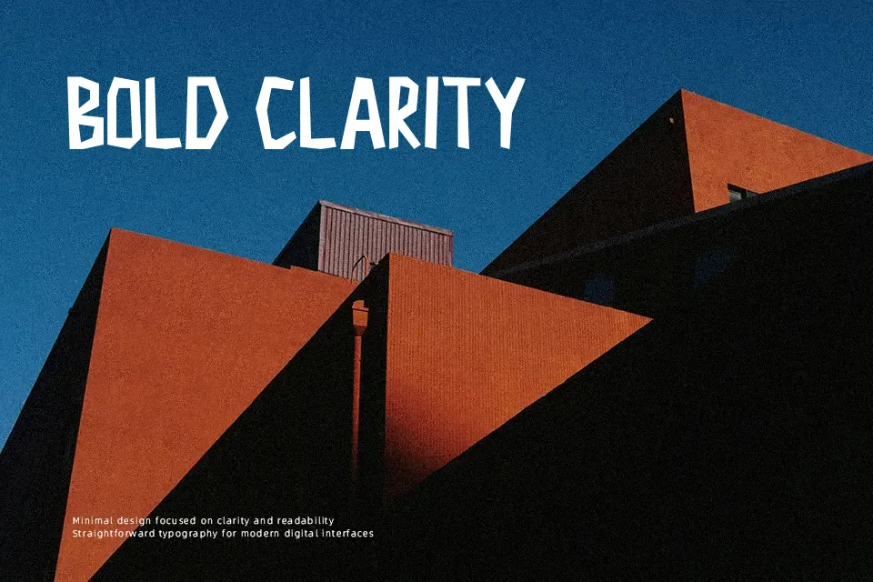
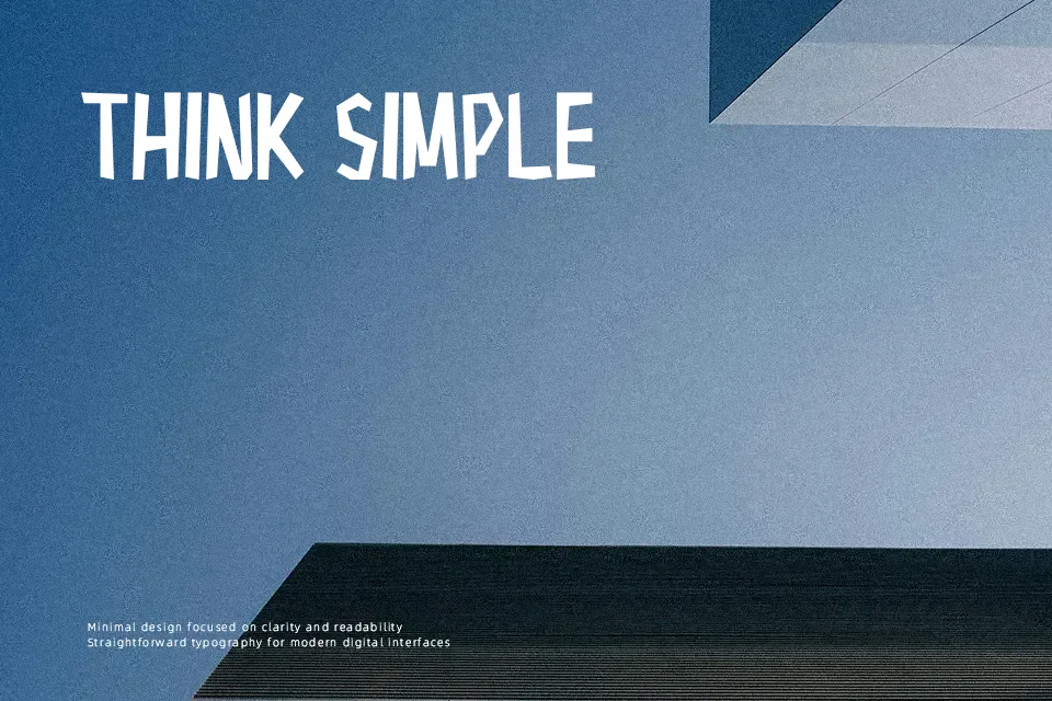
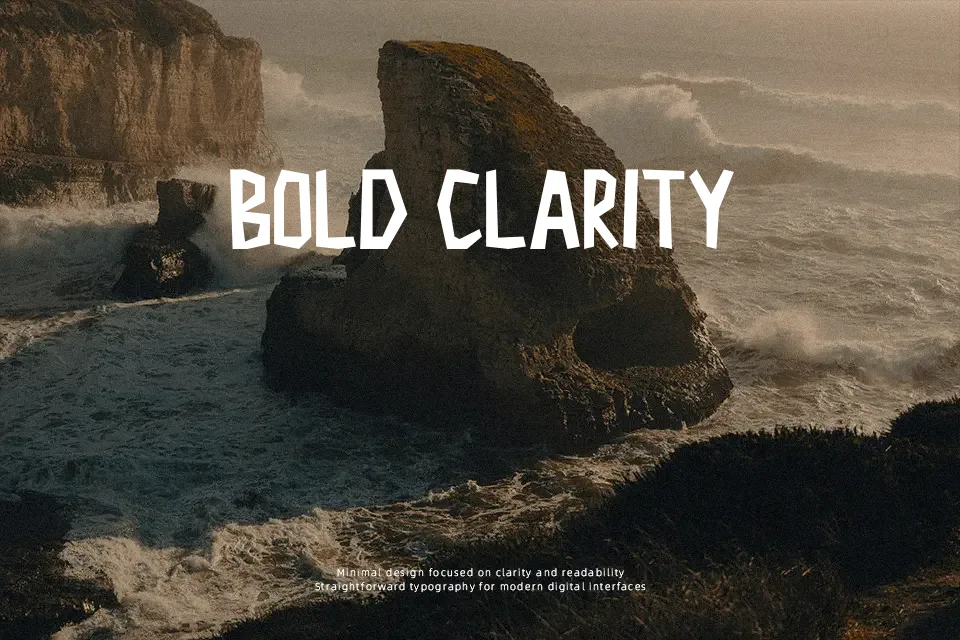
Crepes French Font performs best when showcased in prominent headline compositions where its quirky proportions and relaxed ink strokes can command visual attention. The letterforms exhibit consistent medium-weight strokes paired with generous counter spaces and gently rounded joins that evoke an approachable personality. Character spacing is relatively open, ensuring that individual glyphs remain distinct when rendered across promotional signage, playful apparel graphics, and cafe menus. However, dense paragraphs and compact text blocks reveal the primary limitation of the typeface, as the eccentric outlines create visual fatigue across continuous passages. In practical design evaluation, the font delivers exceptional personality for brief display accents but sacrifices the disciplined uniformity needed for lengthy body copy.
Best For: children’s book covers, dessert packaging labels, cartoon poster headlines
Not Ideal For: long paragraph body text, formal corporate contracts, dense technical documentation
Perfect for headline, kids, and logo, with a cute and cartoon style.
License
Gallery