Couriertxt Font
Free for personal useAbout
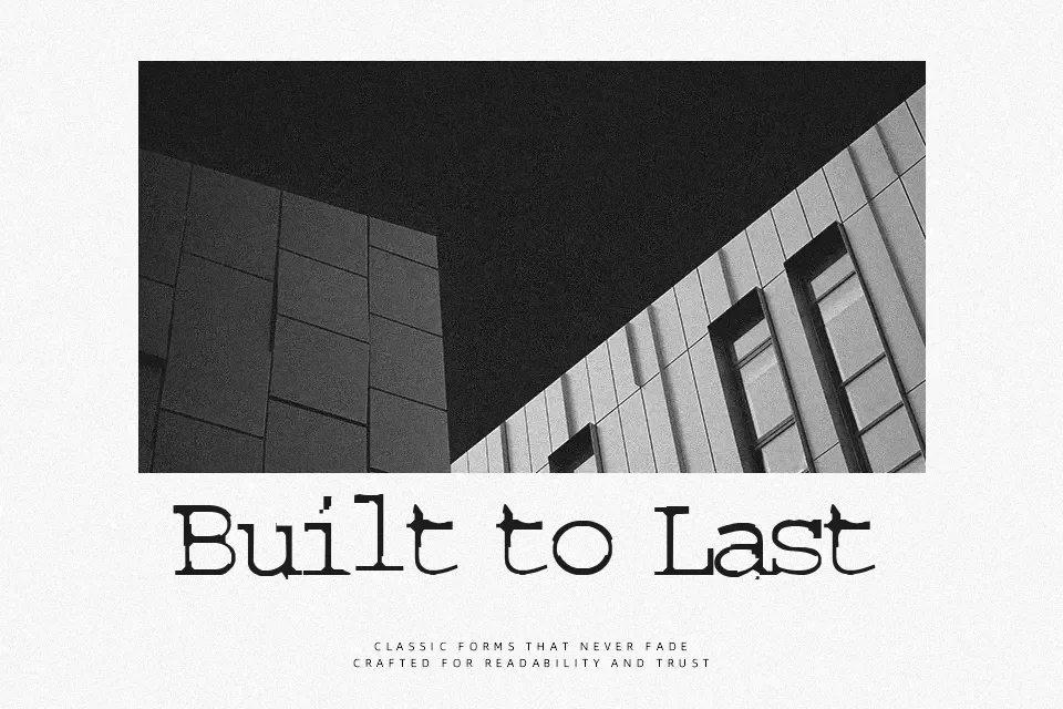
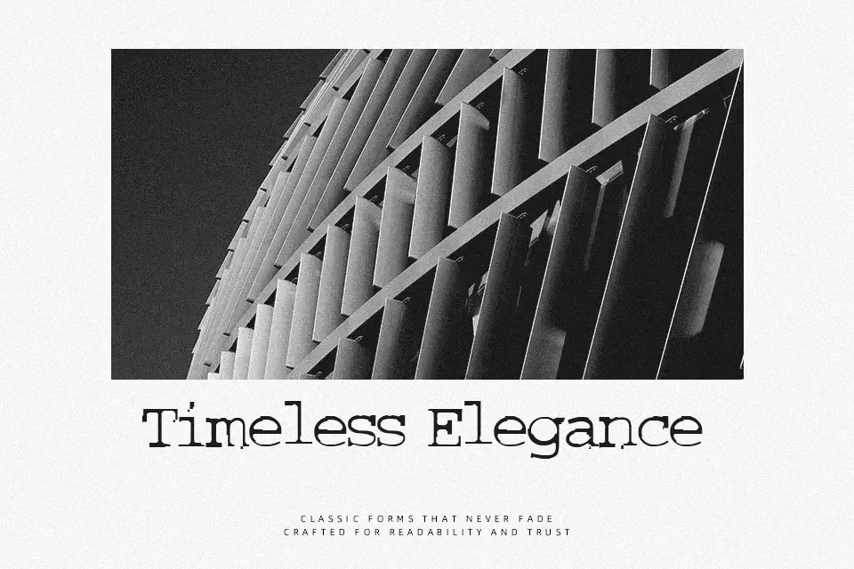
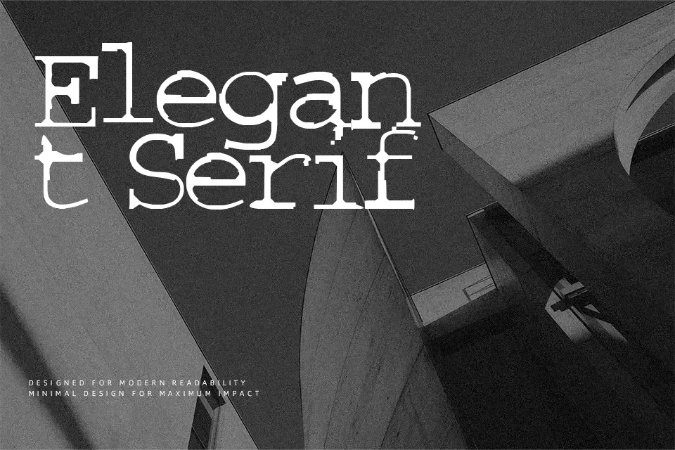
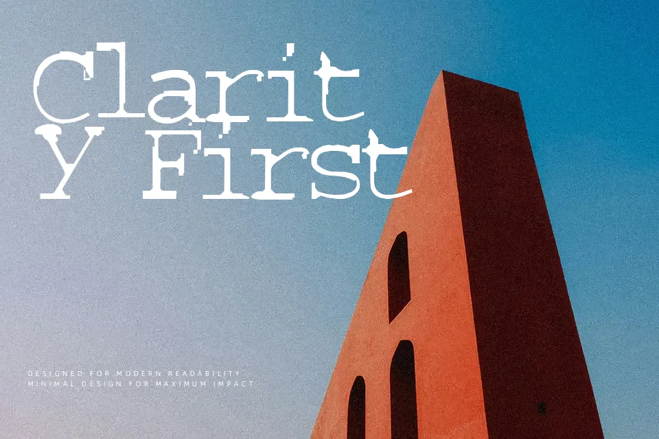
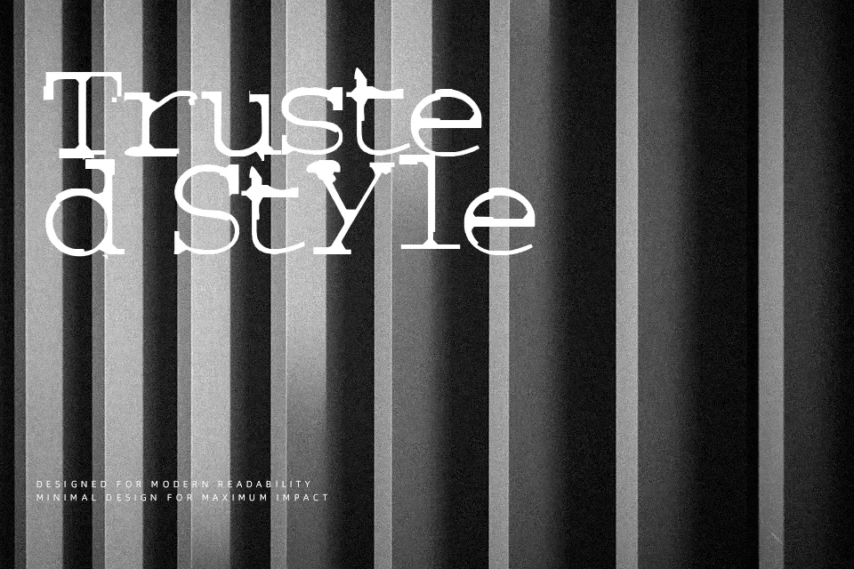
Couriertxt Font presents a gritty typewriter structure with uniform character widths, blunt slab serifs, and deliberately smudged contours that replicate imperfect ink transfers. Each glyph displays uneven stroke weights alongside softened terminals, creating an organic rhythm across steady letter spacing. The balanced proportions preserve legibility in titles, making the typeface compelling for music festival banners, period film graphics, and rustic label designs. However, the heavy distress and ink bleed reduce definition at smaller point sizes, making the letterforms less practical for continuous body text. The irregular edge details establish immediate tactile presence while demanding generous leading in crowded compositions.
Best For: vintage poster headlines, retro packaging labels, music festival banners, film title cards
Not Ideal For: continuous body text, legal contracts, dense spreadsheet layouts, small digital UI captions
Perfect for branding, headline, and packaging, with a grunge and decorative style.
License
Gallery