Crackvetica Font
Free for personal useAbout
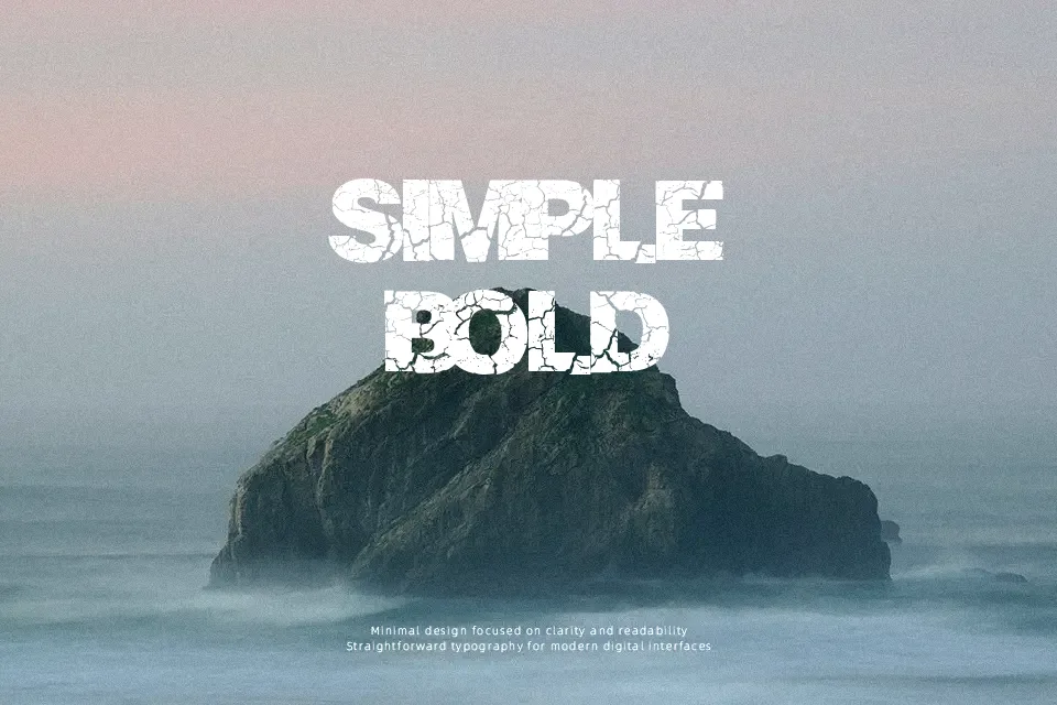
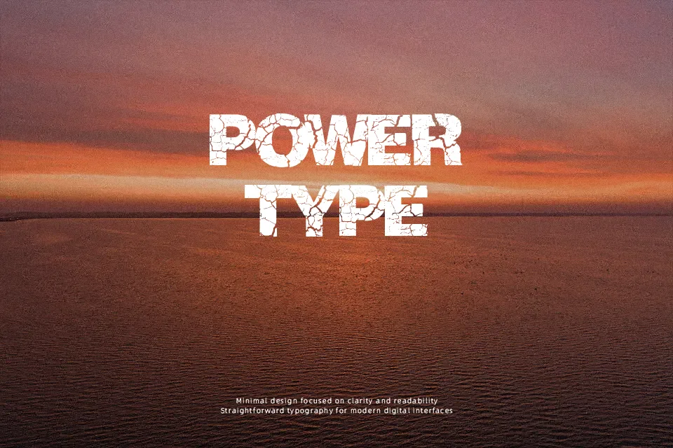
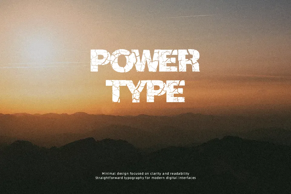
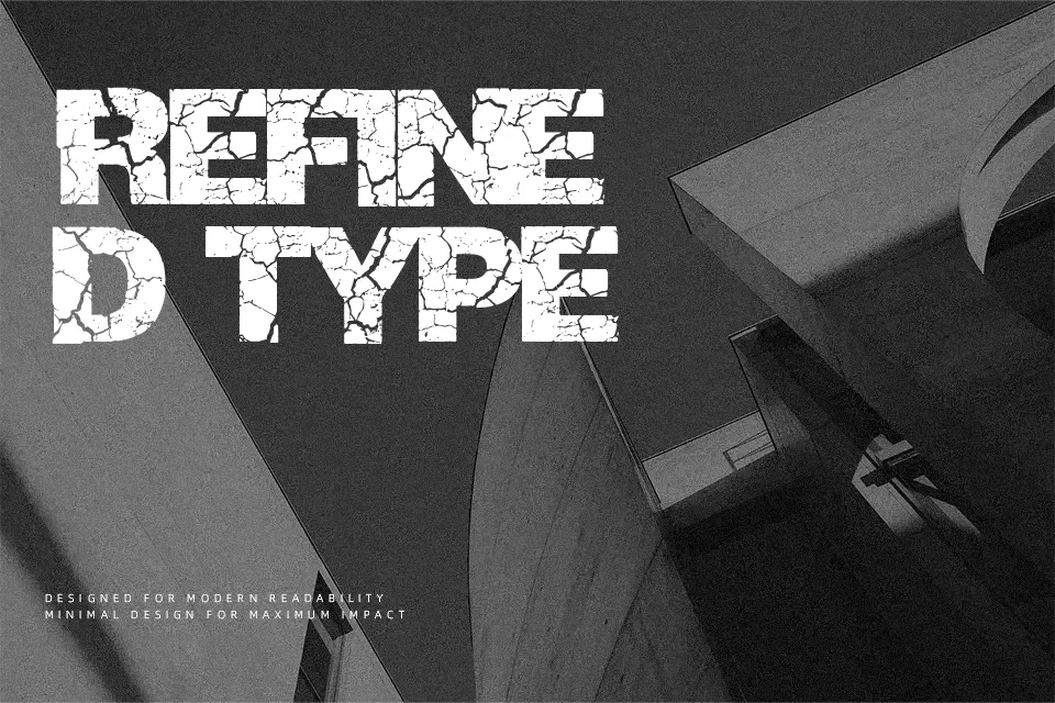
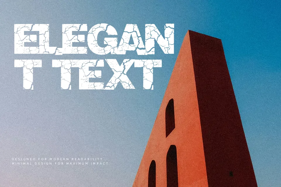
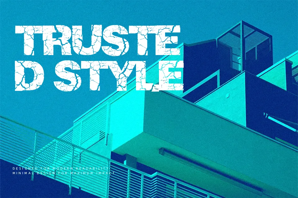
Originating from a sturdy grotesque structure, Crackvetica Font fragments traditional geometric proportions through sharp fissures cutting across every character. Uniform stroke thickness and balanced vertical metrics anchor each glyph, though uneven surface decay yields tight spacing and a restless cadence between adjacent forms. In oversized editorial headlines and vinyl record sleeves, these fractured contours impart immediate grit without sacrificing letter distinction. However, heavy surface erosion severely diminishes small-scale legibility, making the typeface poorly suited for dense paragraphs or technical documentation. The weathered styling remains visually potent in short display bursts where decorative degradation amplifies the core message.
Best For: horror film titles, skate apparel graphics, underground music posters, distressed product packaging
Not Ideal For: dense paragraph text, mobile app user interfaces, corporate legal agreements, technical spreadsheets
Perfect for film, headline, and music, with a bold and decorative style.
License
Gallery