Courier Prime Font
Free for Commercial UseAbout
Courier Prime takes the familiar typewriter skeleton of Courier and tightens it up: strokes feel more deliberate, serifs are sharper, and the counters open up just enough to keep dense dialogue pages breathable. Bold runs noticeably darker, which helps callouts or character names pop without breaking the grid, while the italics lean subtly cursive for a more conversational tone in notes and parentheticals. On screen, those refinements add up to steadier rhythm and less visual noise when you are reading page after page of scripts or code. If you want a flamboyant display face for branding or a super-tight geometric look for tech UI, this family will feel too restrained and mechanical. Compared with default Courier, it reads a bit more professional and less clunky without losing the strict monospaced structure many workflows rely on.
Best For:
screenplay pages
scriptwriting tools UI
typewriter-style coding themes
printed drafts and annotations
Not Ideal For:
high-impact logo wordmarks
fashion or lifestyle branding
dense body copy in books
minimalist tech interfaces
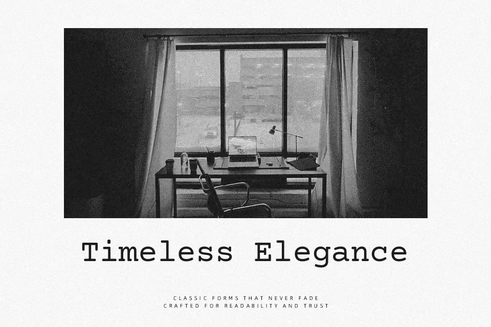
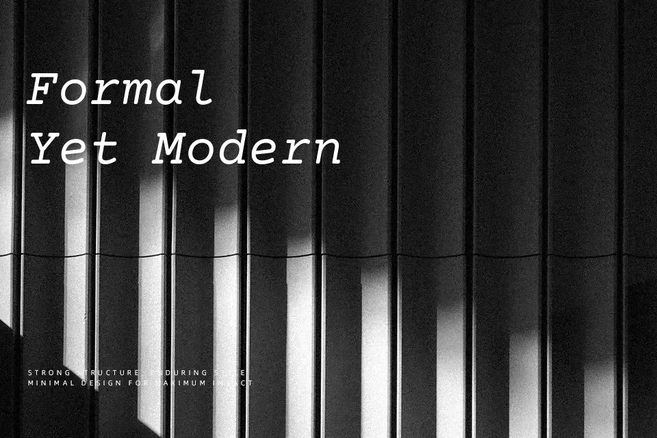
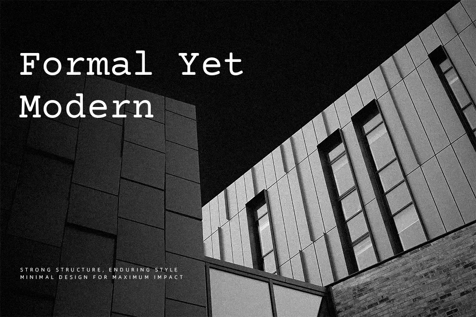
Perfect for body text, editorial, and headline, with a classic and monospace style.
License
Gallery