Coopers Town Font
Free for Commercial UseAbout
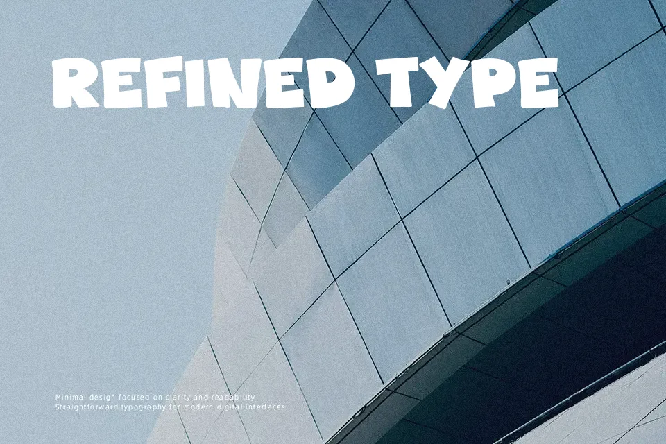
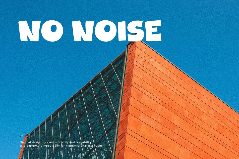
Coopers Town Font presents an exuberant display structure defined by exaggerated stroke weight, circular counters, and soft curved terminals. The typeface exhibits minimal stroke contrast, pairing plump character widths with compact spacing that establishes a rhythmic, bouncy baseline. Upper and lowercase forms maintain balanced vertical proportions, keeping individual characters identifiable when set as bold logos, snack food packaging, or festival event flyers. However, the sheer volume of the solid shapes makes the design unsuitable for extended body text or dense information graphics, where closed apertures compromise decipherability. The substantial mass ensures exceptional visual impact in headline settings, but tightly packed compositions require deliberate tracking adjustments to avoid visual clutter.
Best For: snack food packaging, animated video titles, children book covers, event poster headers
Not Ideal For: continuous body text, corporate annual reports, mobile UI microcopy, legal documentation
Perfect for headline, kids, and logo, with a bold and cartoon style.
License
Gallery