Bitter Font
Free for Commercial UseAbout
Bitter is a contemporary slab serif with low contrast strokes, square yet softened serifs, and a regular weight that runs heavier than most, creating a dense, even text color on screen. The tall x-height and generous letterforms stay readable in responsive layouts, especially for Latin copy, while the underlying pixel-grid thinking keeps curves crisp on modern displays. It works nicely when you want body text that feels sturdy and human rather than clinical, for example content-heavy blogs, documentation sites, or reading-focused apps. At very small sizes or in ultra-light, airy layouts, that same weight can look a bit dense, so it’s better to pair it with more open type for microcopy or fine-print UI elements.
Best For:
reading-focused websites
editorial-style blog layouts
interface body text
documentation pages
Not Ideal For:
very small caption sizes
highly decorative branding
ultra-formal print typography
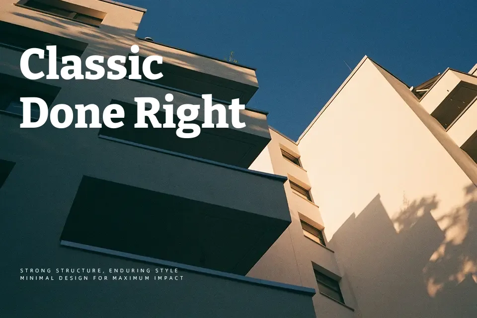
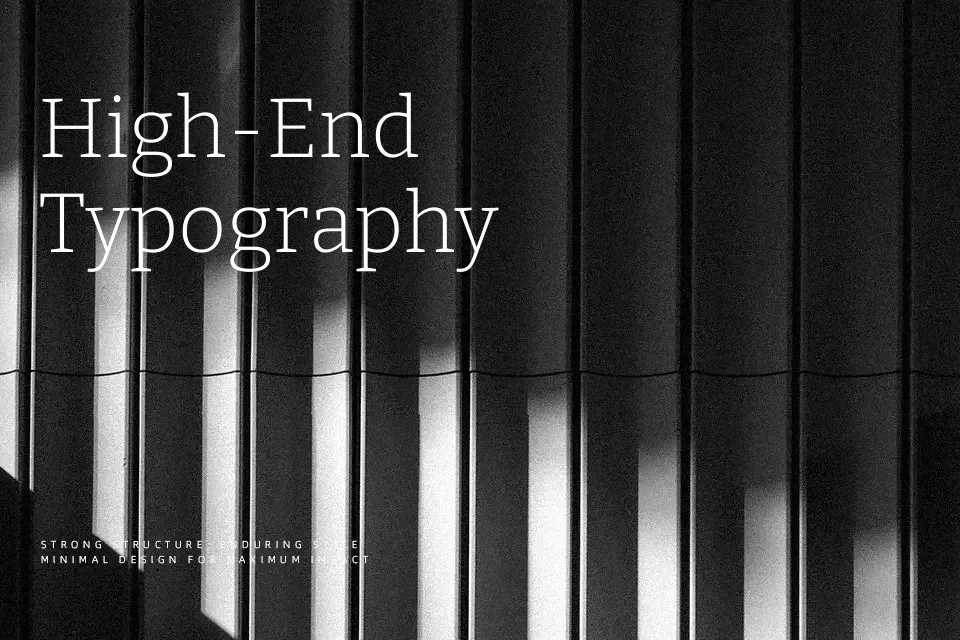
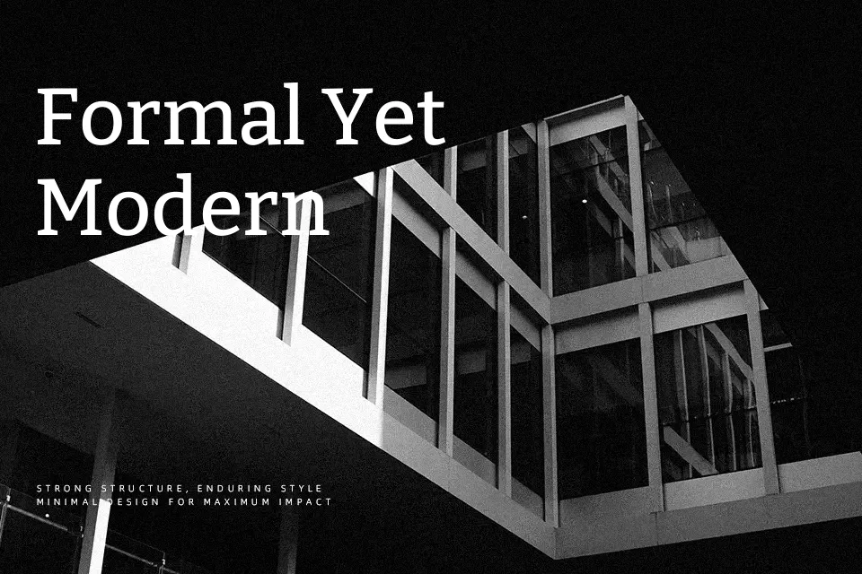
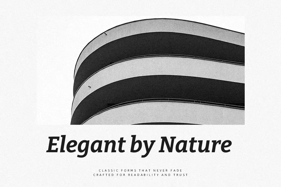
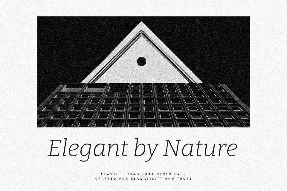
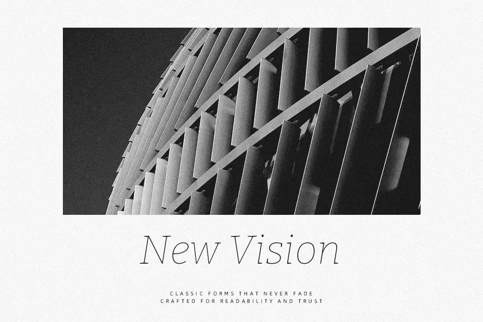
Perfect for body text, editorial, and headline, with a classic and slab serif style.
License
Gallery