Crispy Samosa Font
Free for personal useAbout
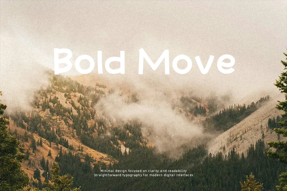
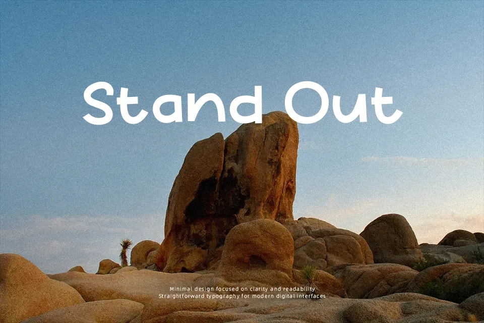
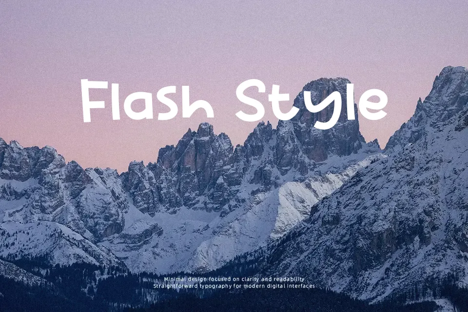
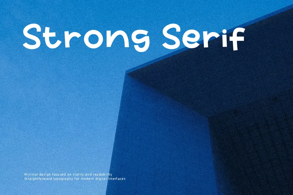
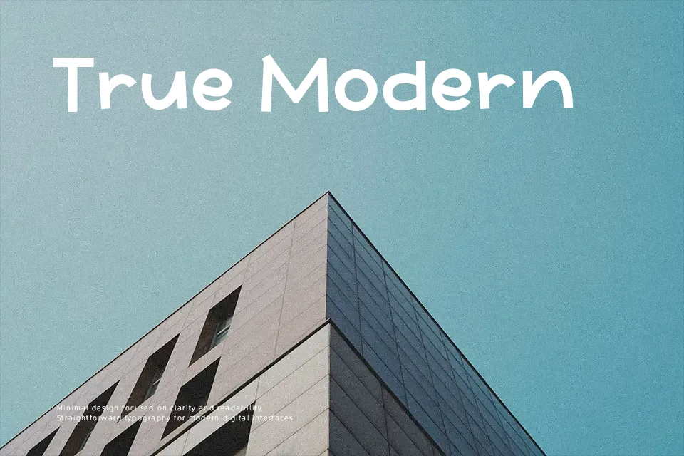
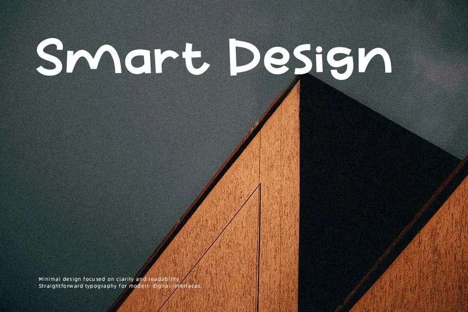
Crispy Samosa Font is built on heavy, pillowy strokes with soft terminals and low contrast across all glyphs. The letterforms show slightly varied character widths and an animated baseline alignment, giving text a lighthearted, casual rhythm. Spacing remains relatively compact to preserve cohesive word shapes, which helps maintain clarity in larger headlines and product branding. At display sizes, the generous counters keep individual characters identifiable. However, the thick stroke weight and bulbous contours drastically reduce legibility when scaled down to small captions or body copy. The design performs most reliably on children’s merchandise, food packaging, and bold event banners.
Best For: children’s merchandise, snack food packaging, cartoon title cards, party banners
Not Ideal For: continuous body text, corporate documents, small interface labels, dense spreadsheets
Perfect for headline, kids, and logo, with a bold and cartoon style.
License
Gallery