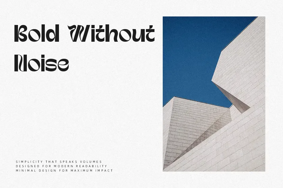
Uertas Font
Free for personal useAbout
Uertas Font delivers substantial graphic presence across title treatments, relying on pronounced stroke thickness and experimental curvature to command viewer focus. The letterforms showcase solid visual weight with asymmetrical swelling along the stems, paired with stylized inner counters that produce a fluid, rhythmic cadence. Character spacing is relatively tight to preserve cohesive word grouping, while the expanded proportions give capital forms a prominent stance. In practical evaluation, the exaggerated contours retain strong legibility when isolated in concise billboard headings, record sleeves, or merchandise graphics. Conversely, the dense anatomy impairs reading comfort in extended body paragraphs, making the typeface unsuitable for small interface labels or dense editorial text.
Best For: music festival posters, craft beverage packaging, streetwear apparel graphics
Not Ideal For: long paragraph text, mobile user interface labels, dense editorial layouts
Perfect for headline, logo, and music, with a bold and decorative style.
License
Gallery