Tippa Font
Free for Commercial UseAbout
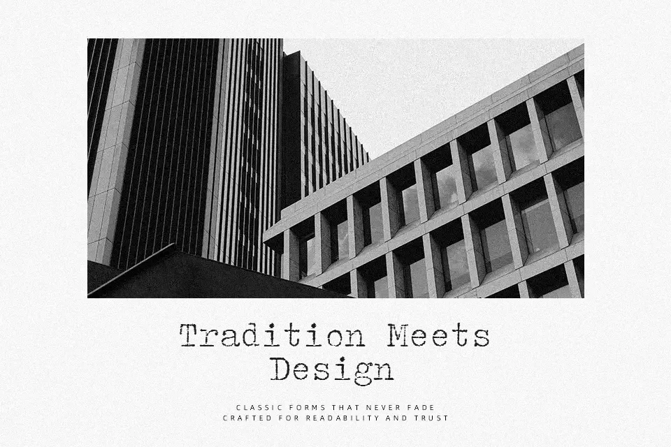
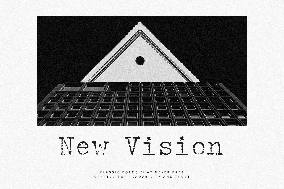
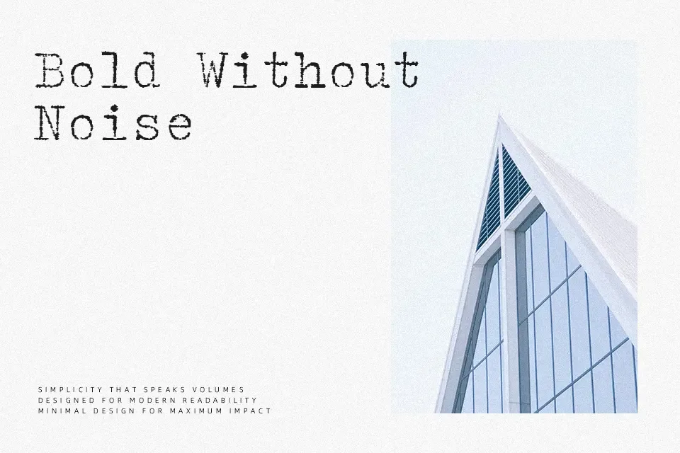
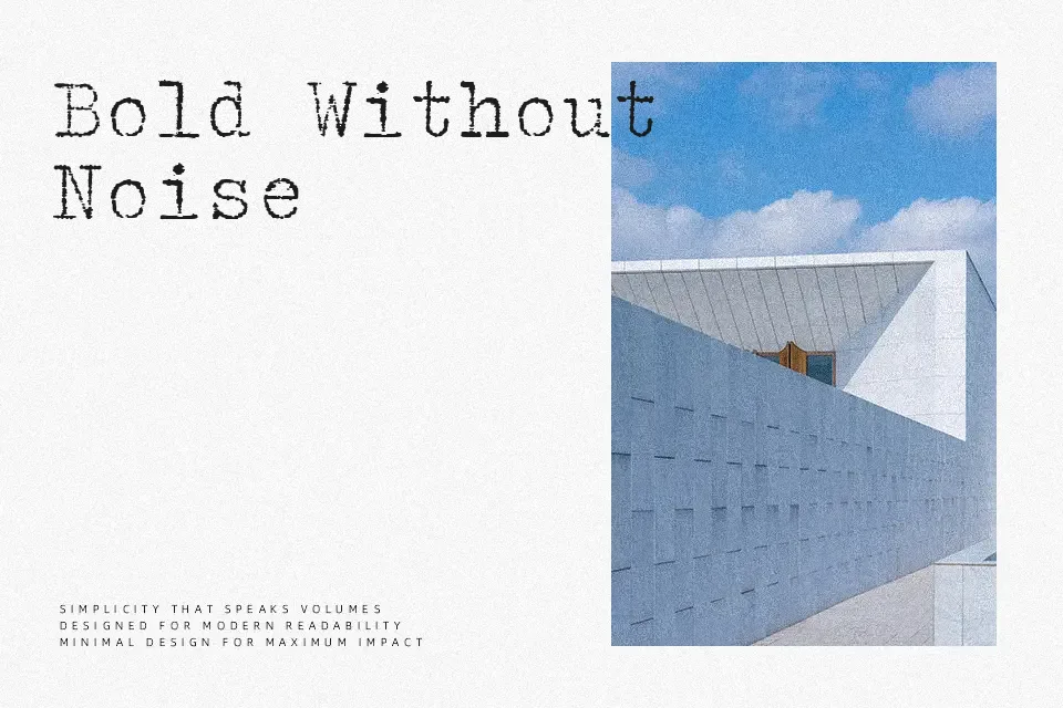
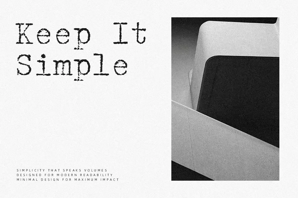
Tippa Font exhibits an unmistakable mechanical structure characterized by flat slab terminals, uniform widths, and consistent stroke weight. Every letterform occupies an identical horizontal footprint, yielding the predictable spacing and rigid visual rhythm typical of vintage manual typing machines. Proportions remain wide across narrow glyphs like the lowercase l and i, which enhances legibility at intermediate sizes. This typeface functions exceptionally well on museum exhibition signage, theatrical poster titles, and thematic product packaging. However, the unyielding horizontal cadence creates visual friction during extended paragraph reading, making dense editorial blocks difficult to scan comfortably. The disciplined spacing maintains remarkable structural clarity across large-format display compositions.
Best For:
– Vintage product packaging
– Museum exhibition signage
– Theatrical poster titles
Not Ideal For:
– Extended multi-page book chapters
– Dense spreadsheet data tables
– Small mobile interface labels
Perfect for editorial, headline, and packaging, with a classic and monospace style.
License
Gallery