Thill Caten Font
Free for personal useAbout
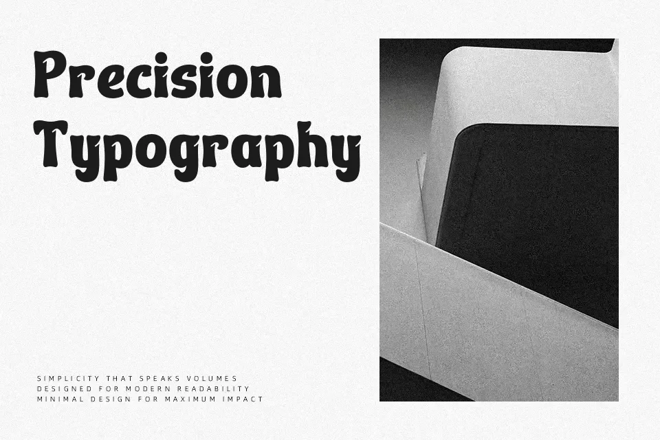
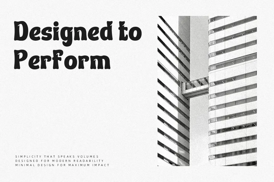
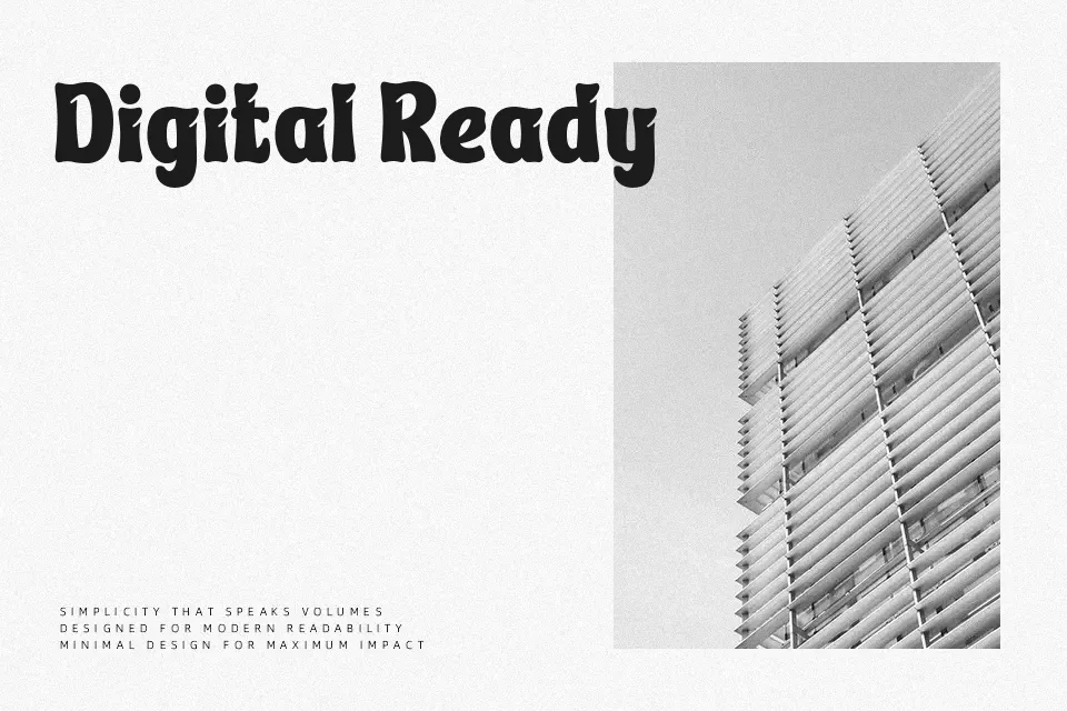
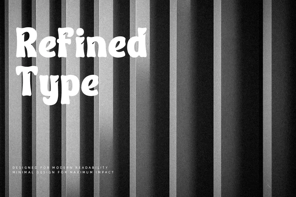
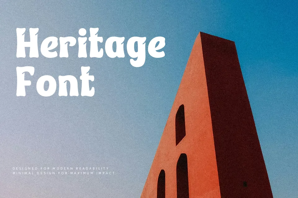
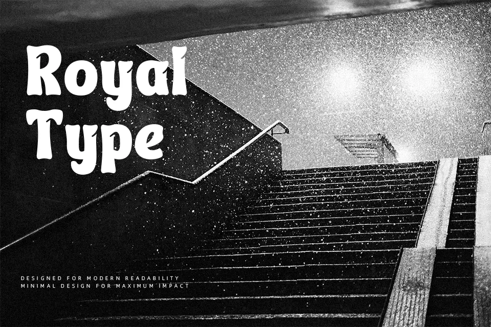
Thill Caten Font achieves its greatest compositional strength at prominent display sizes where its distinctive structural balance commands immediate visual interest. The letterforms combine moderate stroke contrast with sharply resolved terminal cuts, establishing a crisp rhythmic cadence. Proportionally balanced glyph widths and deliberate character spacing preserve clear legibility across title sequences, festival banners, and promotional merchandise. The spacing helps maintain clarity in larger headlines without crowding adjacent glyphs. However, the assertive geometry and sculpted features lose definition at smaller scales. Consequently, the design is less suitable for continuous body text, technical documentation, or dense editorial layouts.
Best For: music festival posters, album cover art, event titles, streetwear branding
Not Ideal For: long paragraph text, mobile app body copy, technical manuals, spreadsheet data
Perfect for headline, logo, and music, with a artistic and decorative style.
License
Gallery