Romace Blades Font
Free for personal useAbout
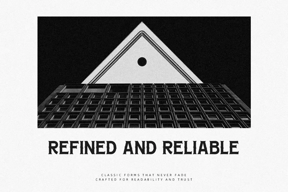
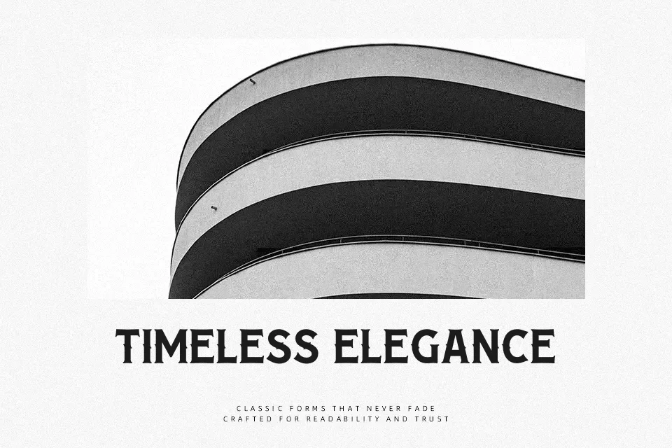
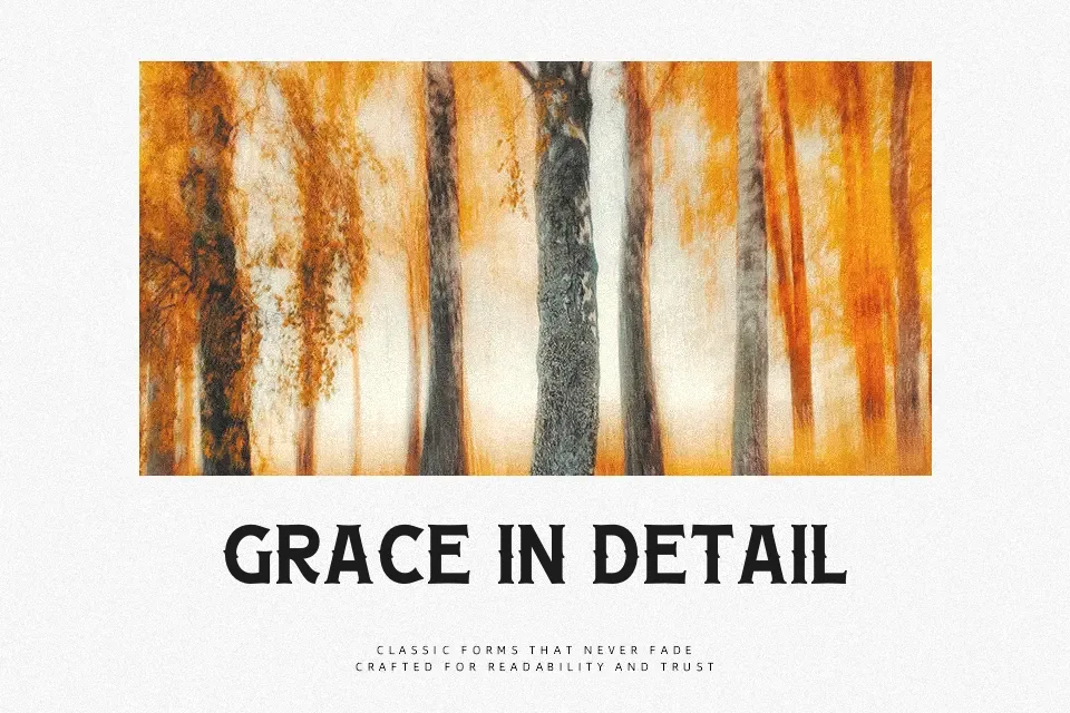
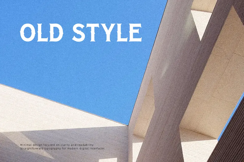
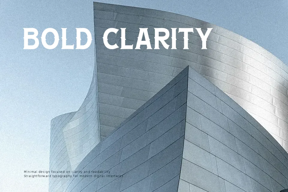
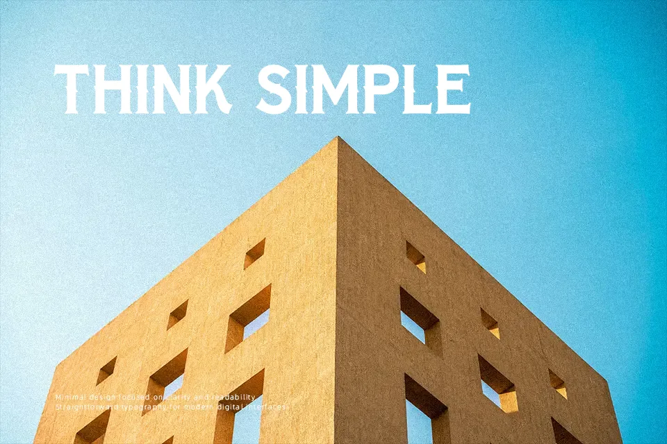
The structural foundation of Romace Blades Font relies on a high-contrast serif design, combining thick vertical strokes with delicate, sweeping curves. This bold interplay creates a strong visual rhythm with striking proportions that instantly draw attention in display settings. The letterforms maintain balanced spacing, allowing the elegant flourishes to breathe without overcrowding the baseline. Because of these distinct decorative terminals, the typeface performs best when displayed at larger sizes, such as in bold headlines or premium labels. However, its heavy contrast and vintage stylization reduce comfort during extended reading, making it less suitable for dense editorial layouts.
Best For: premium cosmetic packaging, vintage restaurant menus, boutique brand logos
Not Ideal For: long paragraph text, small interface labels, dense editorial layouts
Perfect for branding, headline, and logo, with a classic and decorative style.
License
Gallery