Prima Font
Free for personal useAbout
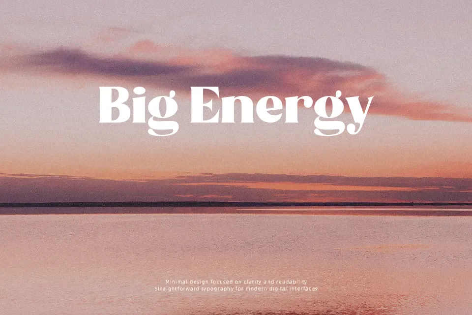
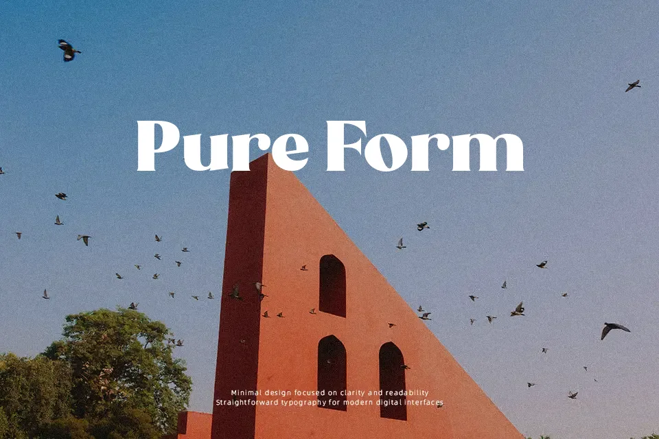
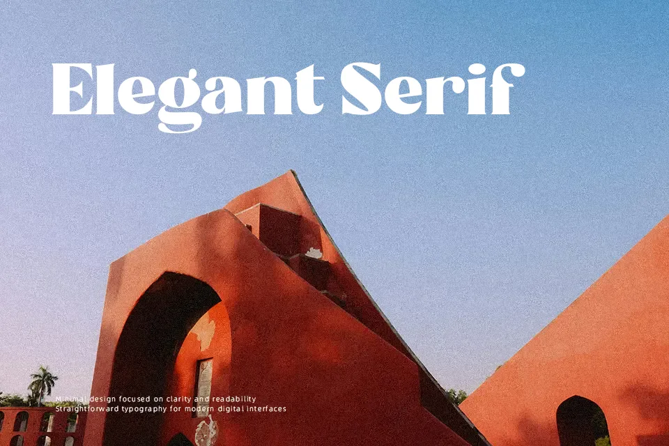
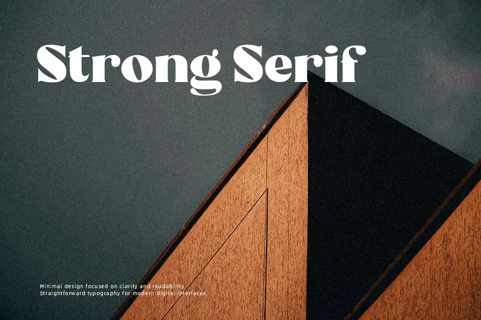
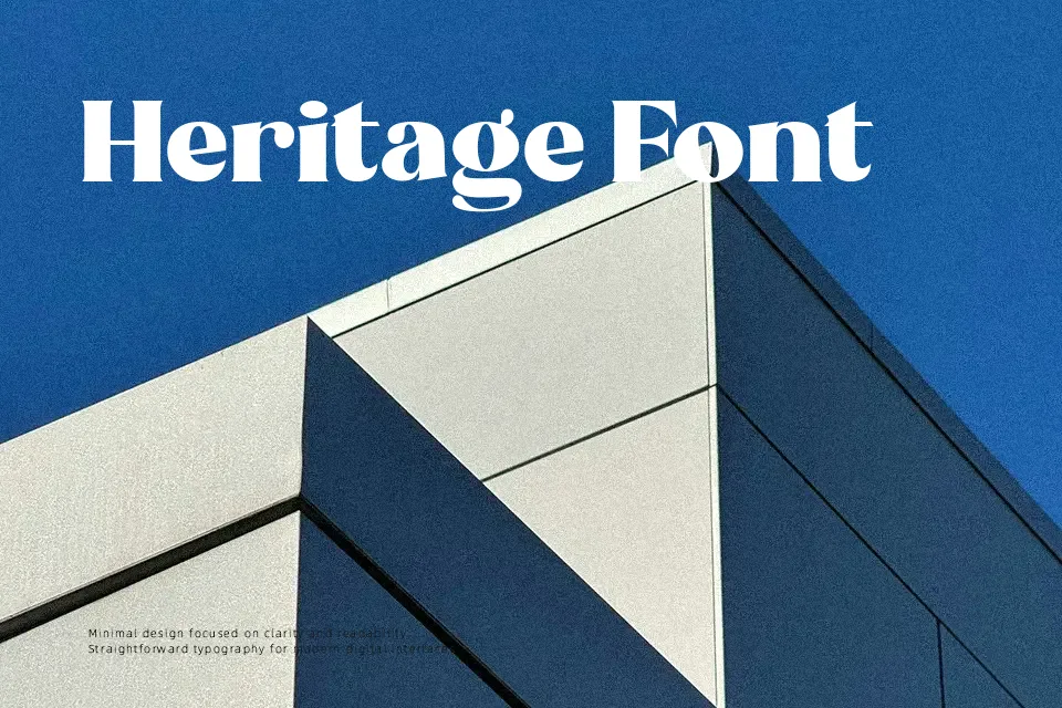
A short product label or poster headline benefits greatly from the vintage energy of Prima Font. The letterforms feature thick, smooth strokes with pronounced curves, creating a seamless visual rhythm across words. Its tightly spaced structure gives headlines a cohesive and striking presence. The spacing helps maintain clarity in larger headlines, allowing the bold letterforms to stand out effortlessly. However, because of the heavy stroke weight and compact spacing, the design is less suitable for long paragraphs or small text sizes, where the dense forms reduce continuous reading comfort.
Best For:
vintage product packaging, vibrant event posters, coffee shop branding, retro apparel graphics
Not Ideal For:
long paragraph text, small interface labels, dense editorial layouts
Perfect for headline, logo, and packaging, with a bold and decorative style.
License
Gallery