Podkova Font
Free for Commercial UseAbout
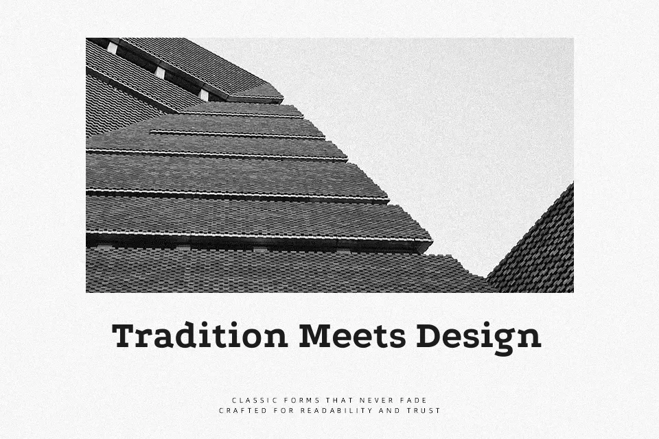
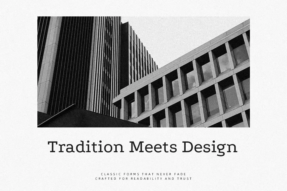
Podkova is a monoline slab serif built around wide proportions, firm verticals, and diagonal terminals that give the strokes a subtle sense of movement. The spacing is generous enough for small captions and dense body copy, yet the chunky slabs and slightly unconventional letterforms keep it visually present in headings. It reads as serious and functional rather than flashy, which suits long-form articles, dashboards, and product UIs that need stability over flourish. When you push it into very delicate, minimalist branding or combine it with ultra-thin sans serifs, the heavy slabs can feel a bit blunt, so it works best where you welcome some weight and structure in the typography.
Best For:
editorial headings and subheads
interface labels and dashboards that need sturdy clarity
branding for practical or utilitarian products
long-form reading where a slab serif feel is desired
Not Ideal For:
high-end luxury branding that calls for very delicate contrast
wedding or romantic stationery with a soft, handwritten tone
minimalist layouts built around ultra-light typography
kids or playful designs that rely on rounded, bubbly shapes
Perfect for body text, editorial, and headline, with a classic and slab serif style.
License
Gallery