Zen Antique Soft Font
Free for Commercial UseAbout
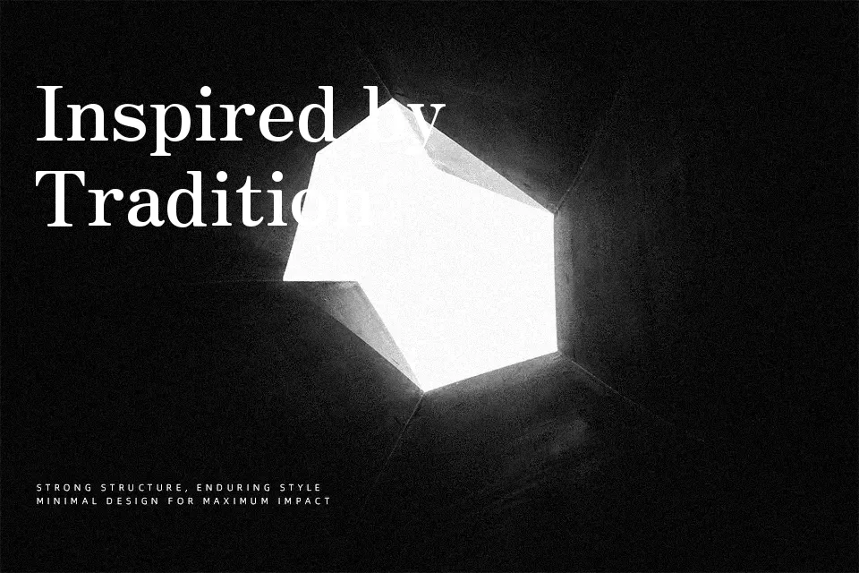
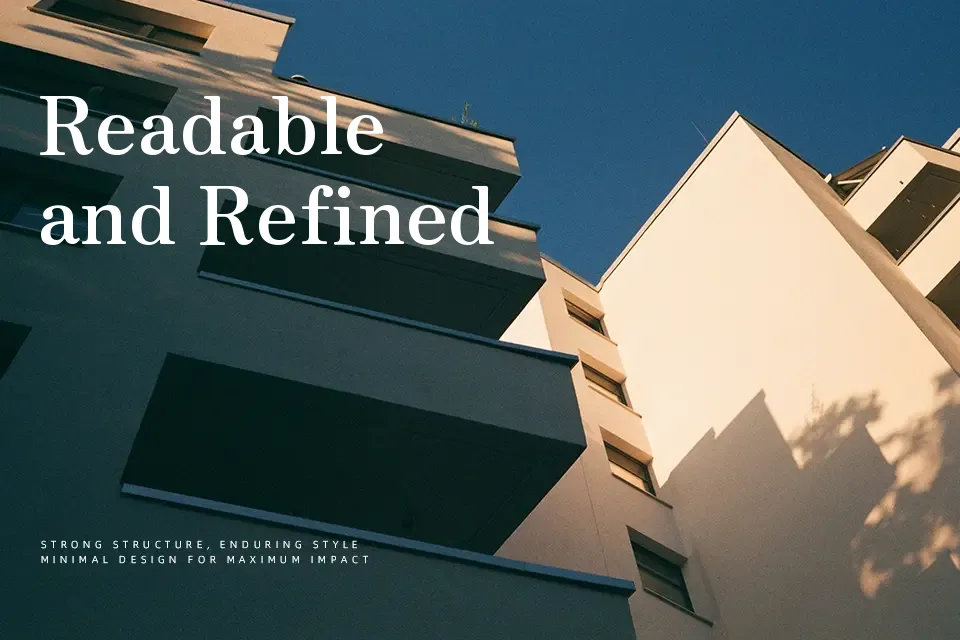
Zen Antique Soft blends classic Japanese antique letterforms with gentle rounding on the corners, so strokes feel structured but never harsh. Stroke weight shifts between characters create a quiet rhythm, with slightly lighter Latin and hiragana and heavier kanji and katakana, which gives mixed-language layouts a distinctive texture. On screen and in print, it reads as calm, traditional, and a bit nostalgic rather than flashy, making it a smart choice for headings, signage, restaurant menus, book covers, or cultural projects that want history without looking stiff. It can feel too ornamental for dense body text or ultra-minimal tech branding, so I’d keep it for display sizes and short passages where its character can actually be seen.
Best For:
Japanese editorial titles and section headers
Restaurant, tea house, or craft brand logos with a traditional tone
Posters or flyers for cultural events, exhibitions, and festivals
Book covers and chapter openers that mix Japanese and Latin text
Not Ideal For:
Long body text that needs neutral, highly efficient reading
Very modern, tech-forward UI or startup branding
Tiny captions or system labels where rounded details disappear
Perfect for branding, editorial, and headline, with a calm and display style.
License
Gallery