Ysabeau SC Font
Free for Commercial UseAbout
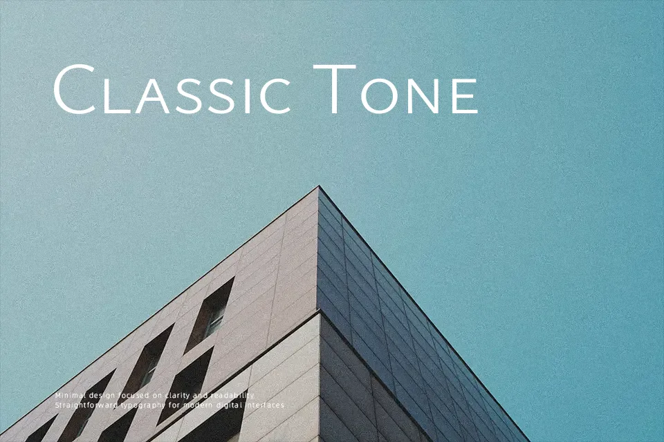
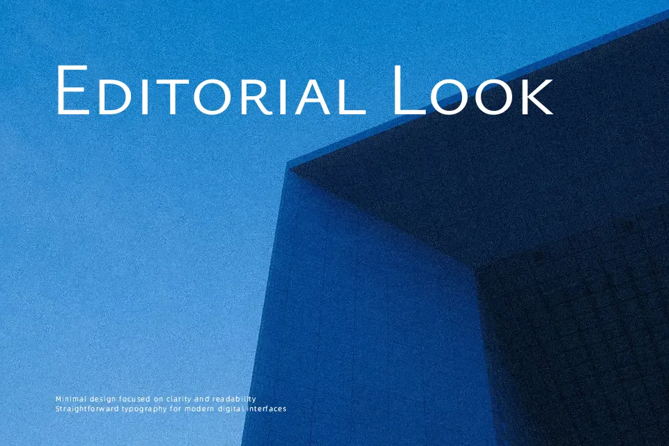
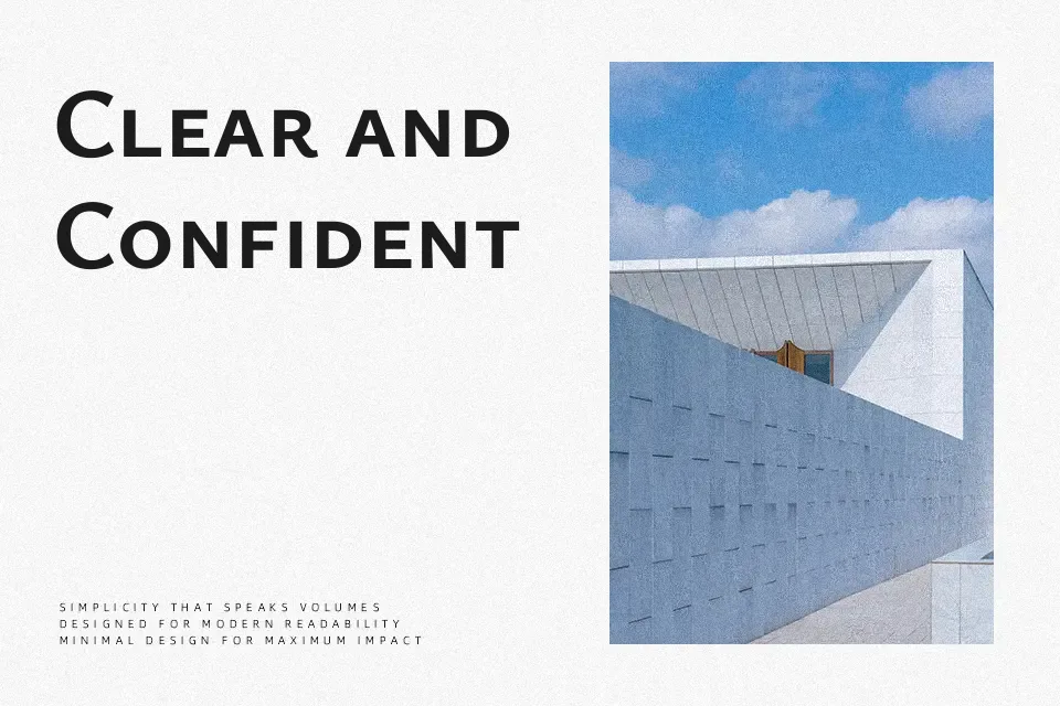
Ysabeau SC takes the readable proportions of Garamond and redraws them as a low‑contrast sans serif, then switches small caps on by default for a compact, orderly texture. Strokes stay clean and controlled, spacing feels even, and the caps sit tall without looking shouty, which helps titles and navigation elements feel composed rather than aggressive. It shines when you need hierarchy inside complex interfaces, subheads, pull quotes, or side notes that must stay legible at smaller sizes. For long paragraphs or ultra‑minimalist tech branding, the constant small‑cap rhythm can feel a bit stiff compared to more neutral grotesques, so it works best as a supporting voice next to a primary text face.
Best For:
UI labels and navigation in content‑heavy interfaces
Subheads and pull quotes in editorial layouts
Brand systems that pair serif text with a small‑caps sans accent
Not Ideal For:
Very long body text where mixed‑case rhythm is preferred
Ultra‑minimal tech branding needing a more anonymous grotesque tone
Highly expressive display work that relies on dramatic contrast
Perfect for body text, editorial, and headline, with a classic and sans serif style.
License
Gallery