Towards Font
Free for personal useAbout
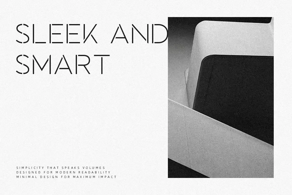
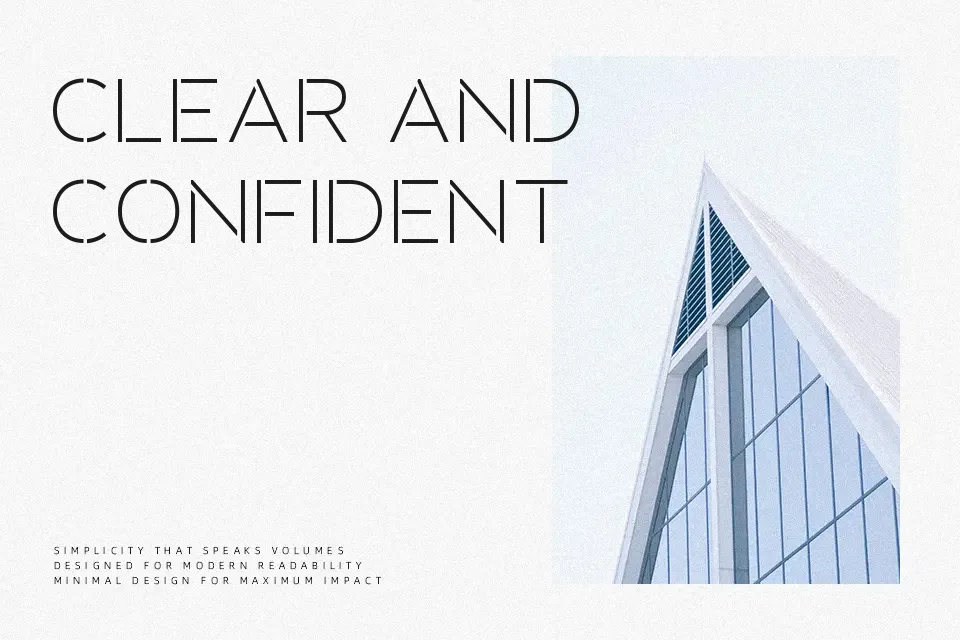
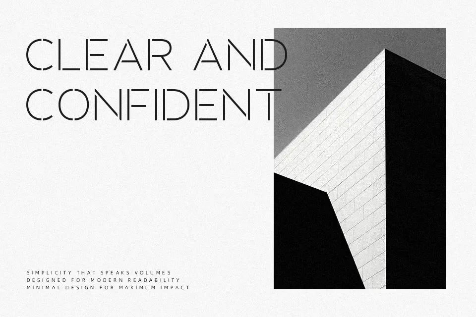
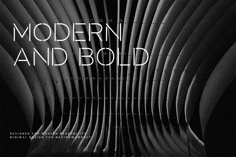
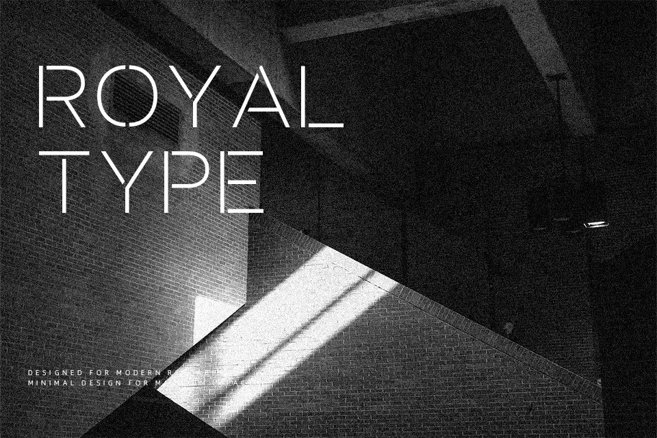
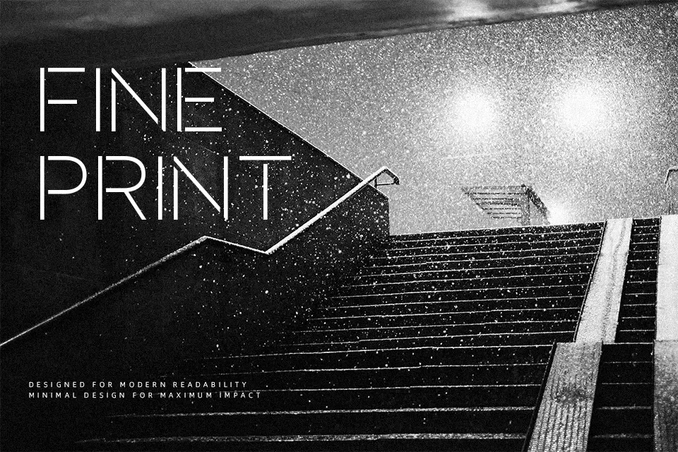
Towards Font performs best when displayed at prominent scale where its segmented letterforms can assert maximum visual authority. Built around solid uppercase proportions and heavy monolinear strokes, the design introduces deliberate physical breaks that define its utilitarian stencil aesthetic. Character spacing remains relatively tight yet disciplined, preserving crisp silhouette recognition across short headline runs and bold branding accents. However, these recurring geometric fractures significantly diminish reading comfort within continuous paragraphs or small-scale interface labels. When deployed across athletic merchandise, tech packaging, or architectural signage, the typeface provides an uncompromisingly direct tone that reinforces structured, industrial design themes.
Best For: industrial packaging labels, military apparel graphics, esports event posters
Not Ideal For: continuous paragraph reading, small mobile ui labels, dense editorial layouts
Perfect for headline, logo, and packaging, with a bold and display style.
License
Gallery