Ysabeau Infant Font
Free for Commercial UseAbout
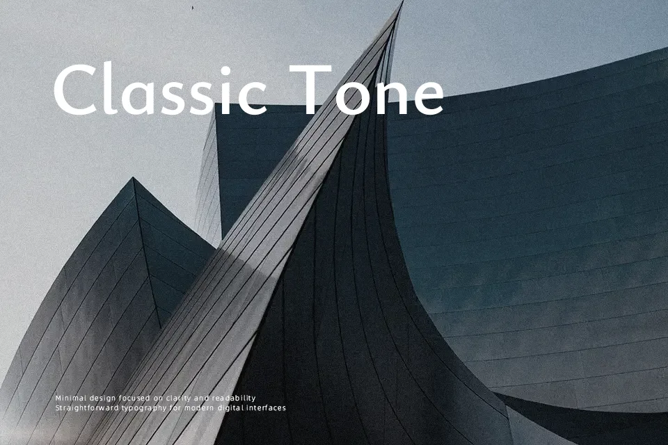
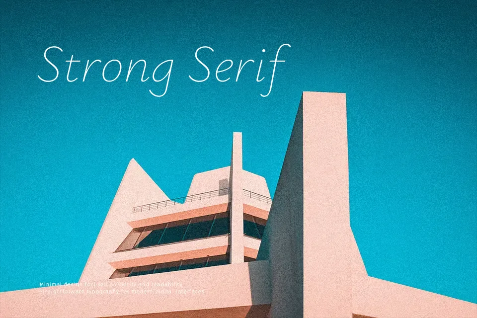
Ysabeau Infant takes the Garamond-inspired structure of the Ysabeau family and reshapes it into single‑storey a and g, a tailed l, and a more script‑like y that feel approachable for early readers. Strokes are low‑contrast and calm, with moderate width and open counters that stay legible in dense paragraphs or small UI labels. It reads as modern but not cold, so it suits textbooks, learning apps, family‑oriented branding, and any project that needs a gentle tone without slipping into caricature. It is less convincing for high‑drama luxury or ultra‑technical interfaces where sharper, more angular sans serifs communicate better.
Best For:
early‑reader books and worksheets
educational apps and dashboards
family‑friendly branding and packaging
long‑form body text with a gentle tone
Not Ideal For:
high‑end luxury branding
hard‑edged tech or sci‑fi interfaces
loud, aggressive sports graphics
heavily condensed headline layouts
Perfect for body text, branding, and editorial, with a calm and sans serif style.
License
Gallery