Ysabeau Font
Free for Commercial UseAbout
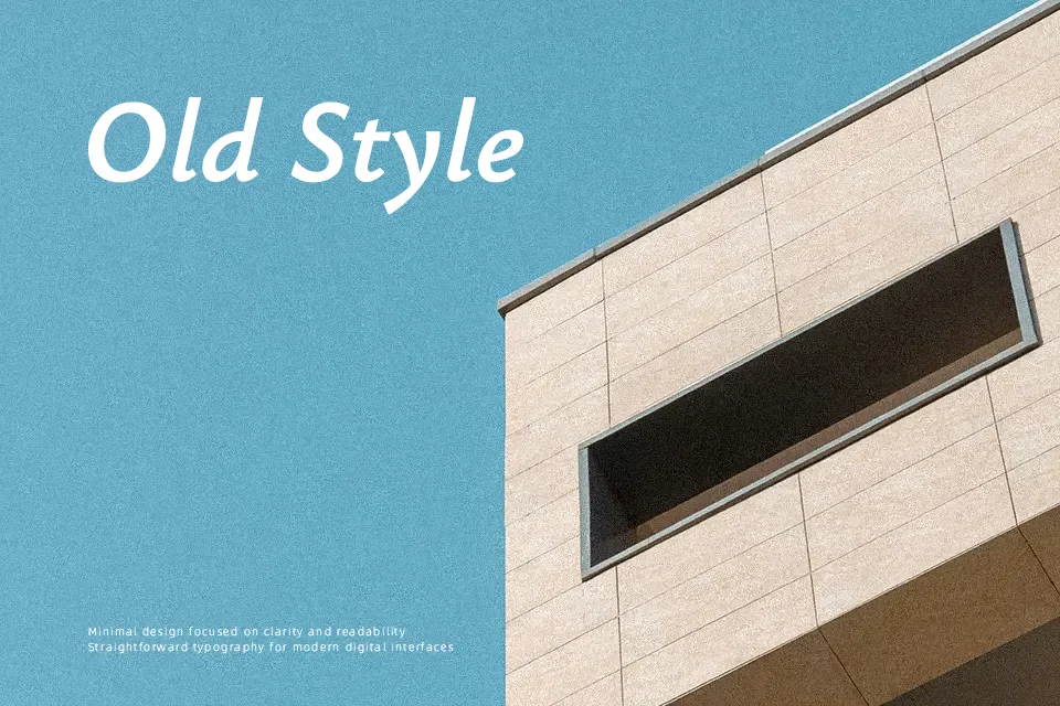
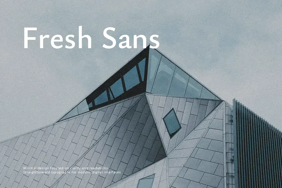
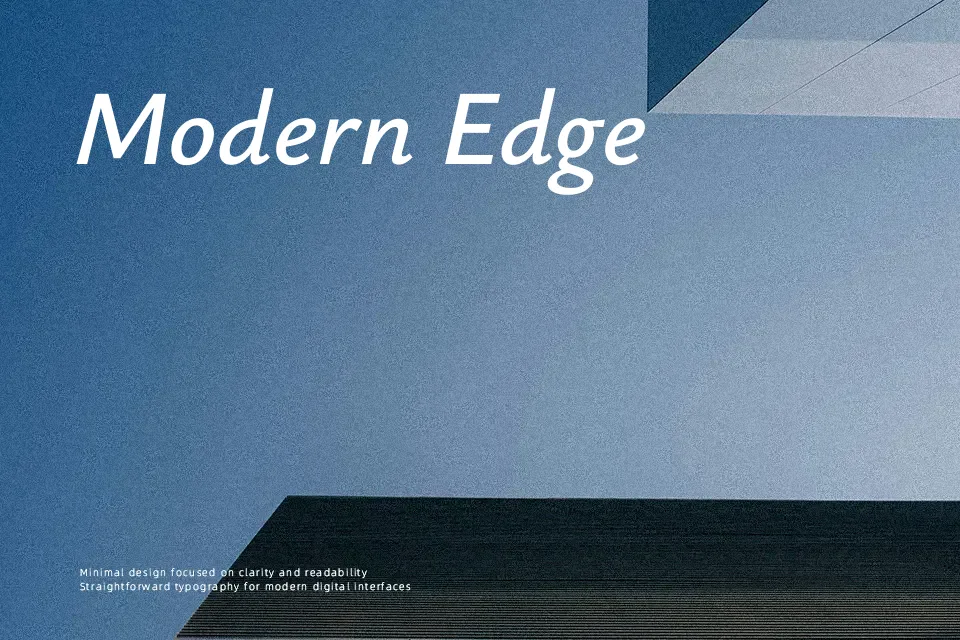
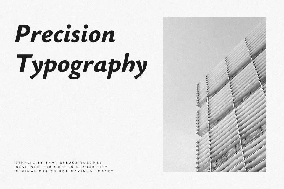
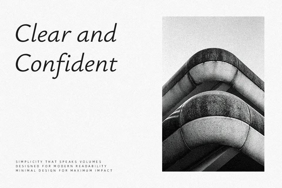
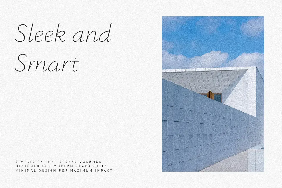
Ysabeau reads like a calm book face translated into a sans serif: generous x-height, open counters, and low contrast keep strokes steady and legible across screens and print. The family spans many weights, so you can build clear hierarchies from quiet body text to assertive headings without leaving the system. It shines in long-form content, interface text, and brand work that needs a serious tone without feeling cold. Where it can fall short is in highly expressive logos or playful, character-heavy display work, where something more decorative or quirky may do a better job.
Best For:
Editorial layouts and book-like digital reading
Branding systems that lean serious but approachable
Interface and app text that must stay readable at small sizes
Not Ideal For:
Highly decorative or experimental display wordmarks
Playful kids or cartoon graphics needing exaggerated character
Horror, grunge, or genre-heavy poster typography
Perfect for body text, branding, and editorial, with a calm and sans serif style.
License
Gallery