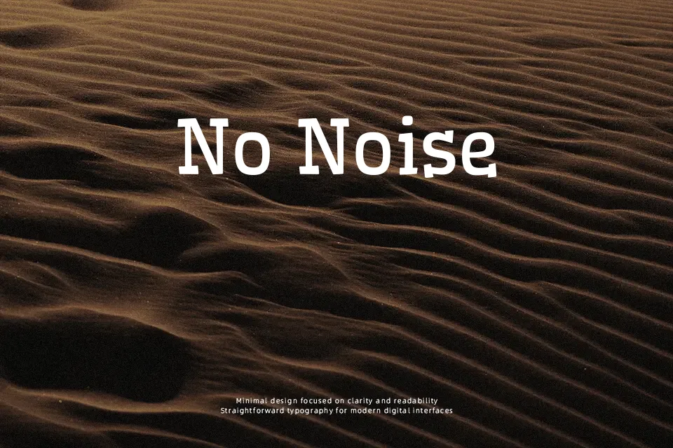
Wellfleet Font
Free for Commercial UseAbout
Wellfleet is a slab serif with low contrast, compact proportions, and slightly uneven rhythm, which gives lines of text a relaxed, hand-set feel. Sturdy verticals and squared terminals keep it grounded, while its bouncy spacing and soft curves introduce a casual tone that avoids feeling goofy. It holds up surprisingly well in small editorial copy, captions, and UI labels, but its personality comes through most in headlines, posters, and branding where a rigid geometric slab would feel too cold. If you need razor-clean corporate minimalism or highly condensed text columns, Wellfleet can feel a bit chunky and restless compared to more neutral slab or sans families.
Best For:
friendly editorial headings and pull quotes
casual brand wordmarks and submarks
posters or social graphics with a warm, text-led look
interfaces that benefit from a characterful slab for labels
Not Ideal For:
dense body text in long-form documents
highly corporate or ultra-minimal branding
very small legal copy or strict data tables
narrow layouts that require condensed letterforms
Perfect for branding, editorial, and headline, with a classic and slab serif style.
License
Gallery