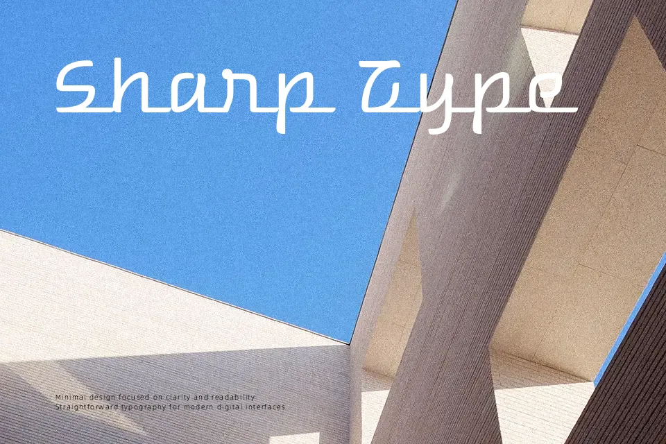
Warnes Font
Free for Commercial UseAbout
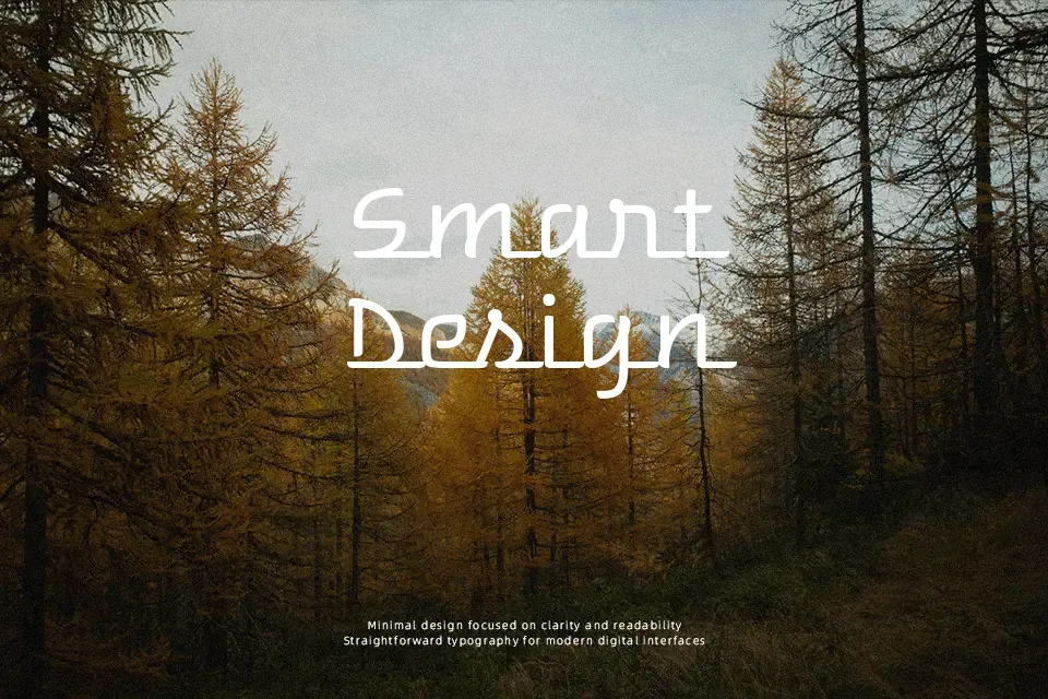
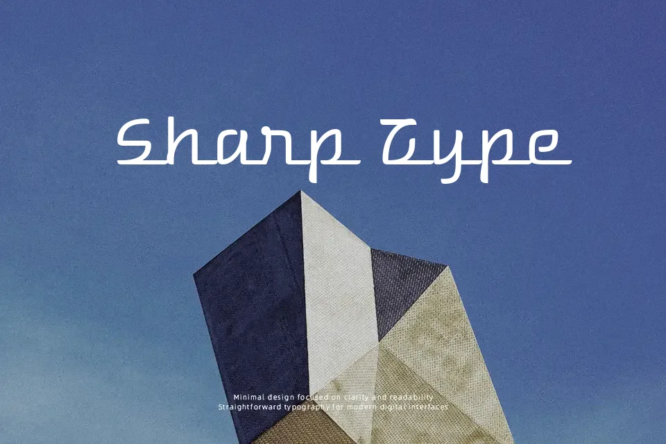
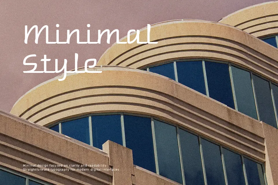
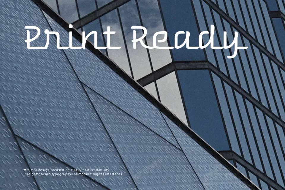
Warnes is a chunky, high-impact display font with rounded terminals, tight spacing, and a streamlined silhouette that echoes classic car emblems. Strokes feel sturdy rather than delicate, so letters read as solid shapes with a strong horizontal flow, especially in all caps. The overall impression is retro and slightly industrial, more playful than formal, which suits automotive, diner, and vintage-inspired branding, posters, or signage where you want the typography to carry the theme on its own. It tends to overpower long paragraphs or minimalist interfaces, so it works best paired with a neutral text face instead of handling body copy by itself.
Best For:
retro automotive logos and wordmarks
vintage-style posters, banners, and signage
branding for garages,diners,or nostalgic products
headline use on social graphics or packaging
Not Ideal For:
long-form body text or dense paragraphs
strictly formal or corporate documents
minimalist UI layouts that need subtle typography
very small text where details blur together
Perfect for branding, headline, and logo, with a artistic and decorative style.
License
Gallery