Van Dyke Font
Free for personal useAbout
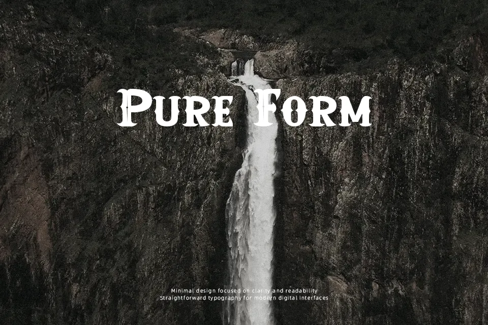
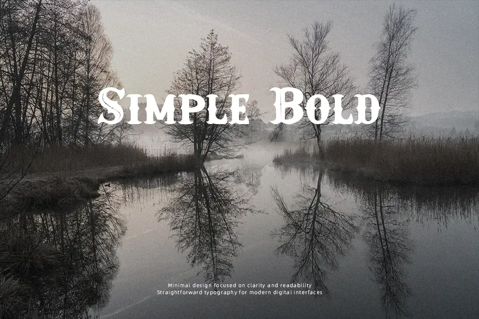
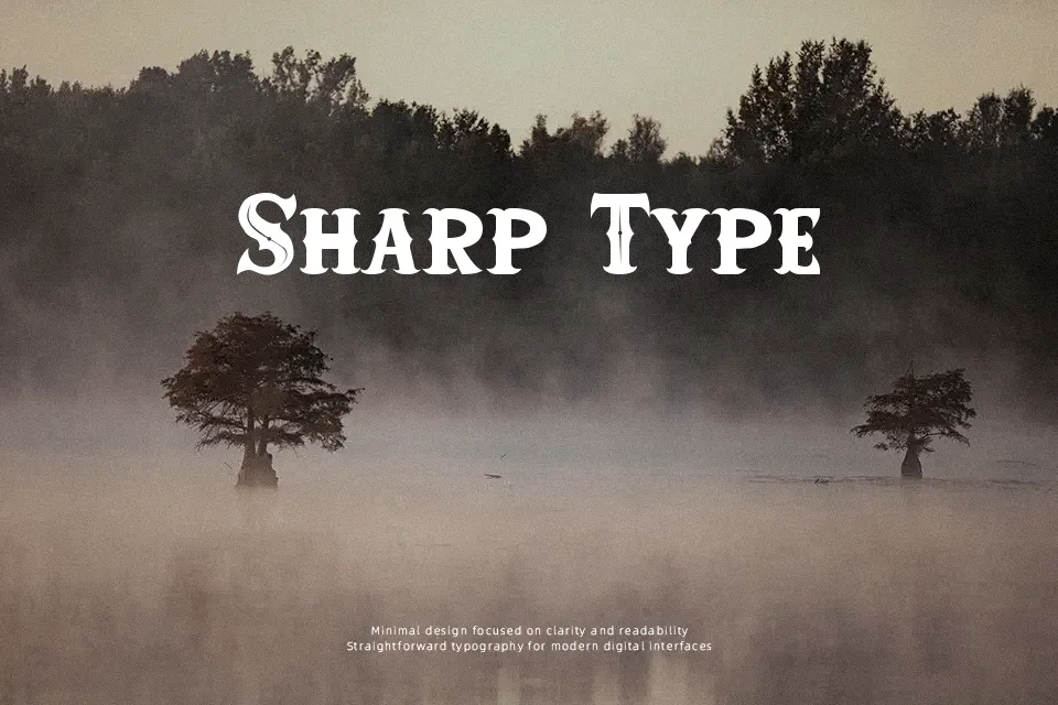
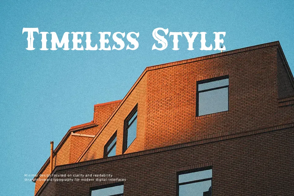
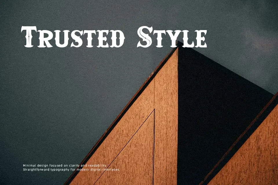
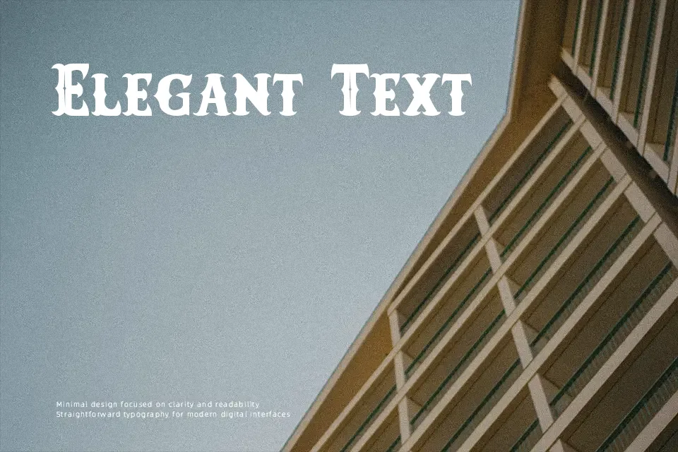
Van Dyke Font establishes an imposing display presence through solid stems, pronounced horizontal slab serifs, and central spurs on major vertical strokes. The design features uniform character widths and moderate letter spacing that keep uppercase headlines readable across signboards and merchandise graphics. Consistent baseline weight anchors the heavier stroke terminals, preventing glyphs from breaking down when set against dark graphic backdrops. Extended body text and compact editorial settings prove less effective due to the heavy decorative geometry and rigid structure. The typeface functions best when isolated as a dominant header where its rustic styling commands attention.
Best For: vintage rodeo posters,saloon menu headlines,craft brewery packaging,western video game titles
Not Ideal For: long paragraph text,small mobile interface labels,dense editorial layouts,financial documents
Perfect for gaming, headline, and logo, with a bold and decorative style.
License
Gallery