Wallpoet Font
Free for Commercial UseAbout
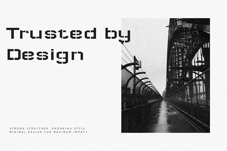
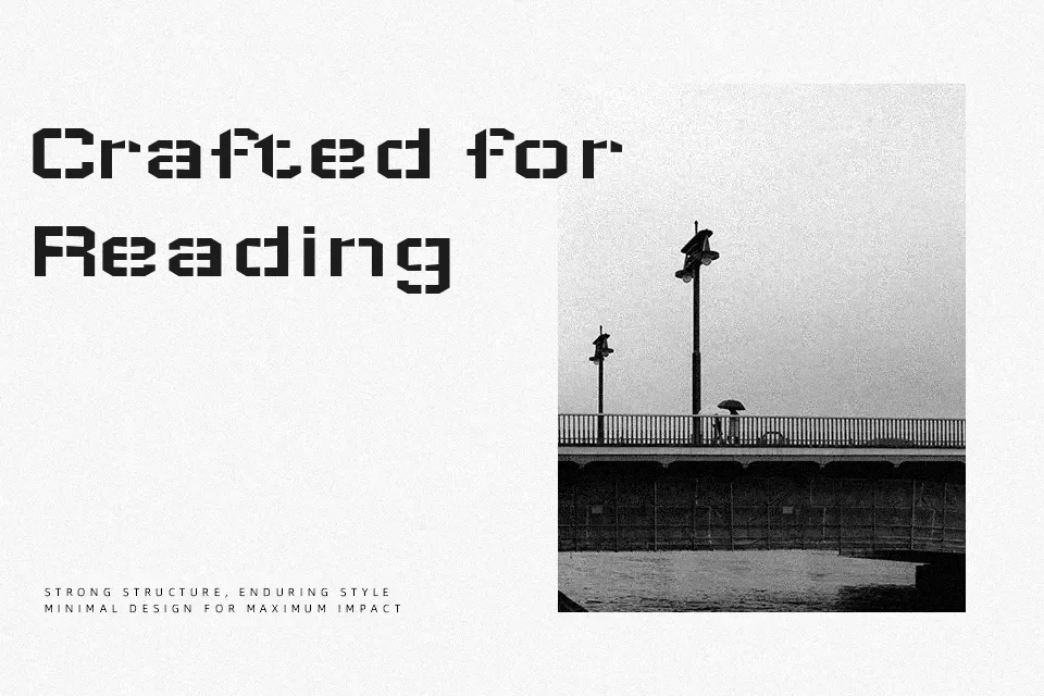
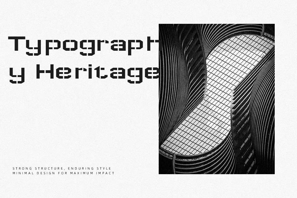
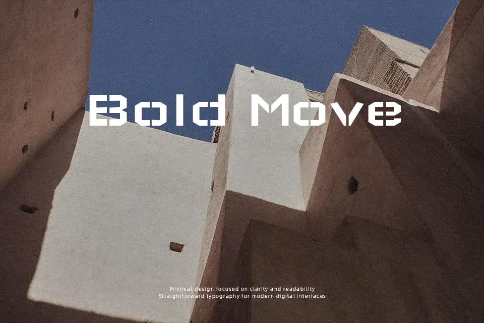
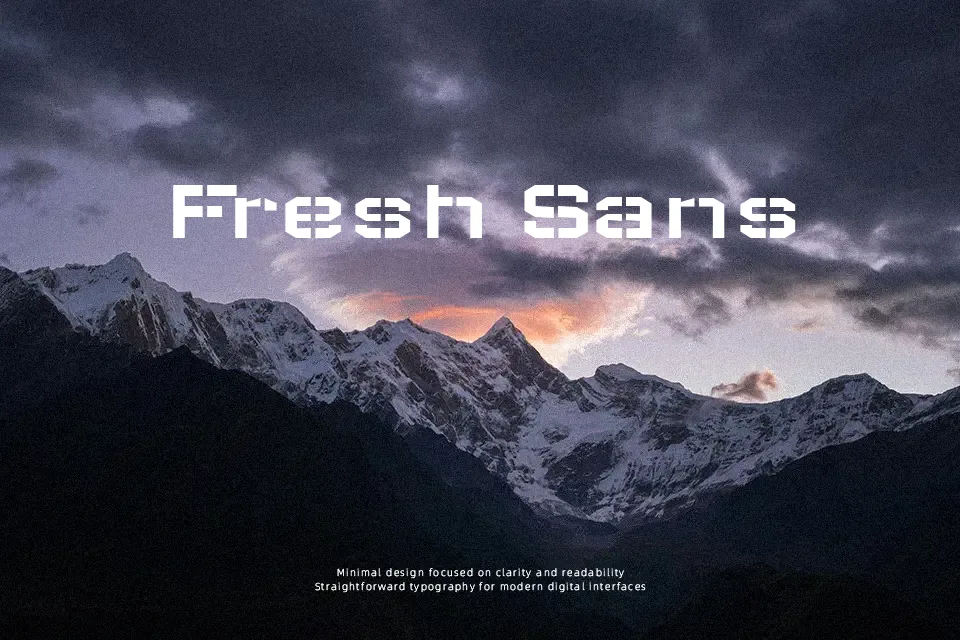
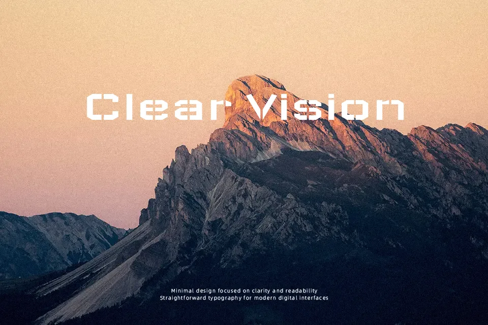
Wallpoet uses blocky, curve-free letters with cut-out stencil shapes, giving every stroke a rigid, mechanical feel that still reads clearly at larger sizes. The spacing is fairly open and the forms are wide, so words feel heavy and grounded rather than sleek or neutral. Visually it lands between industrial sans serif and urban graffiti, which suits protest graphics, music artwork, gaming overlays, or any layout that needs a gritty, constructed voice instead of a polished corporate tone. It works well for short headlines and templates where you repeat and spray or print the same message, but long paragraphs quickly become tiring and blunt, so it is better kept away from body text or refined editorial layouts.
Best For:
urban protest posters and flyers
album covers and music event graphics with a gritty edge
gaming or streaming overlays needing a mechanical graffiti look
bold headline lockups for streetwear or alternative branding
Not Ideal For:
long-form body copy or reading-heavy layouts
formal corporate documents or conservative brands
wedding or romantic stationery where softness matters
small UI text where stencil gaps hurt legibility
Perfect for advertising, branding, and gaming, with a bold and display style.
License
Gallery