UptightC Font
Free for Commercial UseAbout
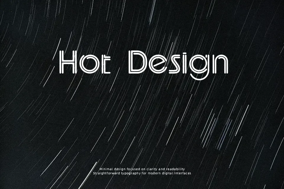
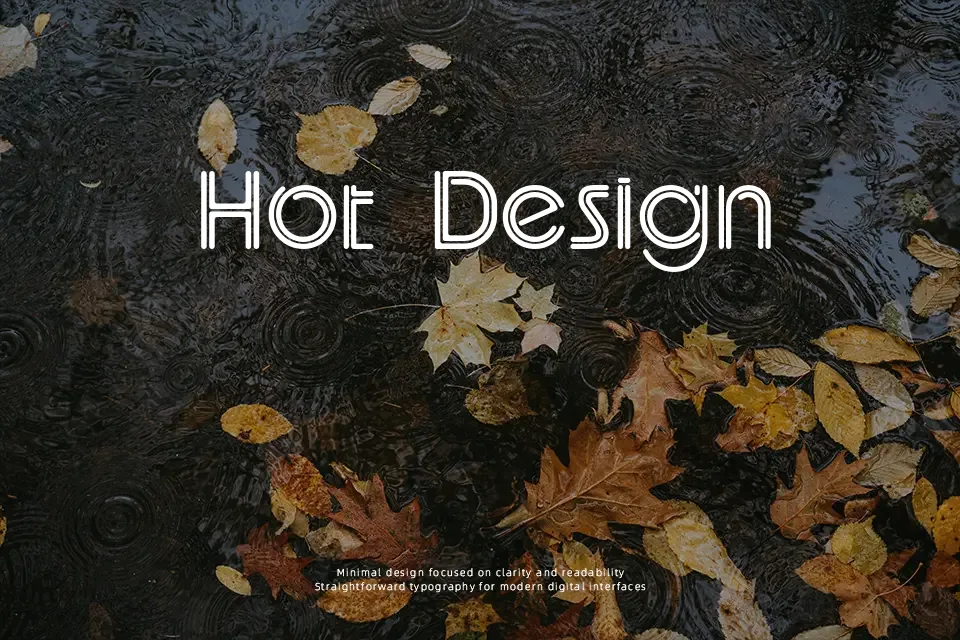
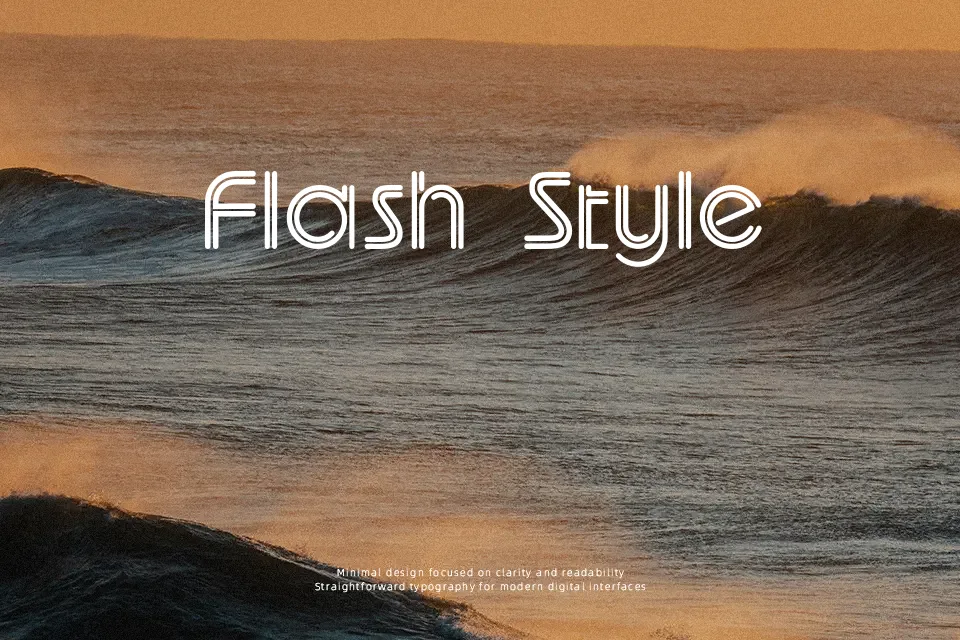
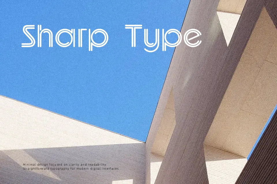
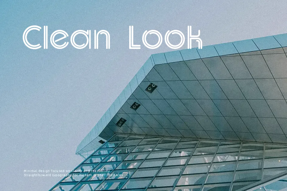
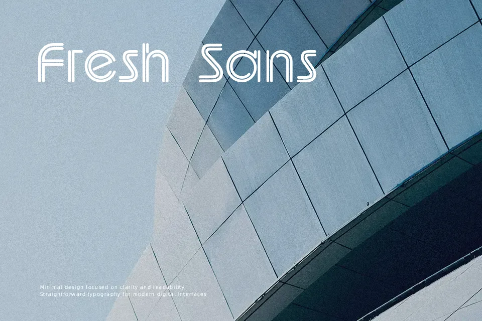
UptightC Font delivers a distinctive display presence characterized by condensed geometric letterforms, uniform heavy strokes, and softly radiused outer corners. The tight spacing between characters creates a dense, interlocking visual rhythm that reinforces its retro display identity. Proportions remain compact across uppercase forms, ensuring prominent hierarchy in large display contexts. However, the heavy weight and narrow tracking quickly diminish legibility in continuous text settings. Decorative forms reduce continuous reading comfort, making the typeface much more effective for concise headlines than dense body copy.
Best For: music festival posters, retro vinyl packaging, streetwear apparel graphics, display title cards
Not Ideal For: long paragraph text, mobile app body copy, dense editorial layouts, small interface labels
Perfect for branding, headline, and music, with a bold and display style.
License
Gallery