UpDown Font
Free for personal useAbout
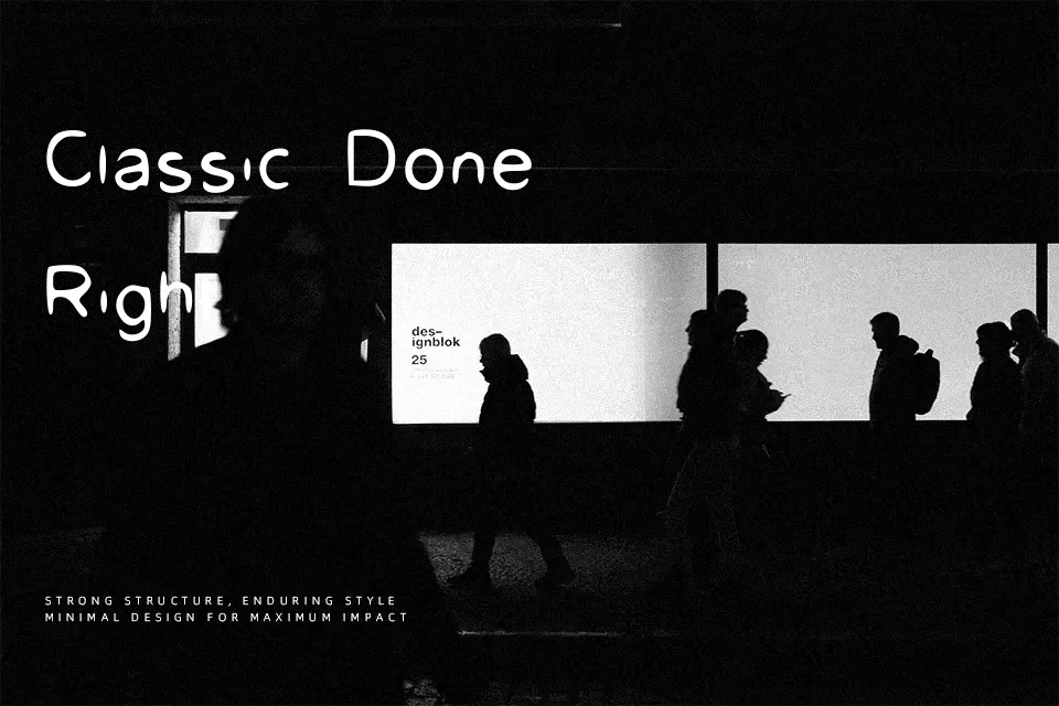
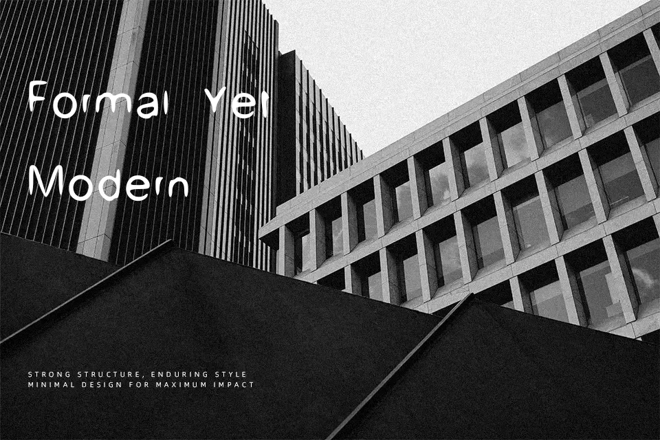
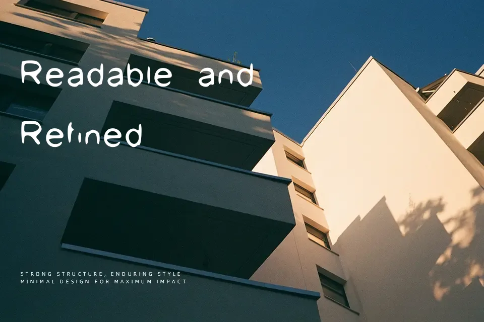
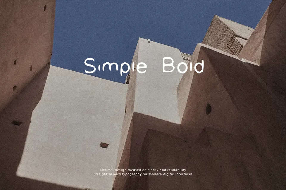
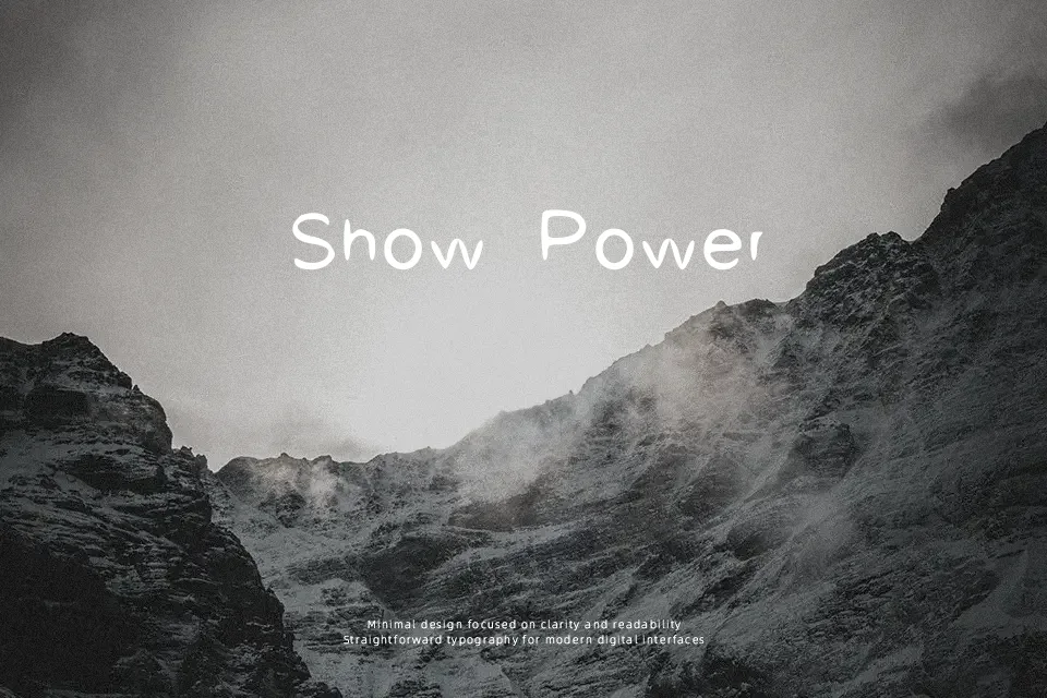
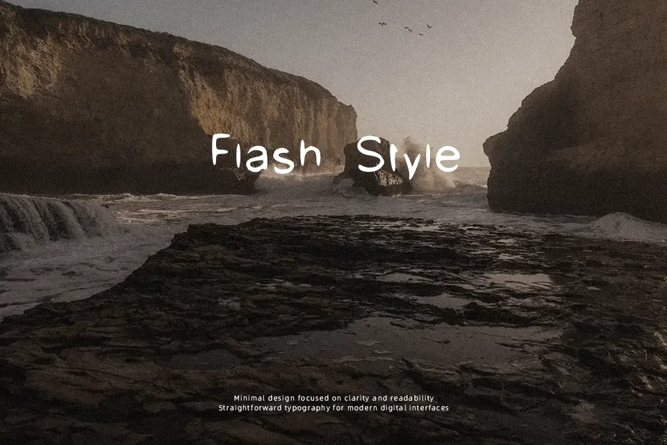
UpDown Font introduces a spirited display style defined by shifting vertical alignments, bold uneven strokes, and lively letterform proportions that instantly command attention. Character spacing remains moderately compact, allowing the dynamic interplay between elevated and lowered stems to form a recognizable rhythmic pattern across display text. Because the baseline shifts and unconventional letter geometry introduce visual disruption, extended reading comfort drops sharply at smaller point sizes. The design performs at its absolute peak when utilized in punchy short titles, packaging headers, and creative entertainment assets.
Best For:
– animated title sequences
– youth event posters
– casual apparel graphics
– video thumbnail titles
Not Ideal For:
– continuous body text
– corporate annual reports
– dense editorial spreads
– mobile interface labels
Perfect for branding, headline, and logo, with a bold and decorative style.
License
Gallery