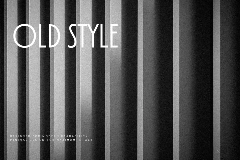
TT Modernoir Font
Free for personal useAbout
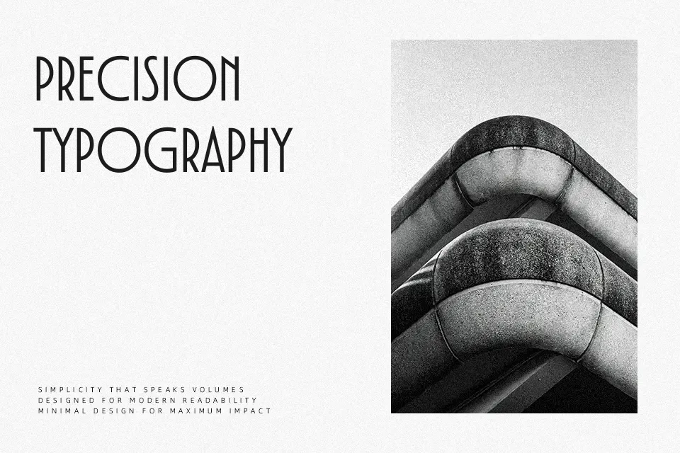
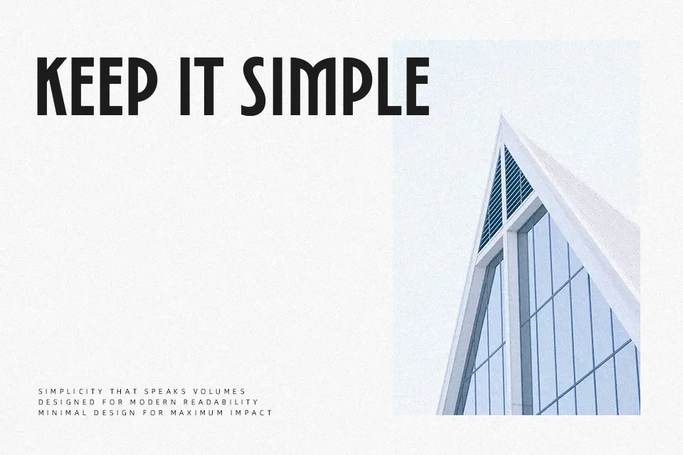
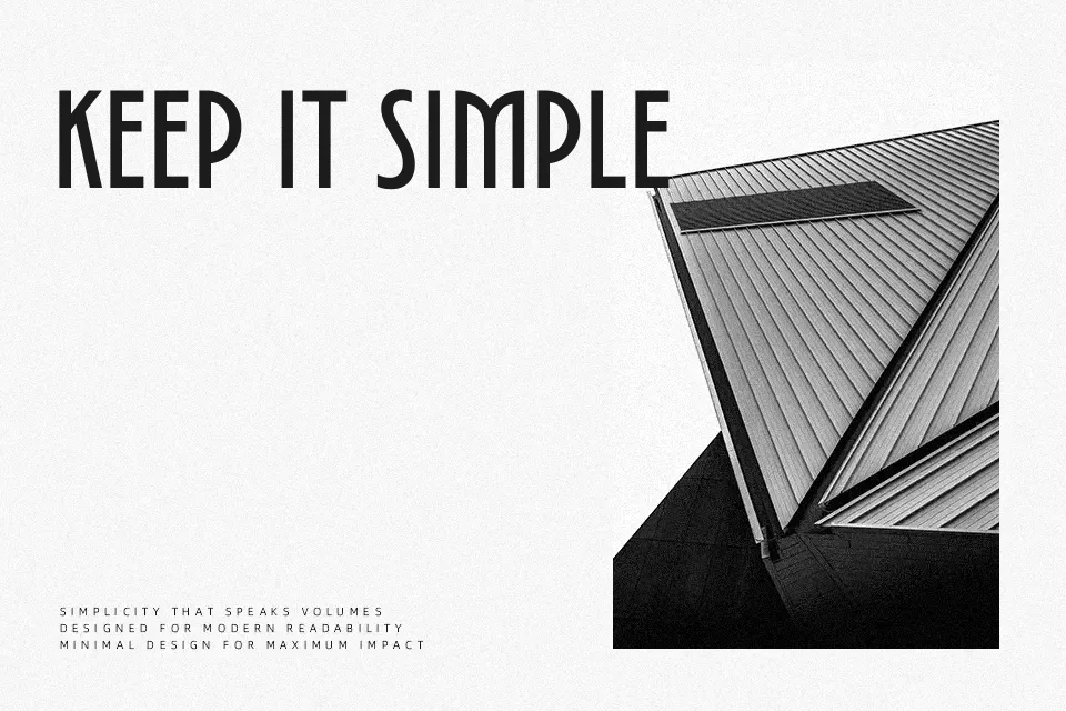
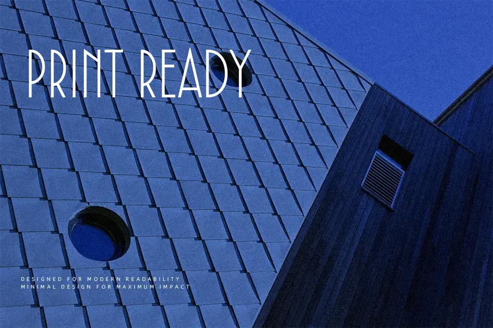
TT Modernoir Font pairs severely condensed rectilinear stems with expansive, looping curves to establish an eccentric display sans-serif rhythm across uppercase compositions. Clean terminal cuts and steady stroke weights contrast sharply against the deliberate width disparities, while tight letter tracking accentuates the dynamic movement of curved descending legs. These exaggerated proportions function exceptionally well on cinematic title graphics, boutique restaurant menus, and exhibition banners where dramatic scale amplifies visual impact. The pronounced structural shifts between narrow and wide glyphs guide the eye effortlessly through brief headline phrases. However, the deliberate omission of conventional lowercase forms and the compressed internal counters significantly reduce legibility in continuous editorial paragraphs or dense multi-line captions.
Best For: theatrical event posters, vinyl record sleeves, cocktail lounge signage, cinematic title cards
Not Ideal For: continuous editorial paragraphs, mobile interface body text, dense spreadsheet tables, small legal disclaimers
Perfect for film, headline, and logo, with a artistic and decorative style.
License
Gallery