Tract Font
Free for personal useAbout
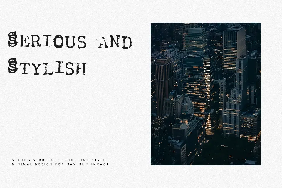
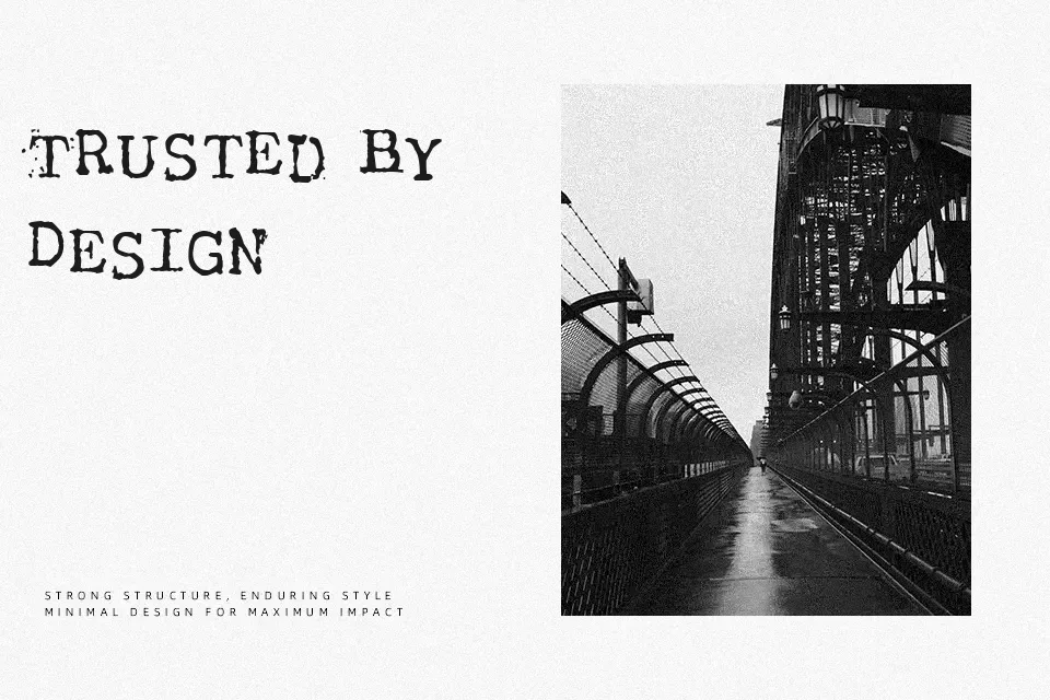
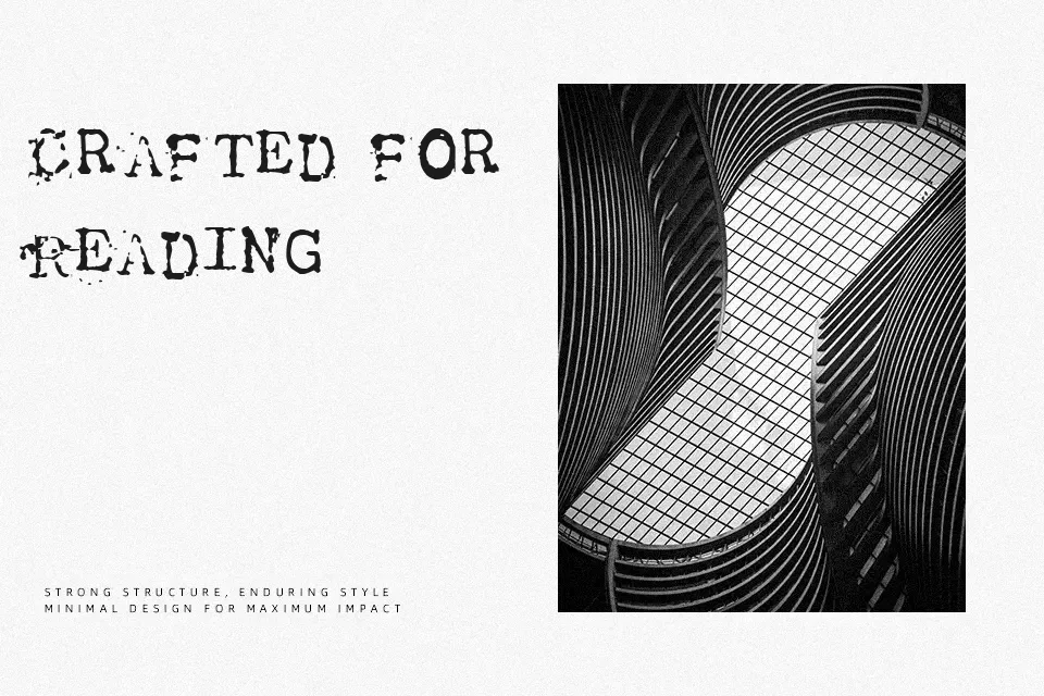
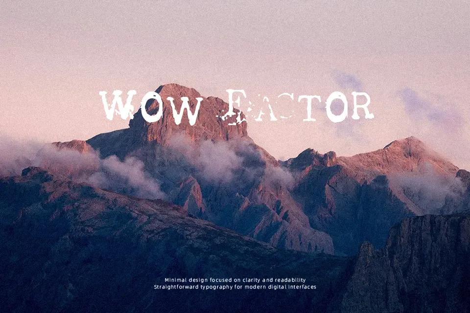
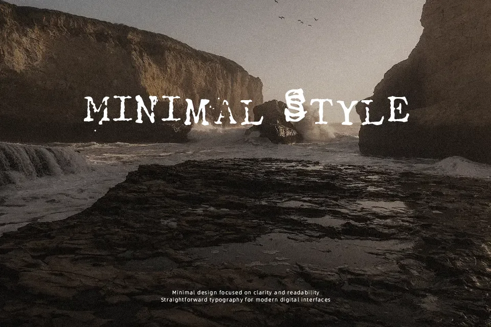
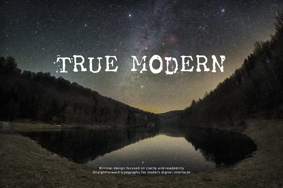
Engineered with utilitarian precision, Tract Font merges structured monospaced proportions with heavily abraded edges and dense, uniform strokes. The design maintains balanced spacing across glyphs, allowing its blocky serifs and gritty exterior to establish a distinct visual cadence. Uppercase characters exhibit steady heights, while the open apertures in simpler shapes sustain acceptable readability across medium titles, outdoor banners, and themed editorial headers. The stamped finish adds convincing tactile depth to period graphics without requiring complex digital distressing. Nevertheless, the pronounced grime accumulates inside compact counters during continuous reading, severely reducing text clarity throughout lengthy body paragraphs or small technical diagrams.
Best For: vintage product packaging, music festival posters, apparel graphics, retro book covers
Not Ideal For: long paragraph text, small interface labels, corporate annual reports, dense editorial layouts
Perfect for branding, headline, and music, with a bold and decorative style.
License
Gallery