Tourney Font
Free for Commercial UseAbout
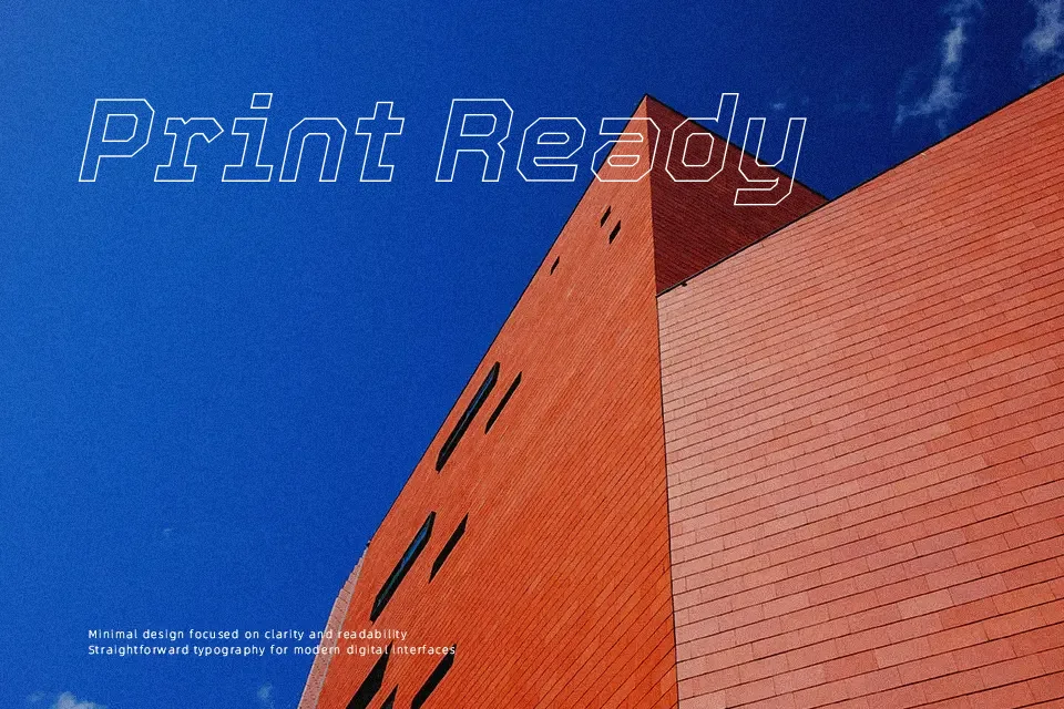
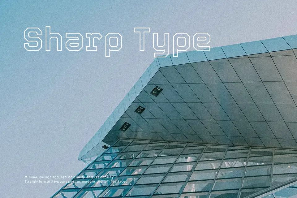
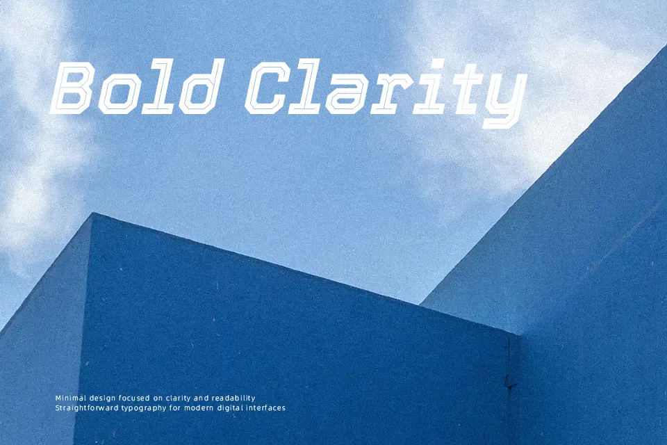
Tourney is a high-impact display sans serif built around straight segments and squared corners instead of curves, so every letter feels engineered and mechanical. Its variable axes for weight, width, and italic let you push from compressed scoreboards to wide, shouty titles without swapping families. The spacing leans tight in heavier settings, which gives banners, esports overlays, sports logos, and racing posters a compact, competitive look. Visually it sits closer to athletic block faces than to neutral grotesques, so I reach for it when I want drama, not subtlety. It struggles in long paragraphs or tiny UI labels where its rigid geometry becomes tiring, but in short, loud messages it does exactly what you ask of it.
Best For:
Tournament and sports branding, scoreboards, and event posters where you want bold, mechanical lettering.
Esports, streaming graphics, and gaming interfaces that need condensed to wide display titles from a single variable family.
Bold wordmarks, banners, and number-heavy layouts like brackets, rankings, or racing stats.
Not Ideal For:
Body copy or long-form reading where its rigid block forms quickly become visually fatiguing.
Minimal, quiet branding systems that rely on soft, humanist shapes instead of assertive athletic lettering.
Very small UI labels or captions where tight spacing and complex outlines can lose clarity.
Perfect for branding, gaming, and headline, with a bold and condensed style.
License
Gallery