Tournedos Font
Free for personal useAbout
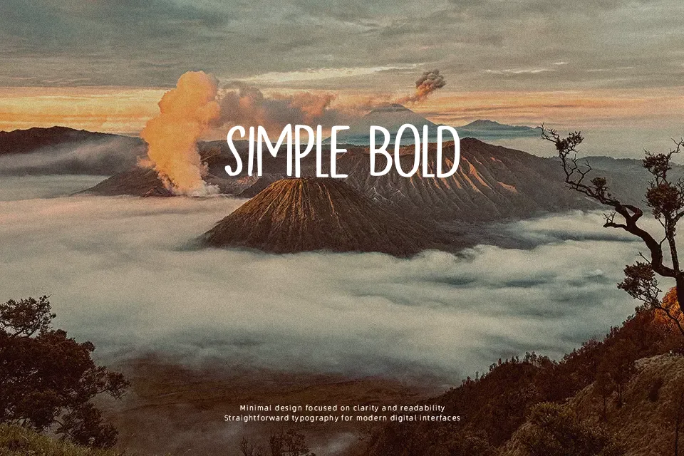
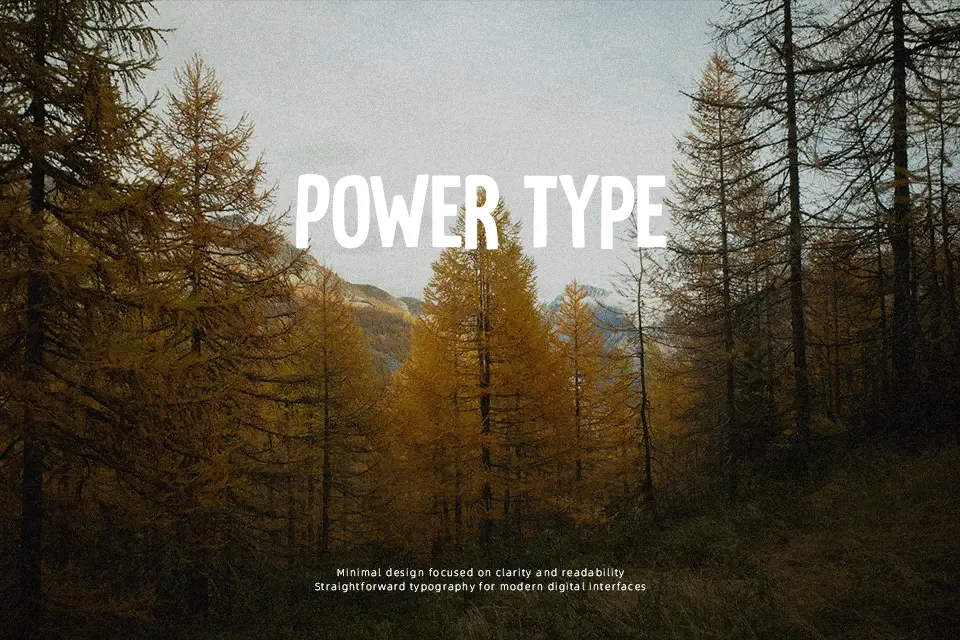
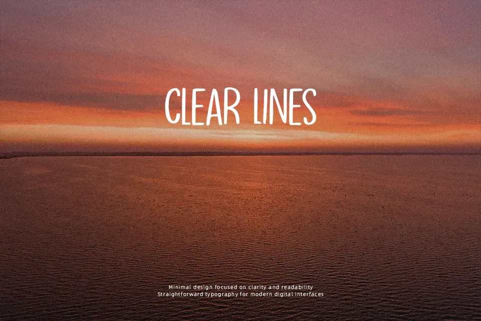
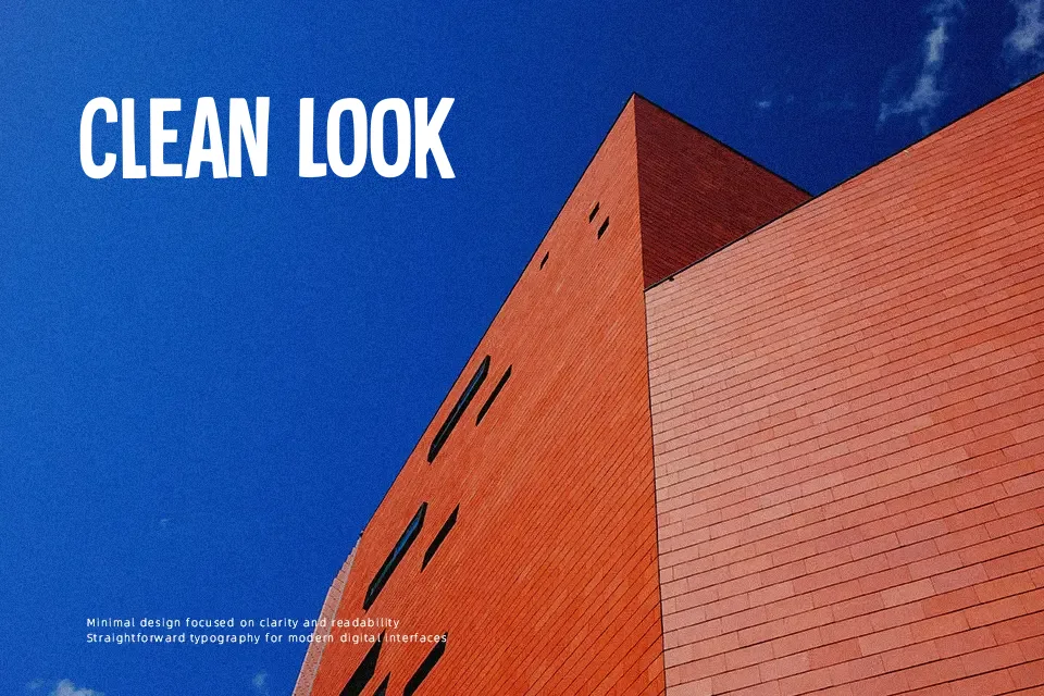
Tournedos Font performs best when set at large display scales where its hefty weight and animated structure can make an assertive impression. The typeface features thick, low-contrast strokes with softened terminals and irregular geometric proportions that evoke a casual cartoon aesthetic. Character widths remain broad throughout the alphabet, while tight letter spacing creates a dense, punchy horizontal rhythm across titles. In short headlines and merchandise graphics, the letterforms remain legible and impactful from a distance. However, the substantial stroke thickness and cramped inner counters significantly reduce readability at smaller point sizes. For this reason, the design is unsuited for body text or dense editorial layouts.
Best For: comic book titles, food packaging labels, children’s book covers, snack branding
Not Ideal For: long paragraph text, corporate reports, technical documentation, small interface labels
Perfect for headline, kids, and logo, with a bold and cartoon style.
License
Gallery