Touch Down Font
Free for personal useAbout
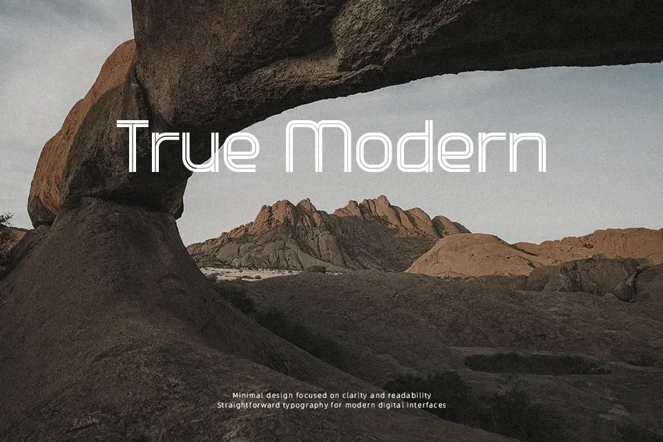
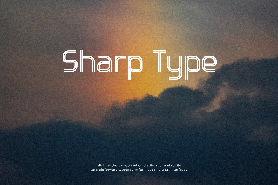
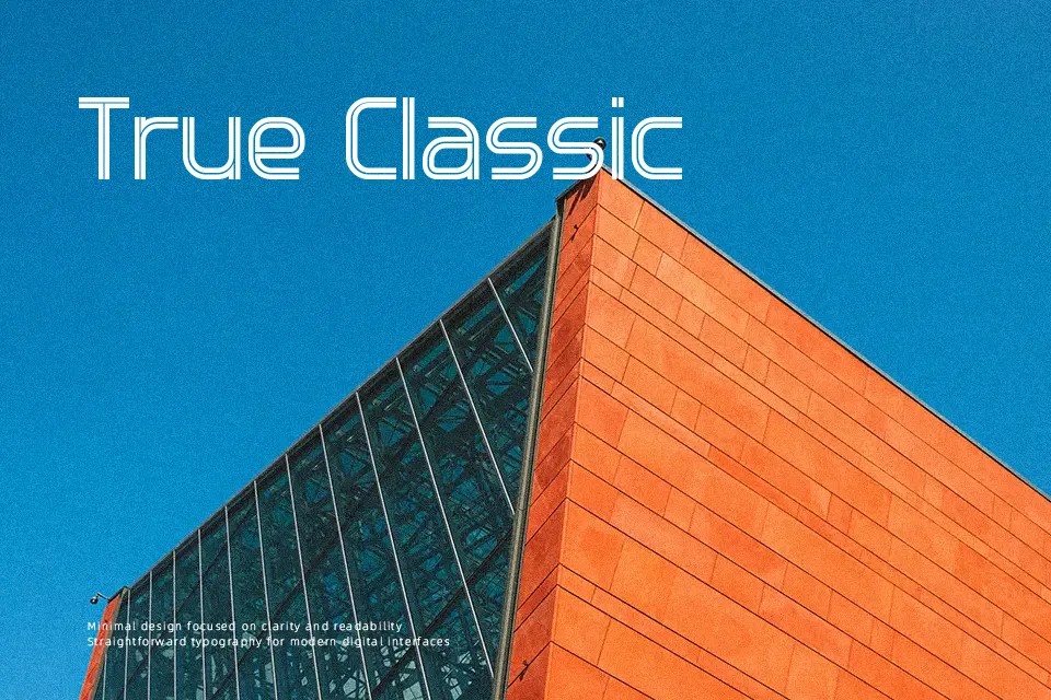
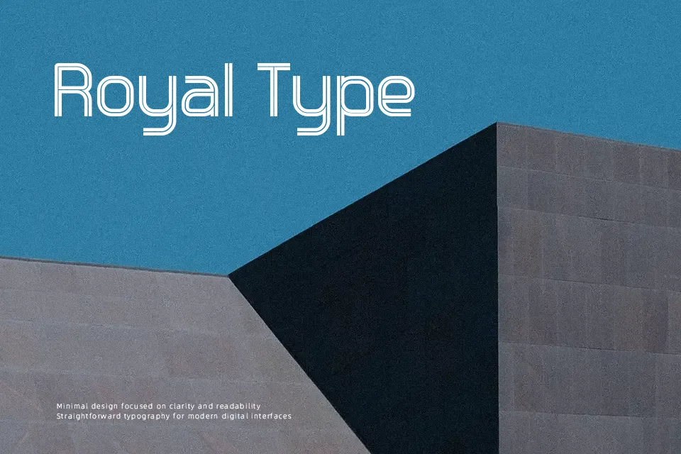
Touch Down Font presents heavy geometric letterforms defined by distinctive multi-line contours and balanced horizontal proportions. Each glyph features clean outer boundaries paired with internal inline detailing that establishes a rhythmic, retro appearance. Spacing between characters is calibrated to maintain legibility in prominent titling without causing visual clutter. While the typeface delivers excellent presence across athletic posters, event banners, and apparel graphics, dense letterforms reduce comfort during extended reading. Small captions may lose clarity because the internal decorative lines blur when scaled down. For large display layouts requiring immediate graphic impact, the design offers dependable consistency and structural stability across its uppercase glyph set.
Best For: sports tournament posters, team merchandise headers, vintage retail packaging
Not Ideal For: continuous book body text, mobile interface captions, compact spreadsheet tables
Perfect for headline, logo, and packaging, with a bold and decorative style.
License
Gallery