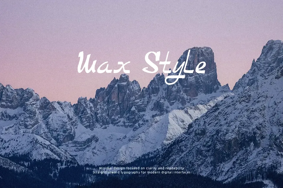
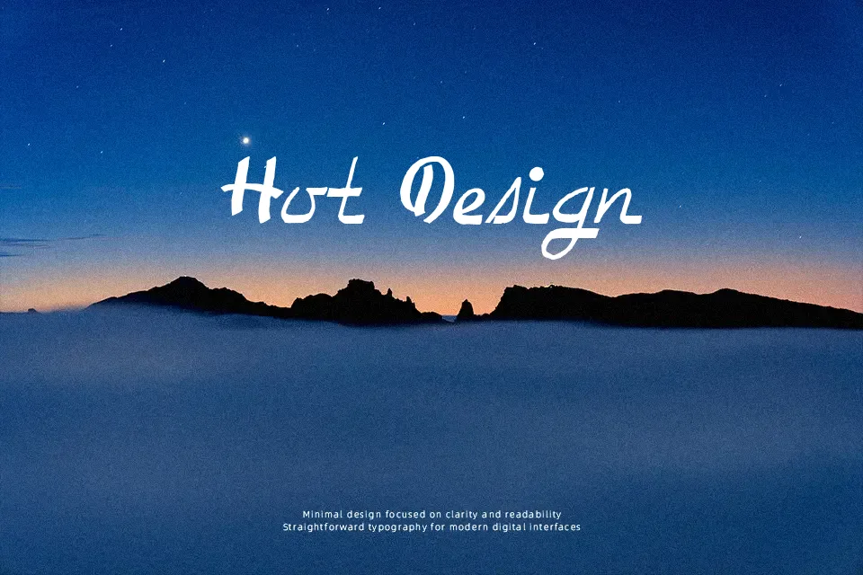
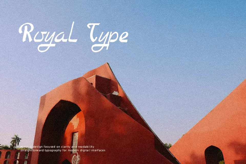
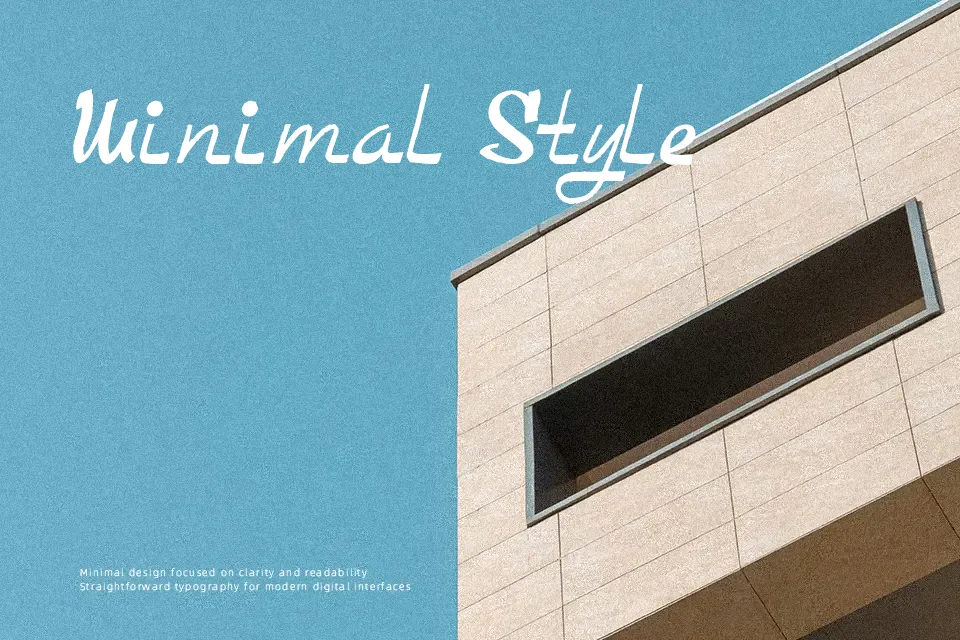
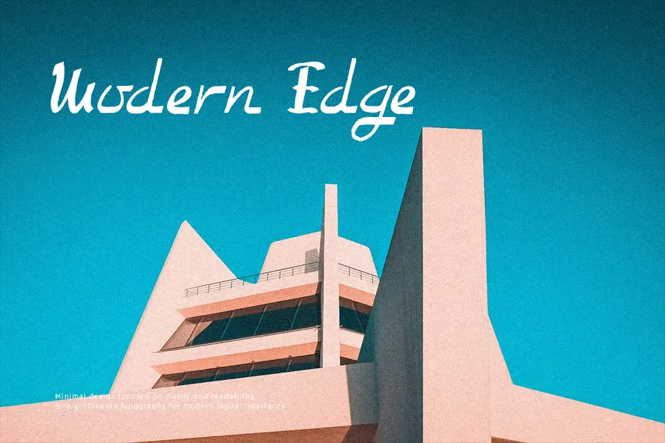
Too Good To Be True Font
Free for personal useAbout
Too Good To Be True Font presents an expressive retro script structure characterized by flowing curves and moderate stroke contrast. The letterforms display balanced proportions with noticeable decorative flourishes that lend a distinct vintage character across uppercase and lowercase sets. Spacing between characters remains fairly compact, creating tight word groupings that emphasize its fluid rhythm. While this tight arrangement enhances visual cohesion at larger display sizes, it reduces overall legibility in extended text settings. The design functions reliably for headline compositions, retro packaging, and display posters where individual letter shapes have room to breathe. Intricate terminal curves become difficult to parse at small sizes, making the typeface unsuitable for running body paragraphs.
Best For: vintage merchandise packaging, retro event poster headlines, cafe branding signage
Not Ideal For: long paragraph body text, dense editorial layouts, small mobile user interface labels
Perfect for advertising, branding, and headline, with a artistic and decorative style.
License
Gallery