Tinsnips Font
Free for Commercial UseAbout
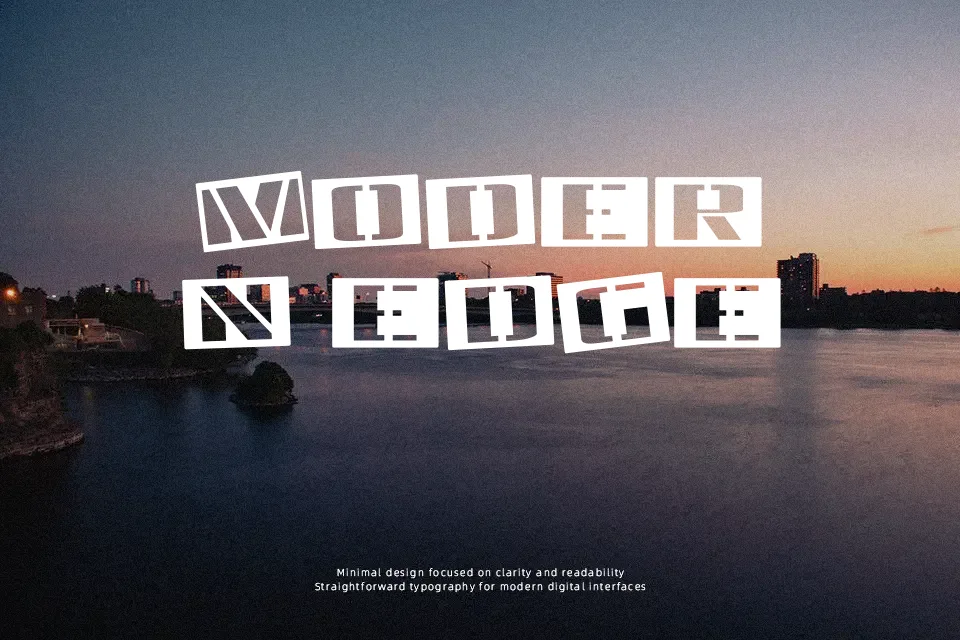
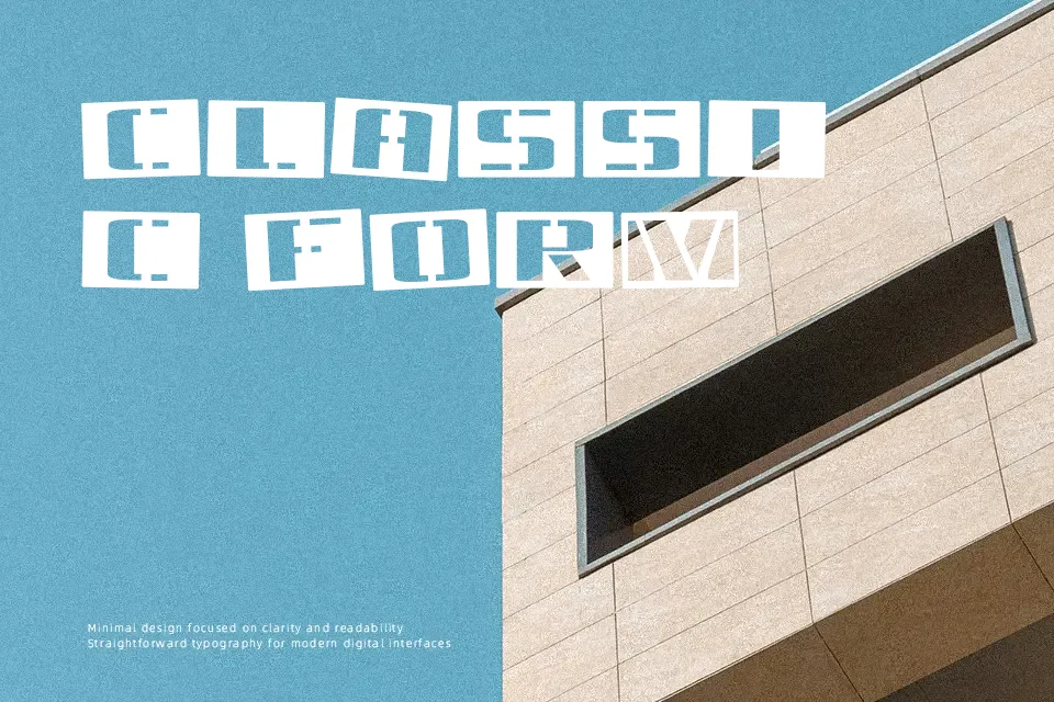
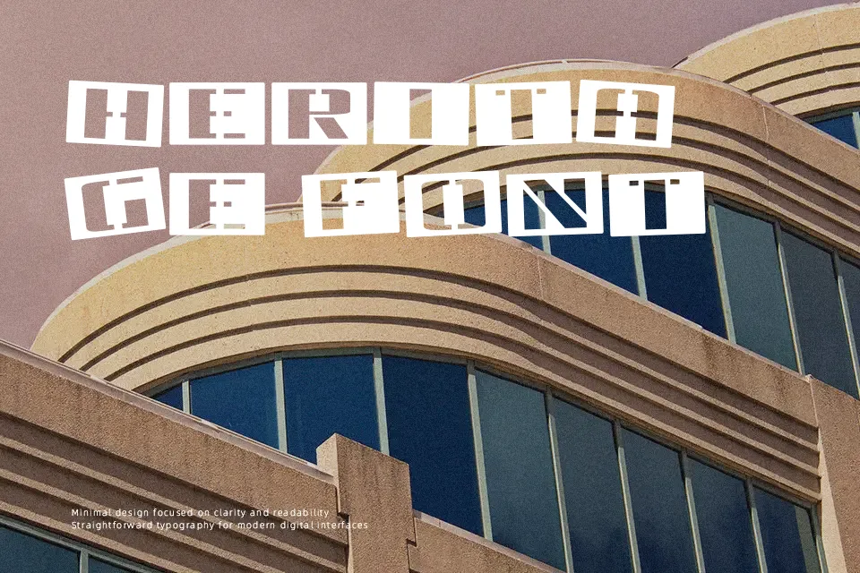
Tinsnips Font features prominent stencil bridges and thick, uniform strokes that shape its rigid, mechanical structure. Wide, blocky proportions give each glyph solid footing, while carefully balanced character spacing prevents adjacent elements from crowding together. Readability stays sharp at large display scales, making the design well suited for apparel graphics, freight packaging, and commanding headline banners. The bold letterforms maintain strong visibility in large display text, creating forceful focal points across outdoor layouts. However, the dense weight and disconnected strokes reduce reading comfort across extended copy, making the typeface ineffective for running text, dense editorial sections, or small technical captions.
Best For: industrial equipment packaging, screen-printed apparel graphics, music festival posters, warehouse signage
Not Ideal For: continuous body text, mobile interface labels, dense editorial layouts, formal corporate documents
Perfect for branding, headline, and logo, with a bold and display style.
License
Gallery