Timepiece Font
Free for Commercial UseAbout
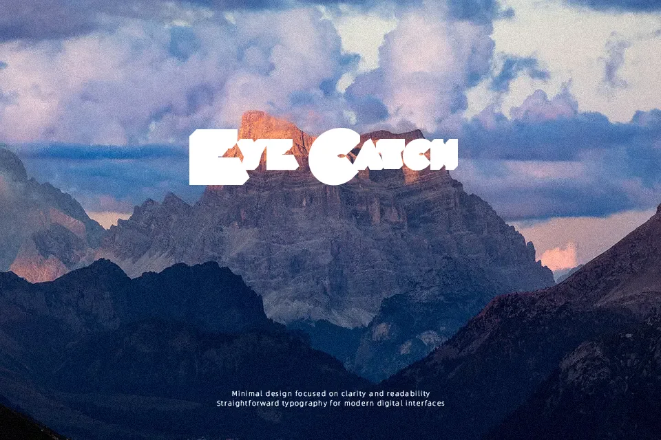
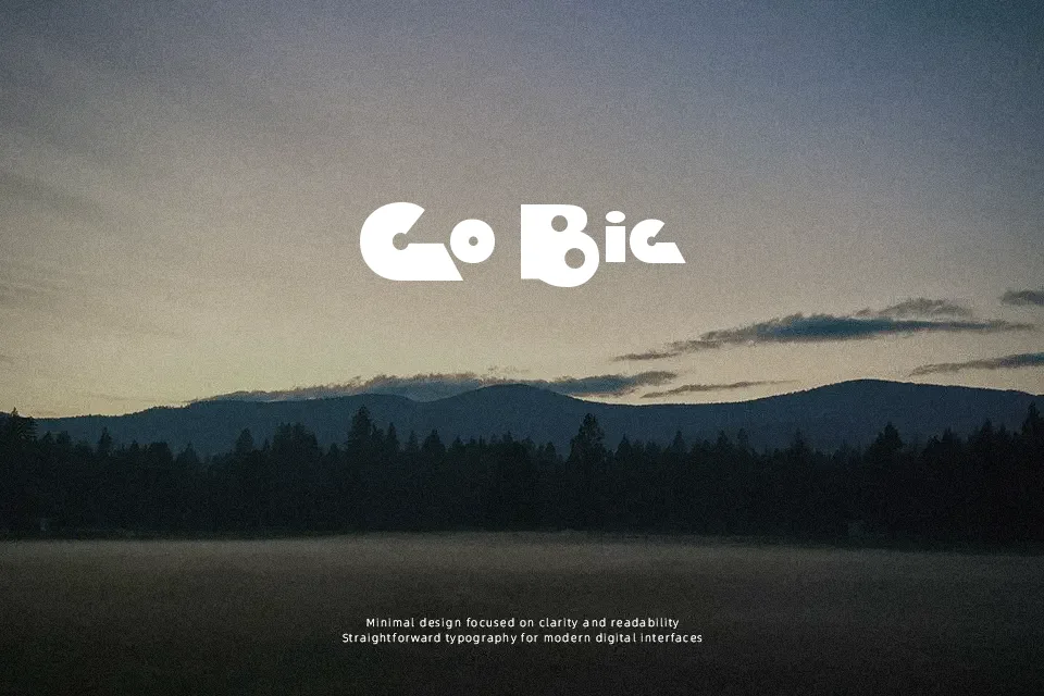
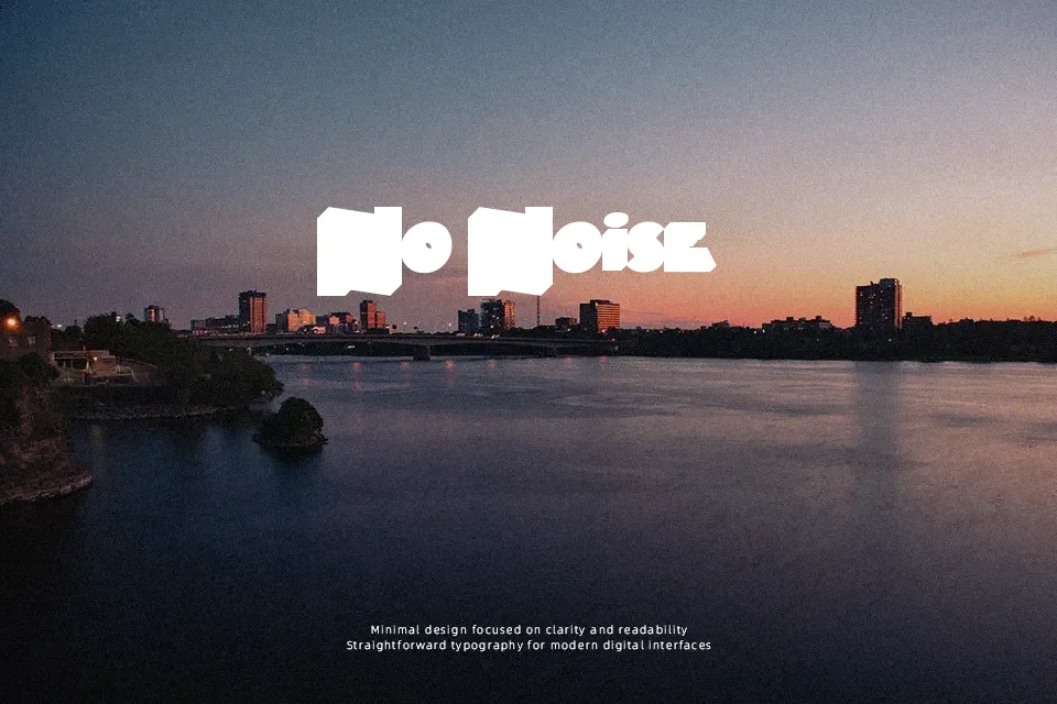
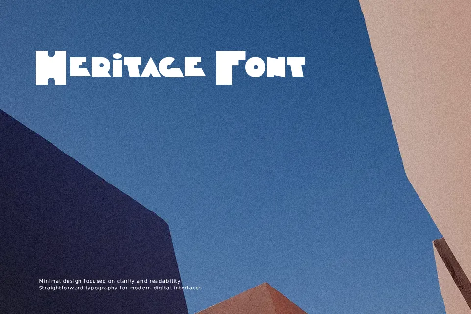
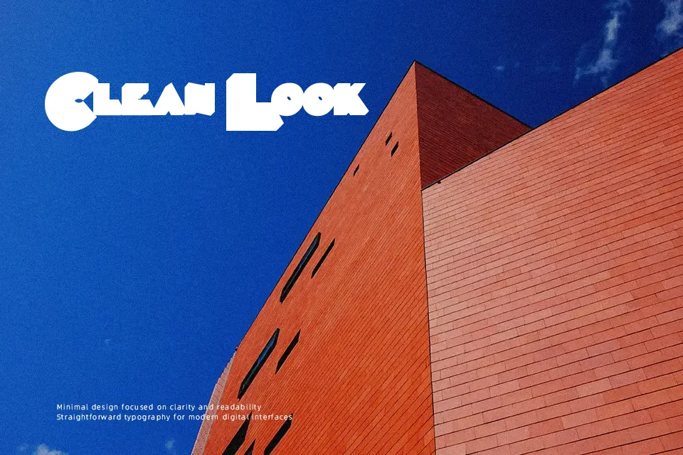
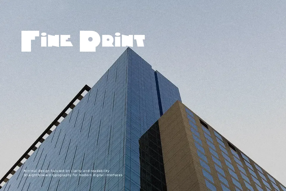
Timepiece Font establishes an immediate focal point across display layouts through exaggerated character mass and sharp, modular construction. The letterforms exhibit solid uniform weights paired with compact spacing, creating a dense, impactful rhythm across theatrical banners and title sequences. Wide horizontal proportions give the design substantial visual weight, yet this structural density reduces comfort dramatically during extended reading. Internal counter spaces tend to close up at reduced dimensions, which impairs readability in dense editorial settings. For optimal visual balance, the typeface performs best when displayed at headline scales where its distinctive contours remain crisp and legible.
Best For: theatrical poster headlines, vintage product packaging, vinyl album covers, cinematic title cards
Not Ideal For: long paragraph text, dense editorial layouts, mobile interface labels, small caption copy
Perfect for film, headline, and logo, with a bold and decorative style.
License
Gallery