Time to get a Watch Font
Free for personal useAbout
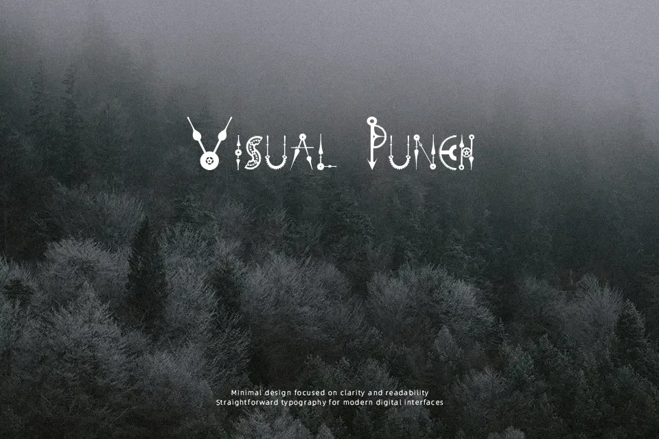
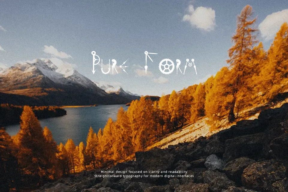
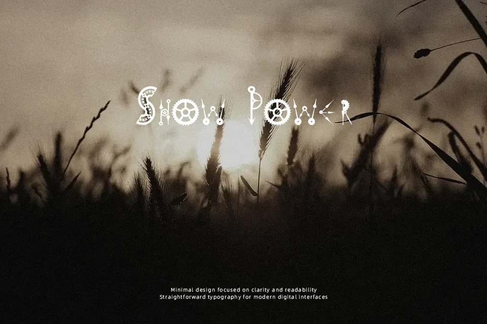
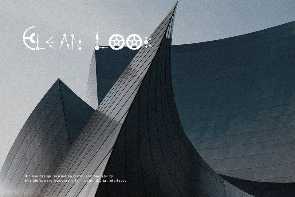
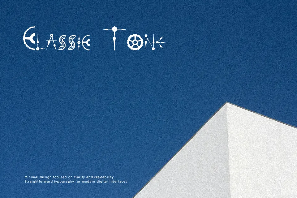
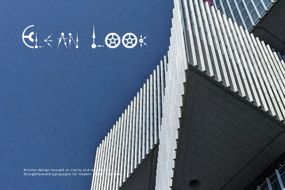
Time to get a Watch Font features an intricate decorative architecture where every character is assembled from illustrative clock hands, rotating gears, and vintage timepiece mechanisms. Thick solid strokes form the core silhouettes, while delicate dial pointers and gear teeth create high internal contrast and irregular outlines. Because mechanical components project outward at varying angles, character spacing feels inherently uneven, demanding manual tracking in tight display settings. The letterforms display broad, non-standard proportions that prioritize thematic expression over uniform rhythm. Readability remains strong in isolated headlines, logos, and escape room signage. However, the complex decorative assemblies severely restrict continuous reading comfort, making this design ineffective for small paragraphs.
Best For: steampunk event posters, escape room signage, themed game titles, antique watchmaker packaging
Not Ideal For: continuous body text, mobile interface labels, legal documents, dense editorial layouts
Perfect for gaming, headline, and logo, with a artistic and decorative style.
License
Gallery