Thiamine Font
Free for Commercial UseAbout
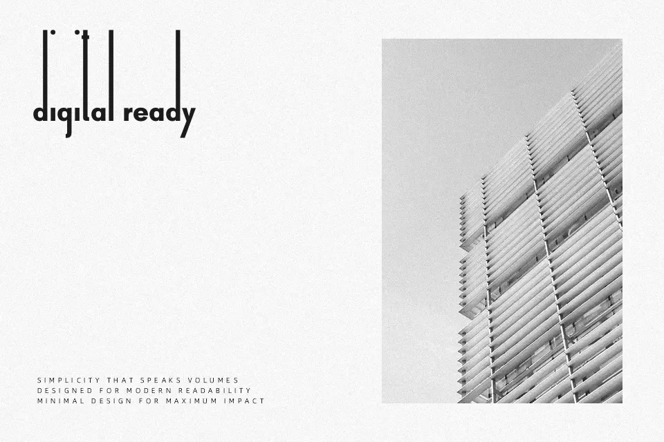
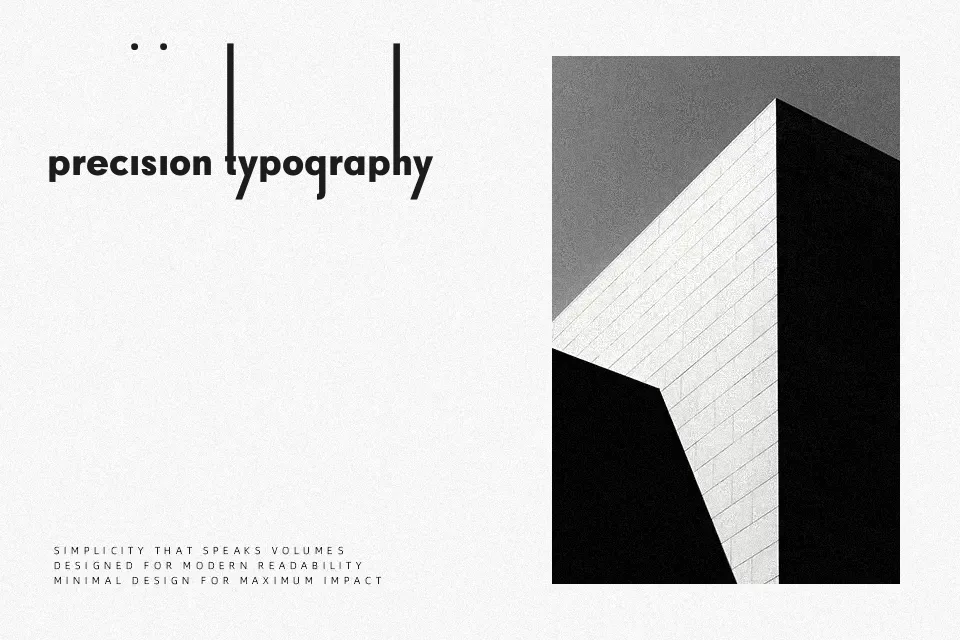
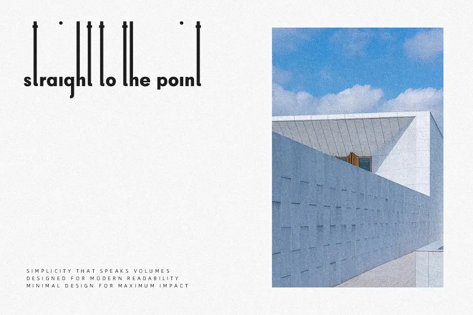
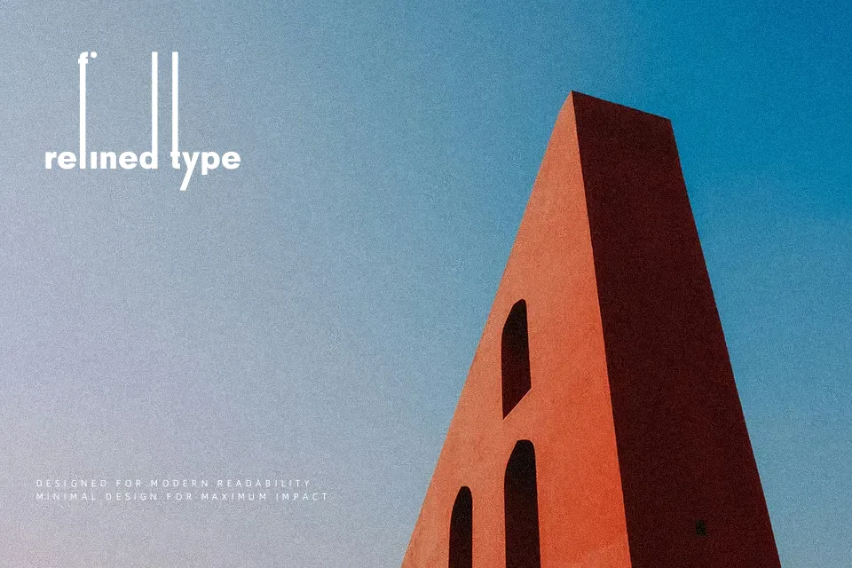
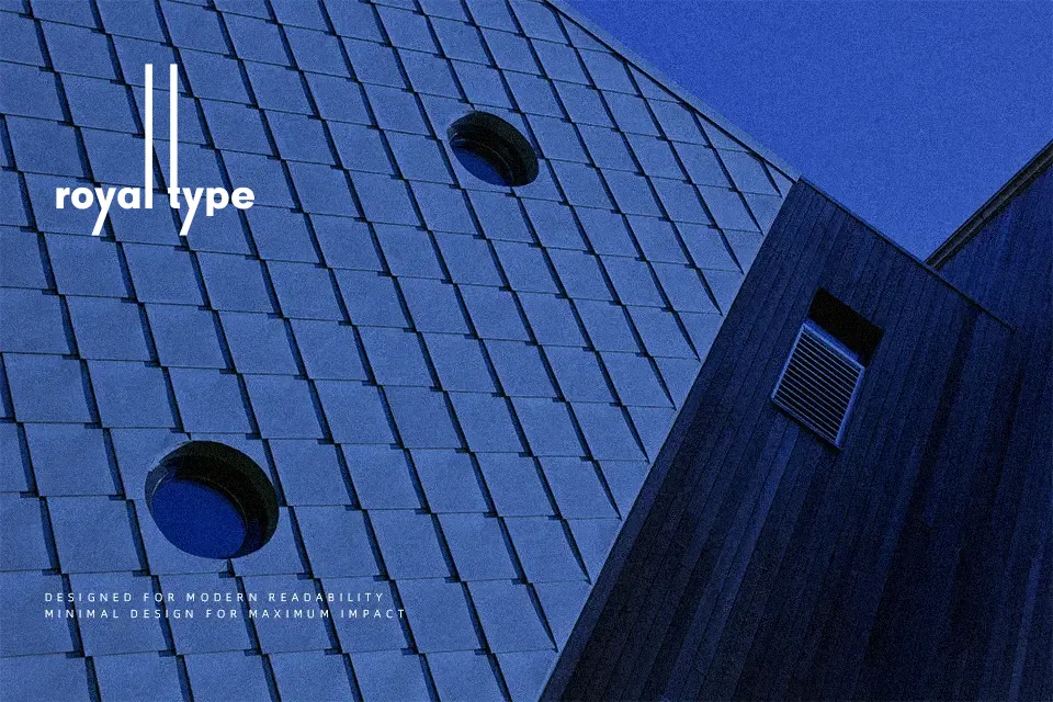
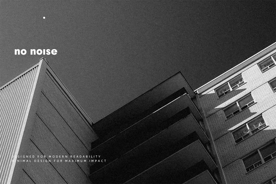
Built with extreme vertical proportions, Thiamine Font pairs an exceptionally low x-height with exaggerated, towering ascenders that dominate the upper typographic plane. The letterforms feature uniform monoline construction with consistent stroke weight, unmodulated terminals, and clean circular curves. Generous horizontal letter spacing balances the compact baseline bodies, establishing a rhythmic cadence across title lines. The design delivers remarkable visual impact when set in large formats, where its distinctive structure remains crisp and deliberate. However, the condensed character forms severely hinder continuous reading comfort, making the typeface impractical for body paragraphs, small captions, or dense editorial settings. Instead, the design excels across luxury goods branding, music album covers, and experimental wordmarks.
Best For: exhibition posters, boutique packaging, music album covers, luxury retail signage
Not Ideal For: body paragraphs, small mobile captions, continuous book text, dense editorial layouts
Perfect for headline, logo, and packaging, with a clean and display style.
License
Gallery