The Ministerio Font
Free for personal useAbout
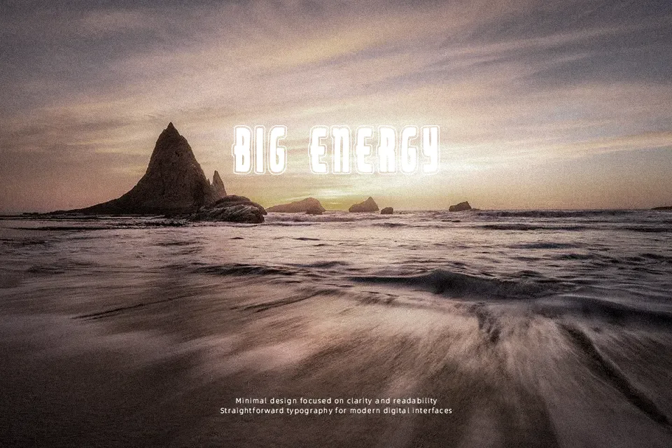
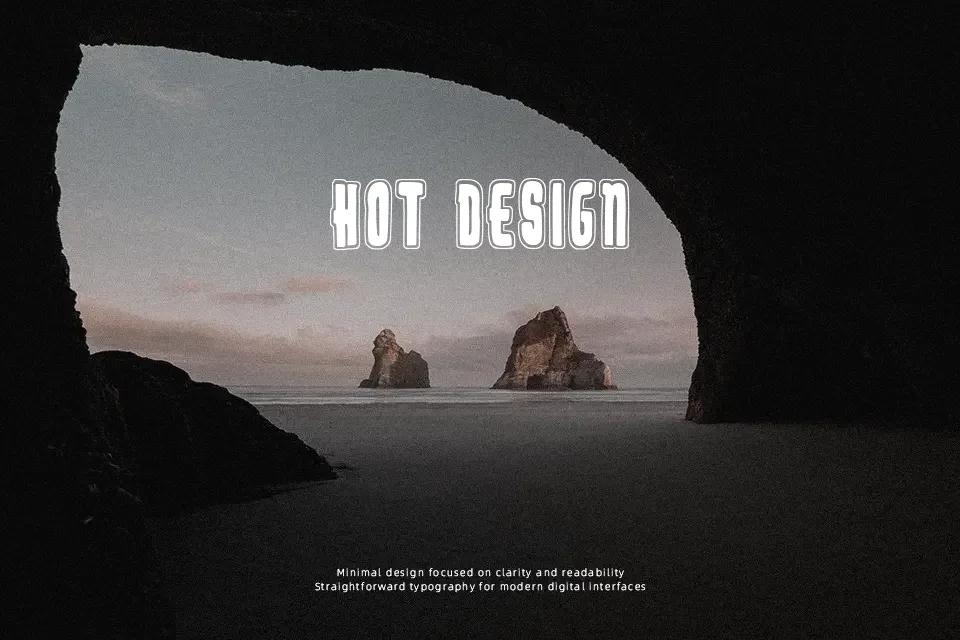
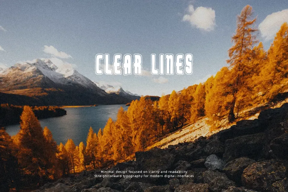
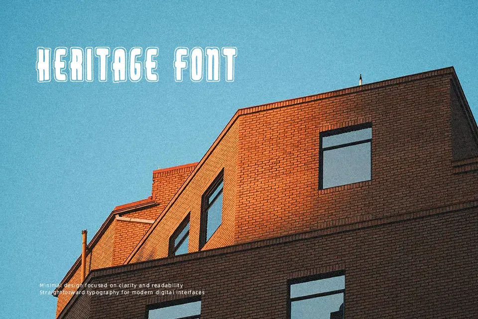
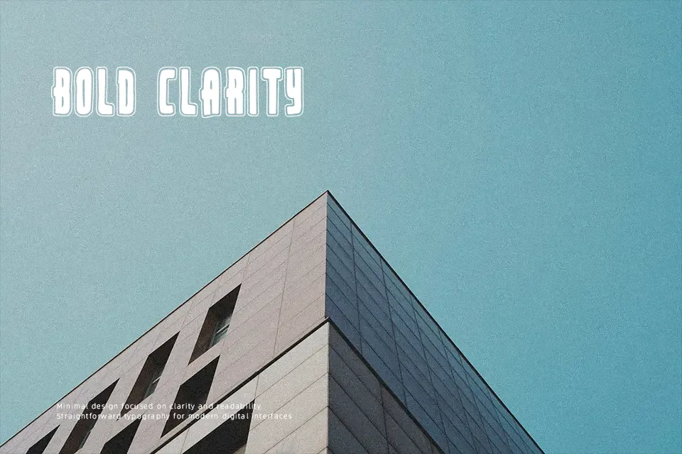
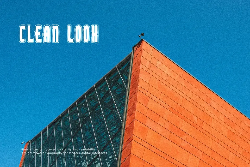
Built with dense medieval geometry and prominent fractures, The Ministerio Font commands attention through sharp diagonal cuts, pronounced finials, and heavy vertical strokes. The compact letter spacing and intricate detailing establish a commanding cadence across uppercase headlines, keeping titles dramatic and immediately recognizable. While the tight internal counters and decorative terminal spikes deliver immense personality in large display settings, they quickly merge together at smaller sizes. Consequently, the typeface excels in short titles, streetwear prints, and themed packaging, but it remains impractical for dense paragraphs or continuous reading where open counters are required.
Best For: heavy metal band merchandise, gothic festival posters, themed escape room signage, craft beer can labels
Not Ideal For: mobile interface body text, corporate annual reports, compact product ingredient lists, lengthy editorial articles
Perfect for headline, logo, and music, with a ancient and blackletter style.
License
Gallery